THE CHOICE OF COLOUR
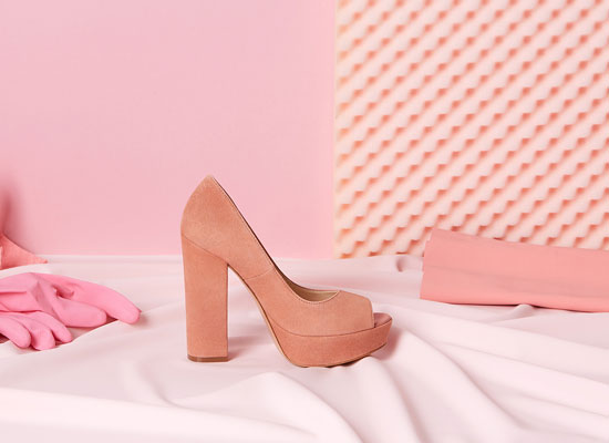
Daroo Photography, Jacob Reischel and Matt Russell produce still life photographs where choices about colour strength and contrast are very important. Martin Parr and Alec Soth carefully consider the colour of props, clothing and background in their documentary studies of people and places.
Daroo Photography, Jacob Reischel and Matt Russell produce still life photographs where choices about colour strength and contrast are very important. Martin Parr and Alec Soth carefully consider the colour of props, clothing and background in their documentary studies of people and places.
I chose the choice of colour because I am intrigued by the use of different colours in one picture. I think many artists concentrate on vibrant colours or black & white, but they don't think about about hues. The shade, the tints, hues and tones are something that I will to experiment with. I think Photoshop will be the tool that I will be using the most to experiment with colours in photos.
My first thought about this is that I will do some research about colours in general and I will look into some artists to see what they do and how they apply the idea of colours in their photographs.
My first thought about this is that I will do some research about colours in general and I will look into some artists to see what they do and how they apply the idea of colours in their photographs.
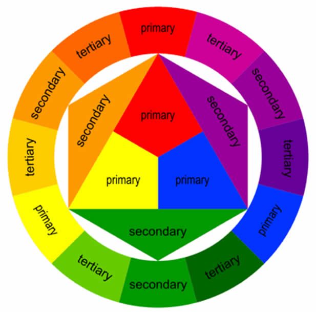
Color Theory
|
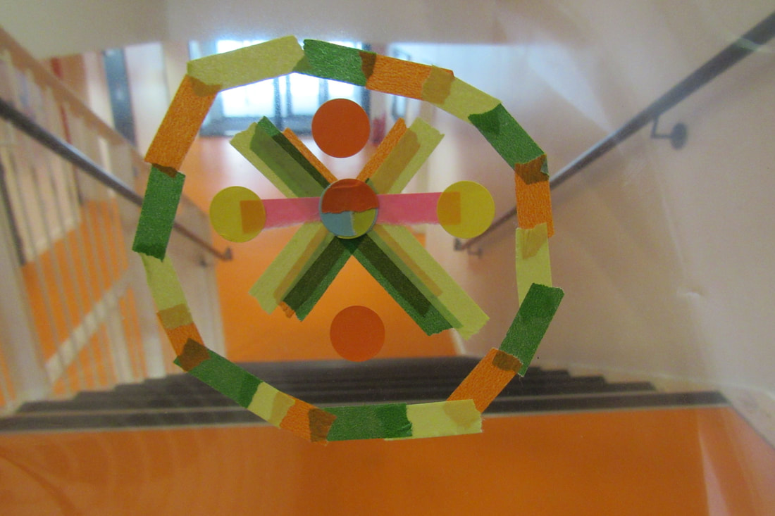
Colour Theory is the theory that talks about the mixing of different colours. Colours are based on the colour wheel: the primary, secondary and tertiary colours. The theory came from pure or ideal colours that give different experiences, the theory started with the primary colours (red, yellow and blue) as it was believed that these could be mixed to make different new colours. Some are complementary colours, this is usually described by using the colour wheel, these are colours that cancel each other's hues to produce an achromatic colour (white, black and grey). Every photographer has a choice, they can use the wheel colour to create different contracts in their photos which in turn creates different moods.
|
Daroo Photography
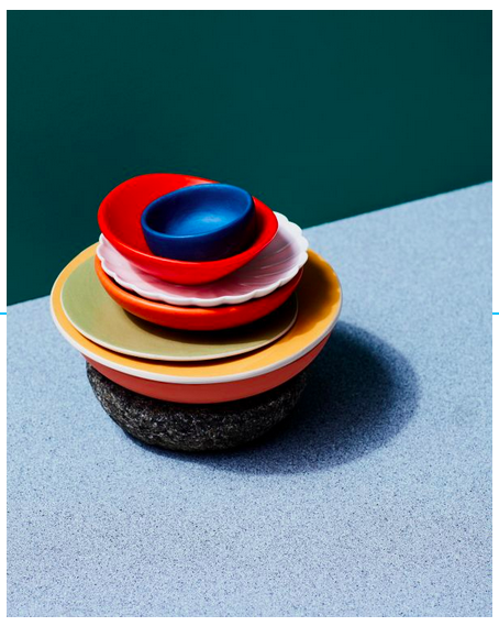
I have done some research about this artist and I like the way colours are arranged in the photographs. Daroo usually highlights one object in his pictures, which I think is interesting and something I want to experiment with. He plays around with colours; usually they are colours that complement each other.
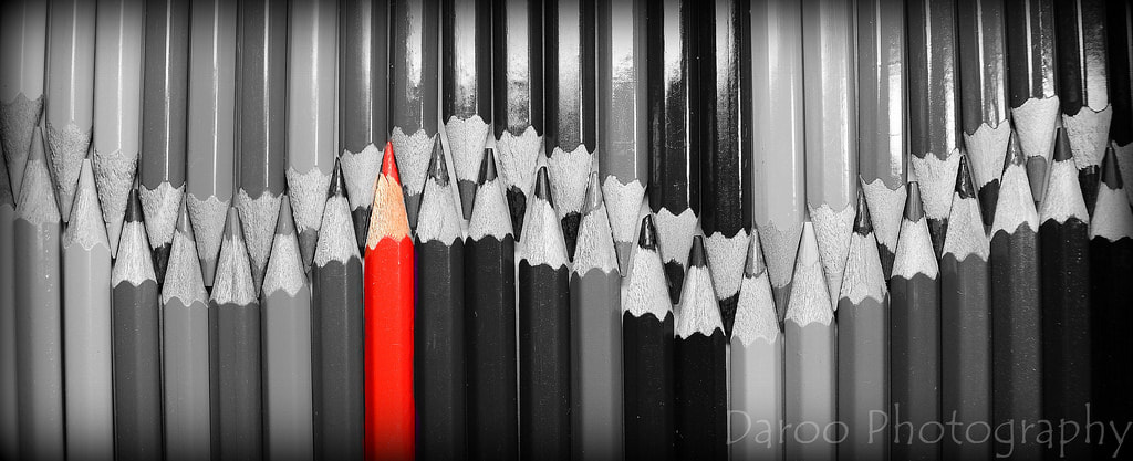
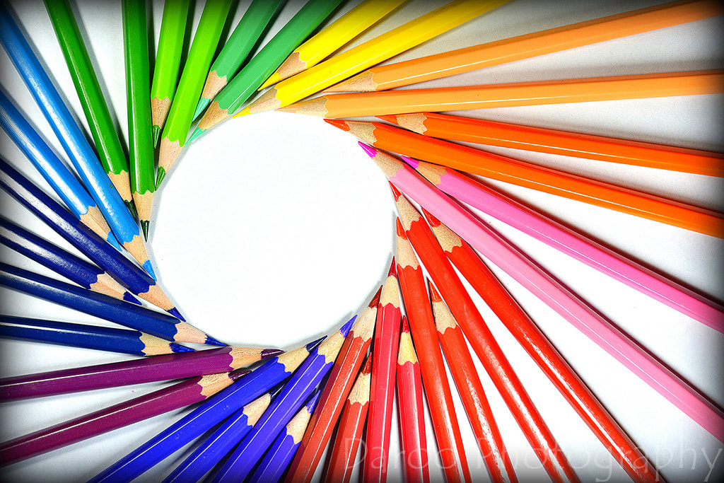
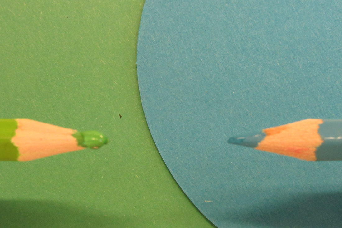
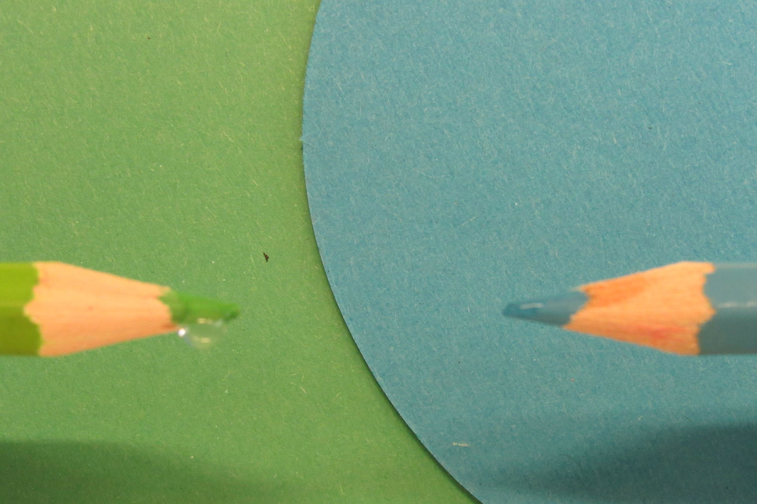
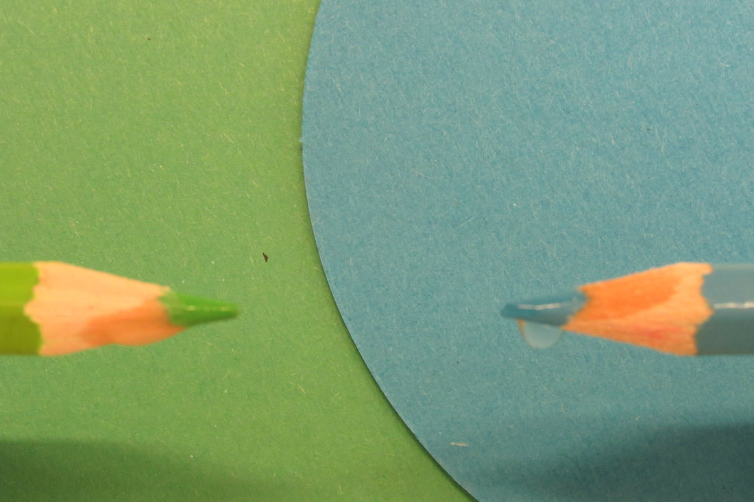
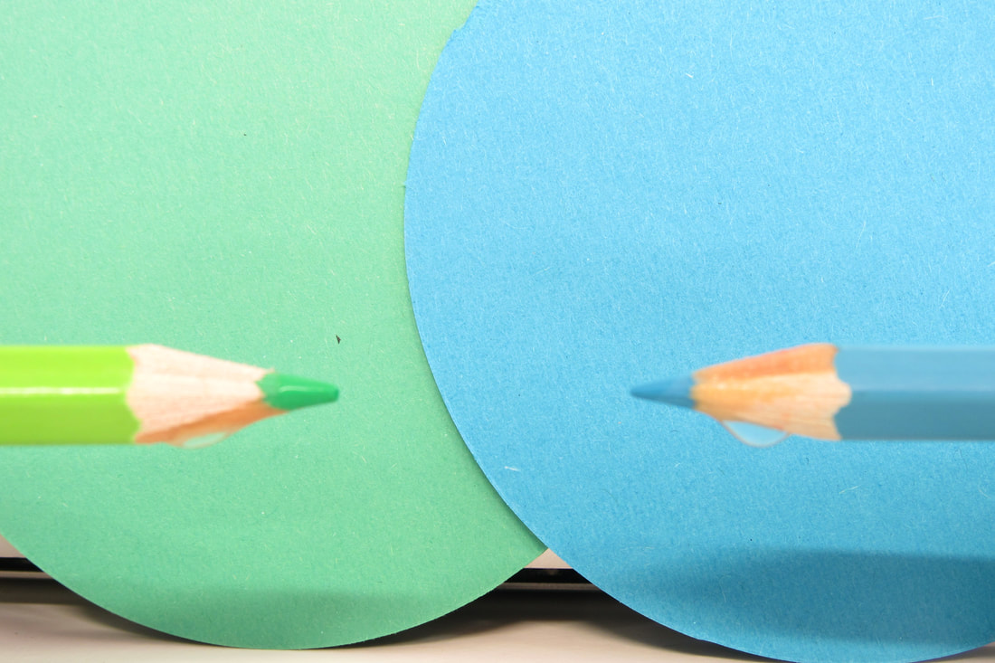
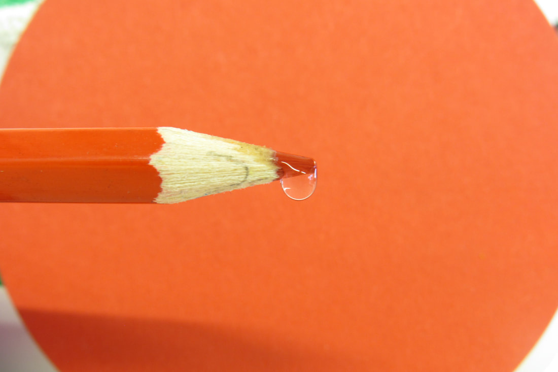
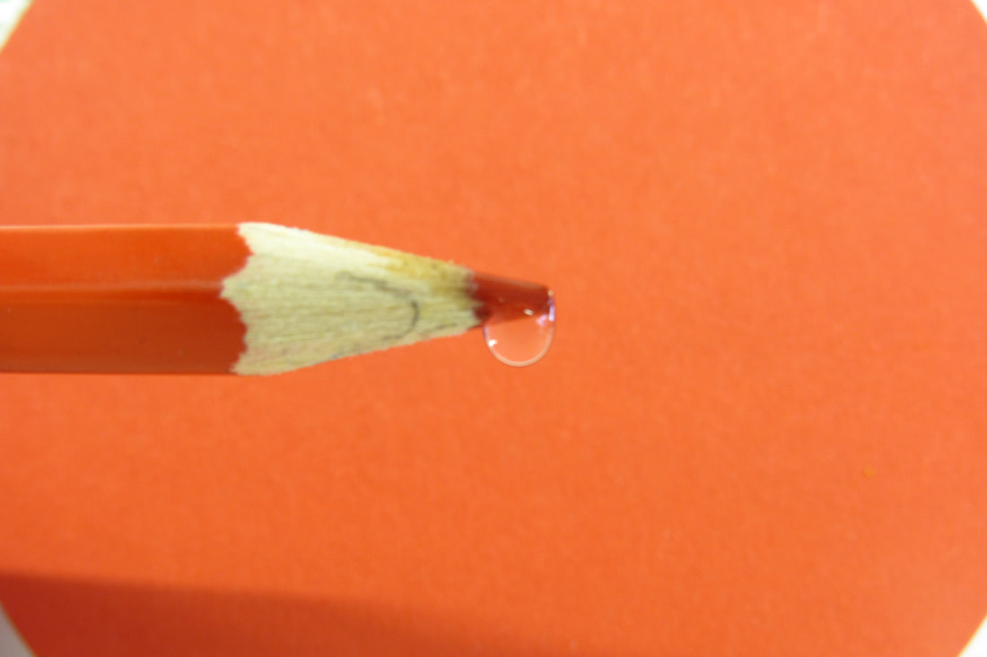
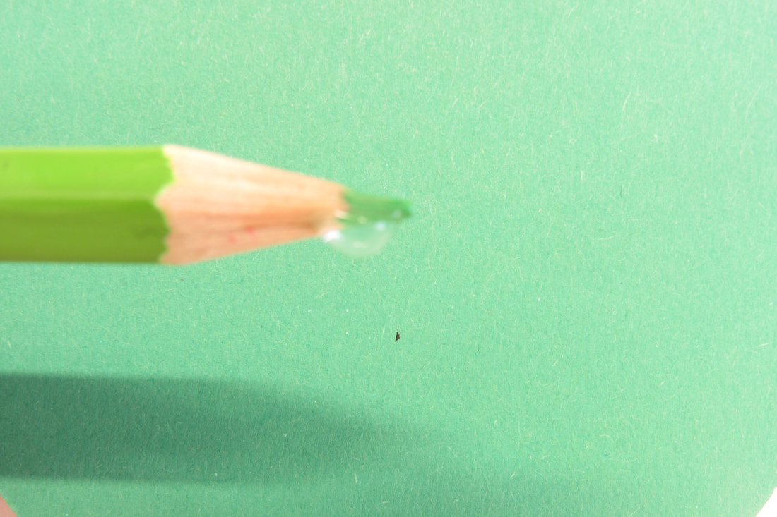
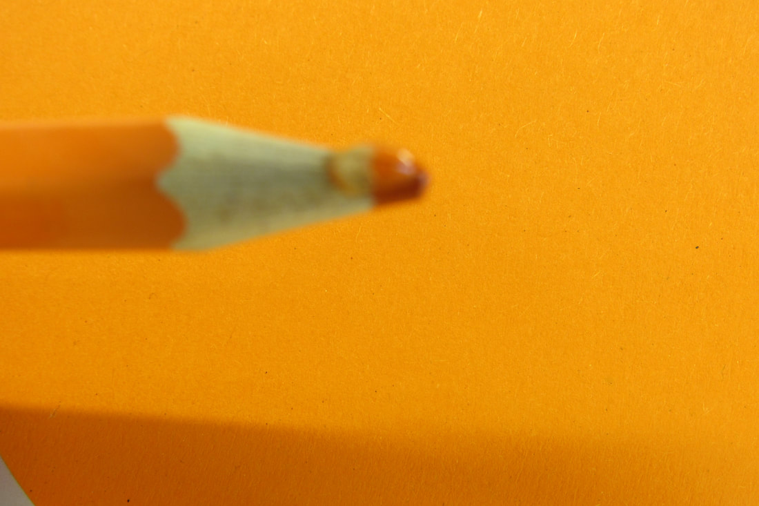
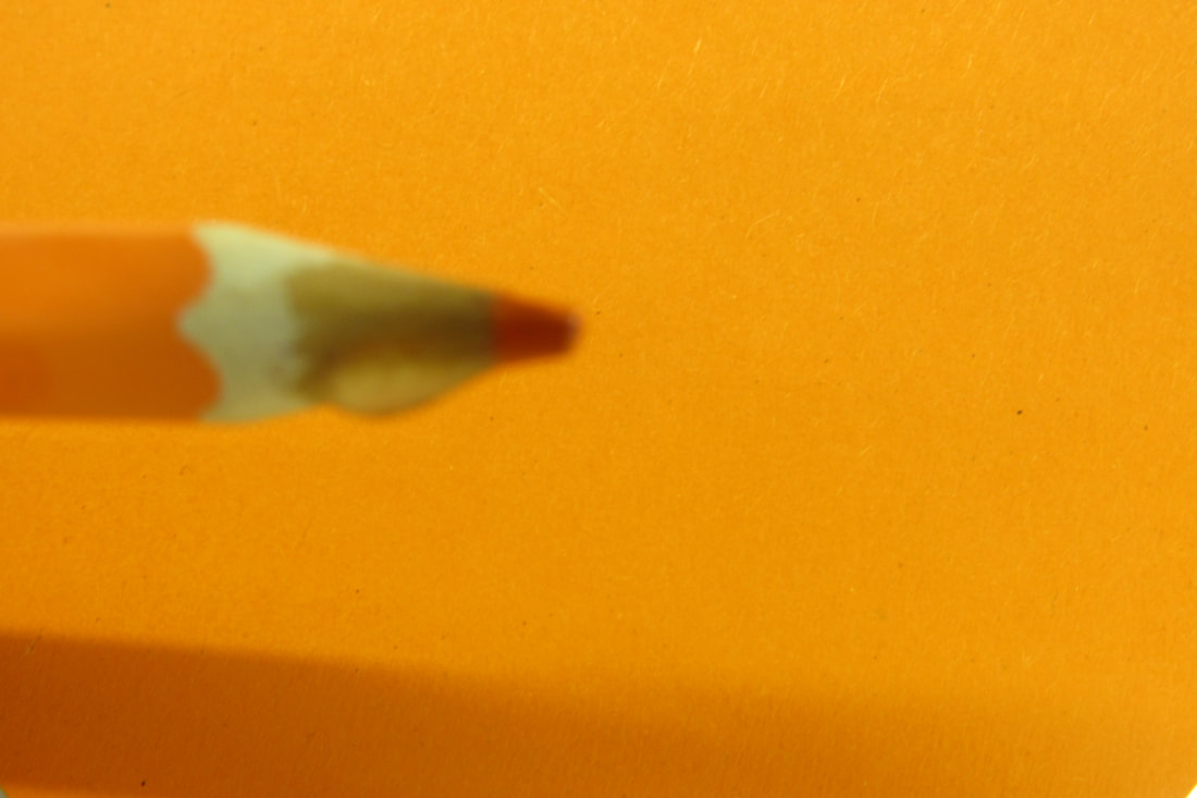
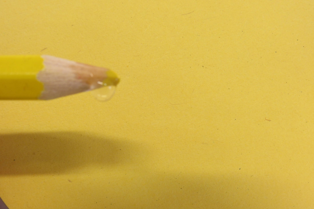
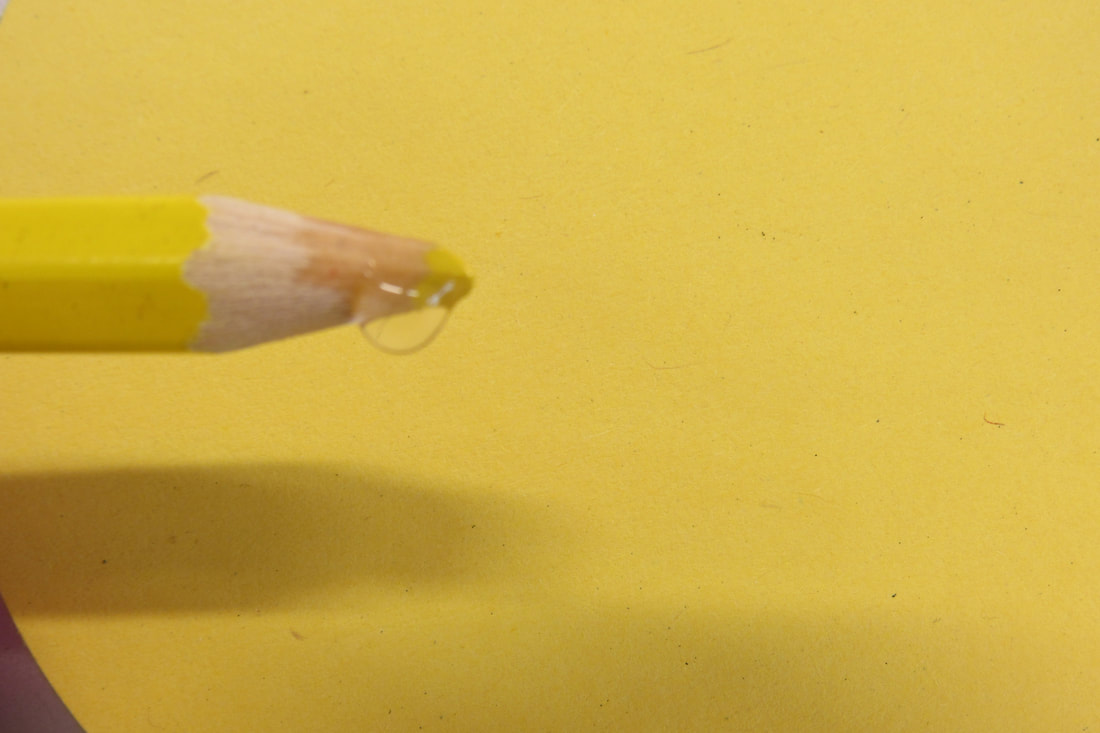
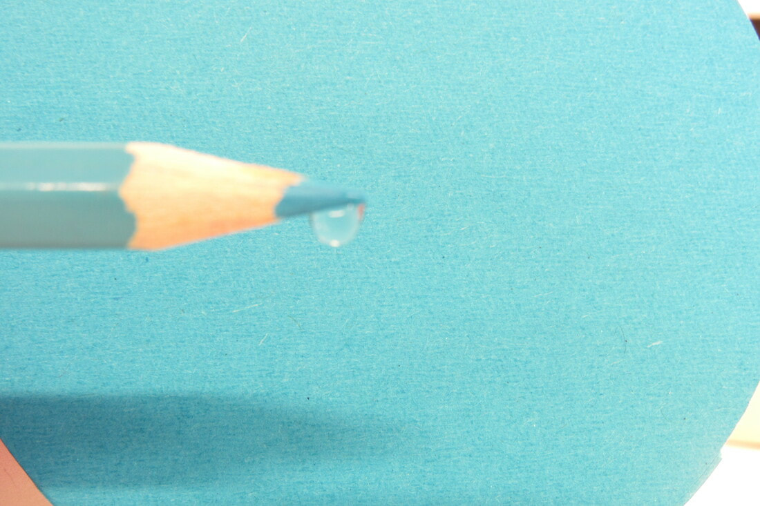
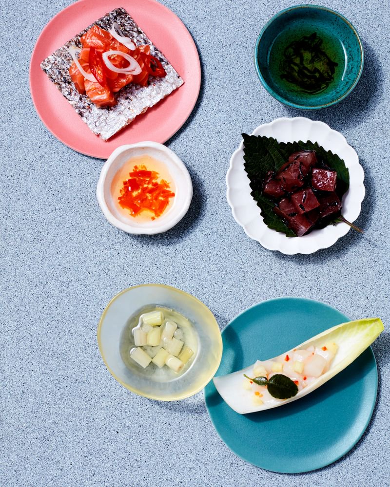
This artist relates to my theme as there is a variety of colours. In the images above, Daroo has decided to mix contrast colours (sometimes two, sometimes several), but it looks like he is following the colour wheel. Daroo also plays with the contrast of black and white against vibrant colours resulting in the colours standing out. I am interested in his work as it intrigues me to know how he managed to create these pictures. I will try to re-create the picture with the pencils and water because I want to understand how he achieved this image and the techniques he used to do so.
|
|
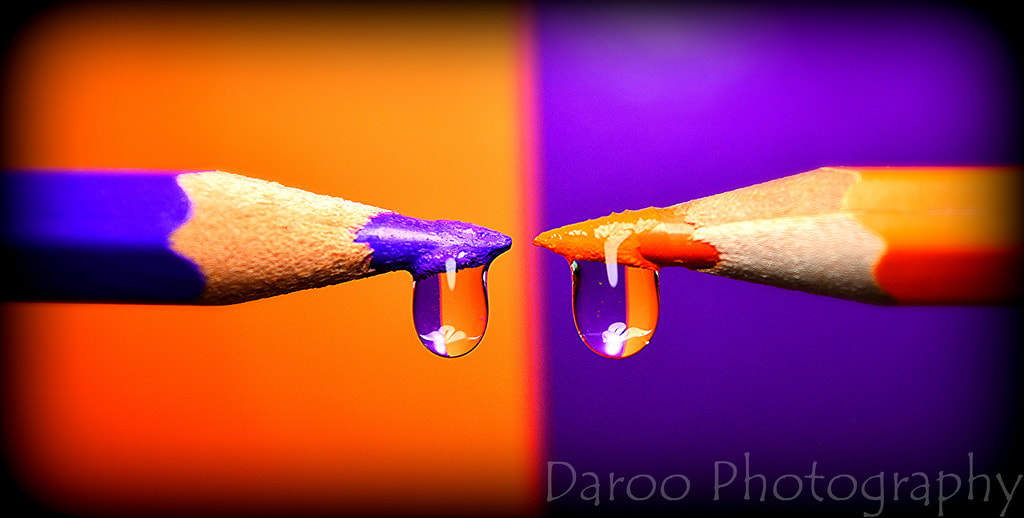
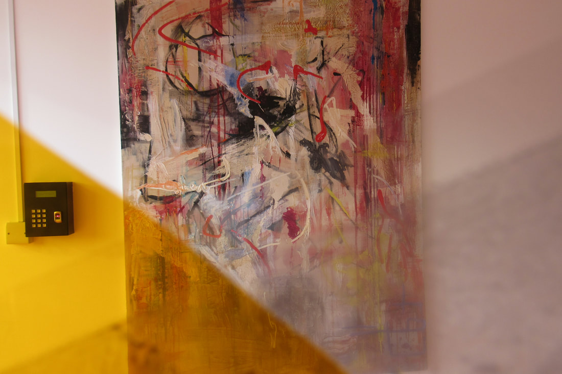
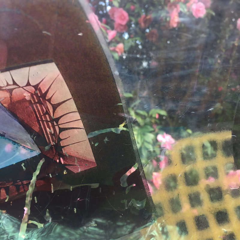
This is the project that I love the most from Daroo's Photography, he uses a variety of colours and mixes two colours that complement each other. From some of the research I have done, I can see that he is following the colour wheel as he used colours that either beside one another or completely opposite one another. I don't know how he manages to get the drops of water on the pencils at the same time whist taking the picture. It really catches your attention seeing different types of colours in the same picture, Daroo makes the pictures particularly striking by inverting the colours in the foreground to create the colour of the background. Furthermore, the drops of water contain both contrasting colours. The pictures are bordered by black frames which focuses the attention to the centre of the photograph because the viewer is drawn to the colour.
|


Further experiment
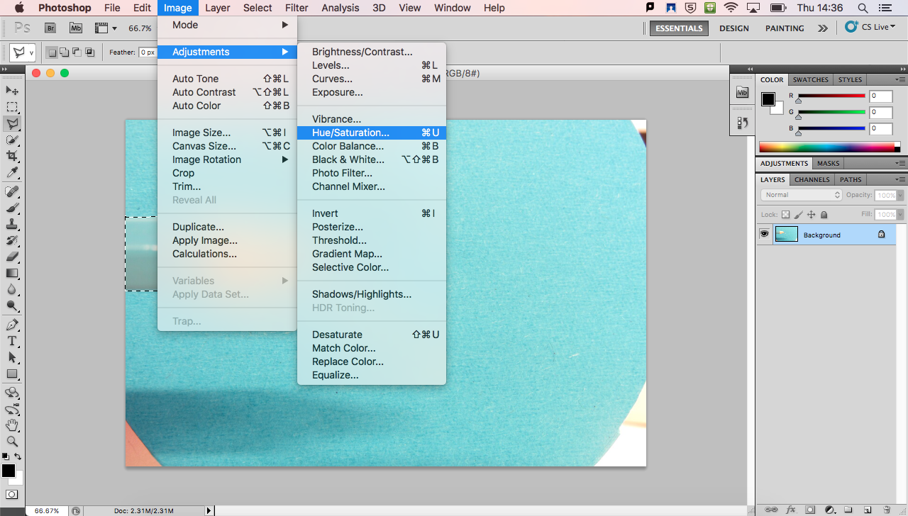
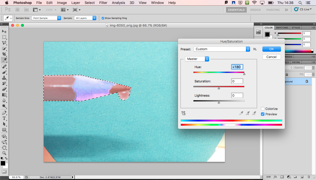
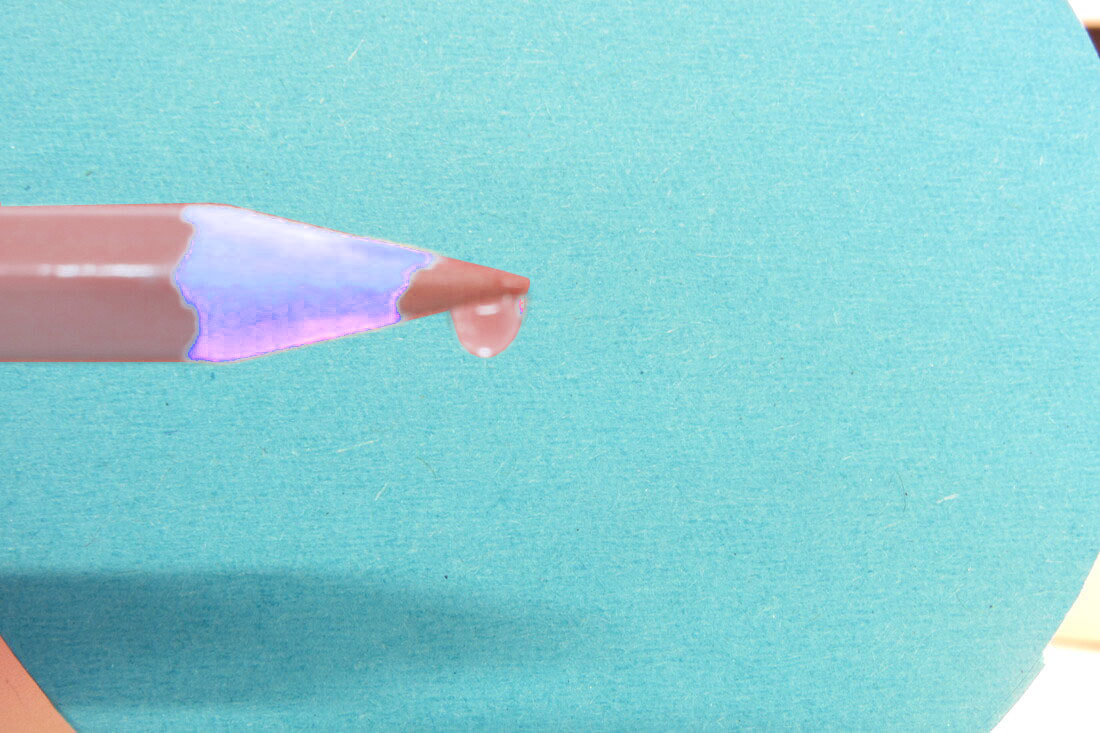
I did a further experiment using Photoshop to see what else I could do with more colours. I selected the pencil in the image and then I changed the colour of the pencil but did not change the background at all. The result was not as I had planned as some parts of the image changed completely and also the water drop changed colour too, which was not what I wanted. However, it gave me an idea to combine different colours in the same image.
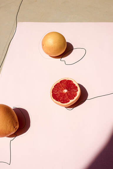
Matt Russell
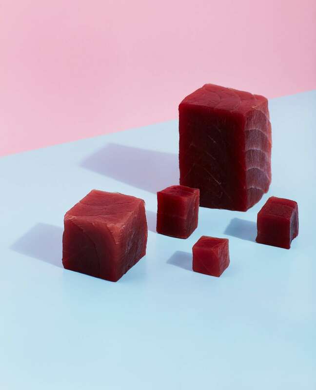
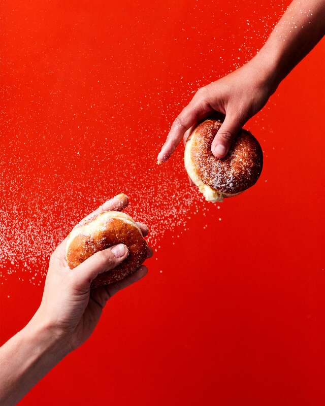
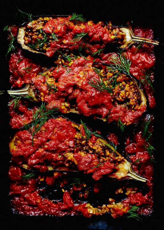
I love Russell's work, I like the different shades of colours he uses in his photographs. Russell has a particular interest in the colour red, it is often well exposed in his pictures, making it stand out consequently making the picture more interesting. The colours used are not the ones that we would call "solids", they are mainly different hues. I like the variety of different colours and that the pictures are photographs of foods, it makes me appreciate the aesthetic of the food makes the viewer see food in a different way. Now, I realise that some fruits complement each other better than others because of their different colours. I did some research and I found out that sellers use this as a technique to encourage people to buy food. For example, some sellers display oranges in blue boxes, this makes it more attractive for buyers.
|
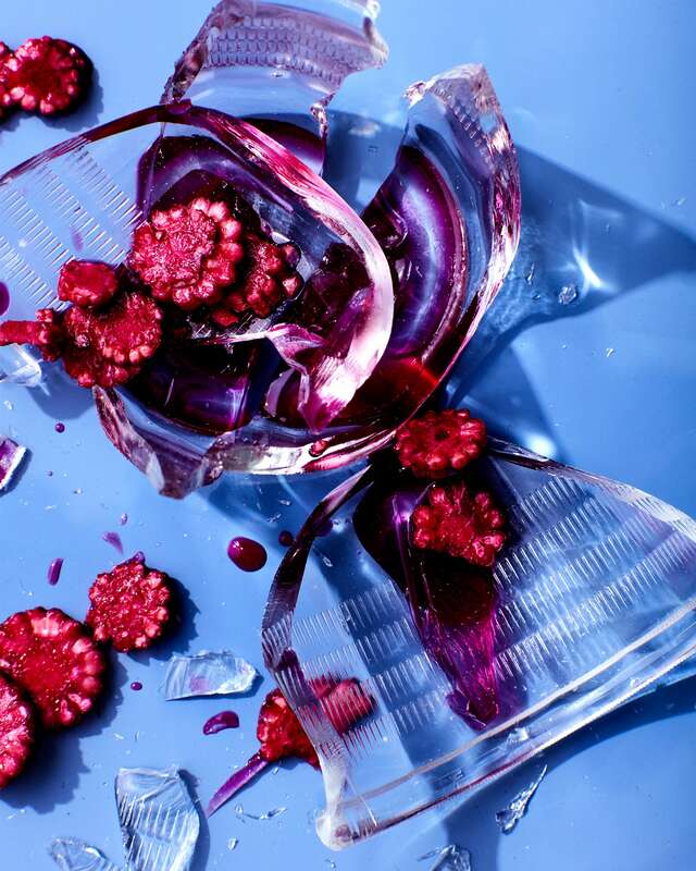
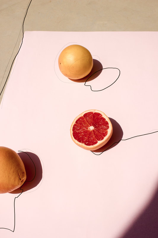
From all his work, this is the picture that I am most intrigued by, the background is a simple light blue, then there is broken glass which creates a reflection on the light-blue background. Without physically adding more colour, Russell creates shades through the reflection of the glass. Also, there is red all around the cup which seems to come from the juice of the fruits. Alternatively, it might be a reflection of the colour of the fruits.
I think Russell often chooses food as his subject because he has complete control over them, as he can place them the way he wants and choose the components that suit each other the most, this allows him to experiment with colour. The light in the picture is quite strong, the picture was taken from an angle above it and it is a close up, which allows us to see the different shapes (U-shapes, circles, rectangles etc.) created by the broken glass. All the fruits are cut into small pieces and I think they were spread around the photograph too create different shades throughout the piece. Russell juxtaposes a light colour with a strong colour, in my opinion I think this is because it allows the red to be more emphasised. This has inspired me to take some pictures of food, as it has made me consider the way colours are actually used by sellers to attract buyers in real life. |

|
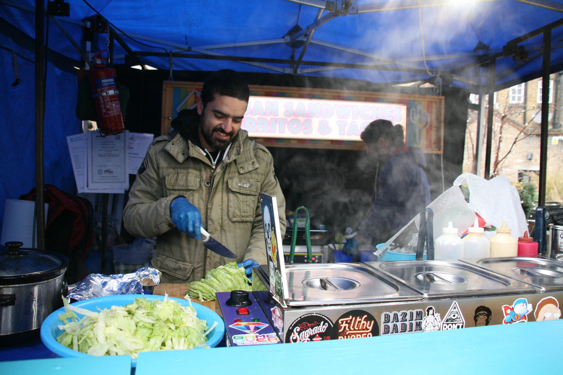
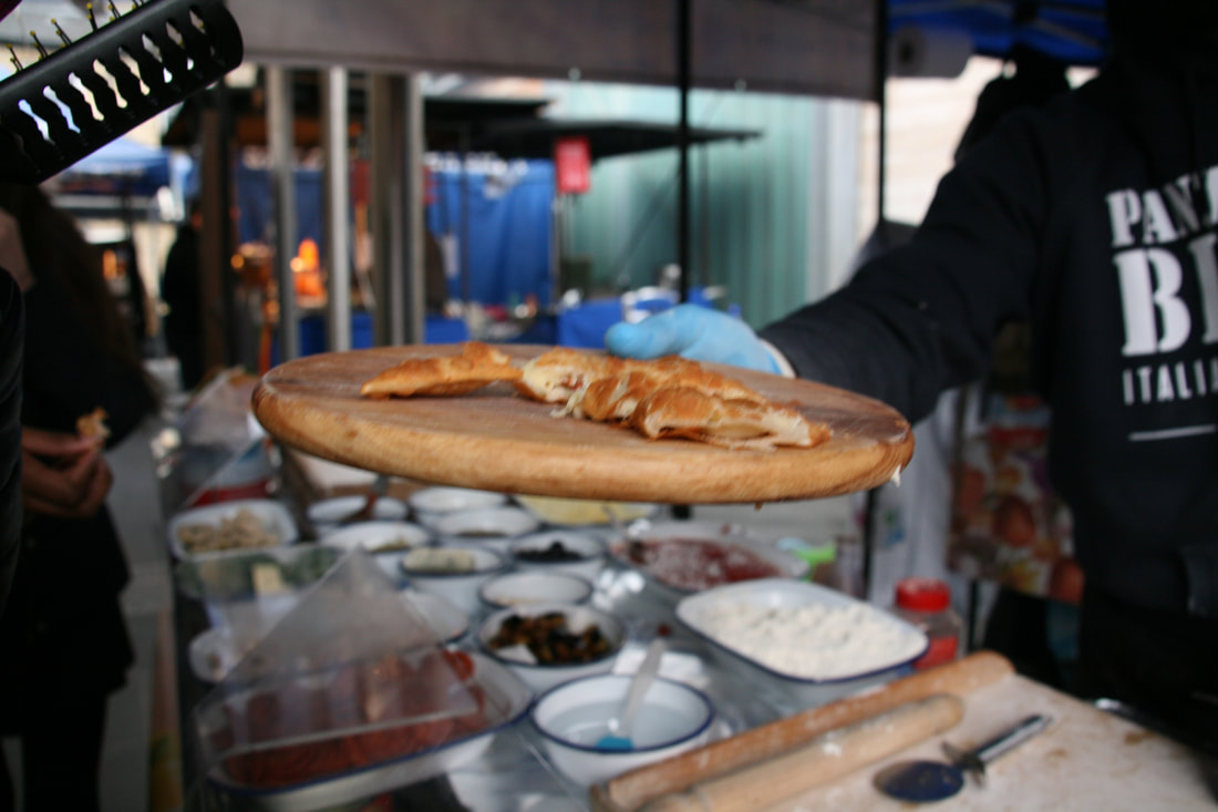
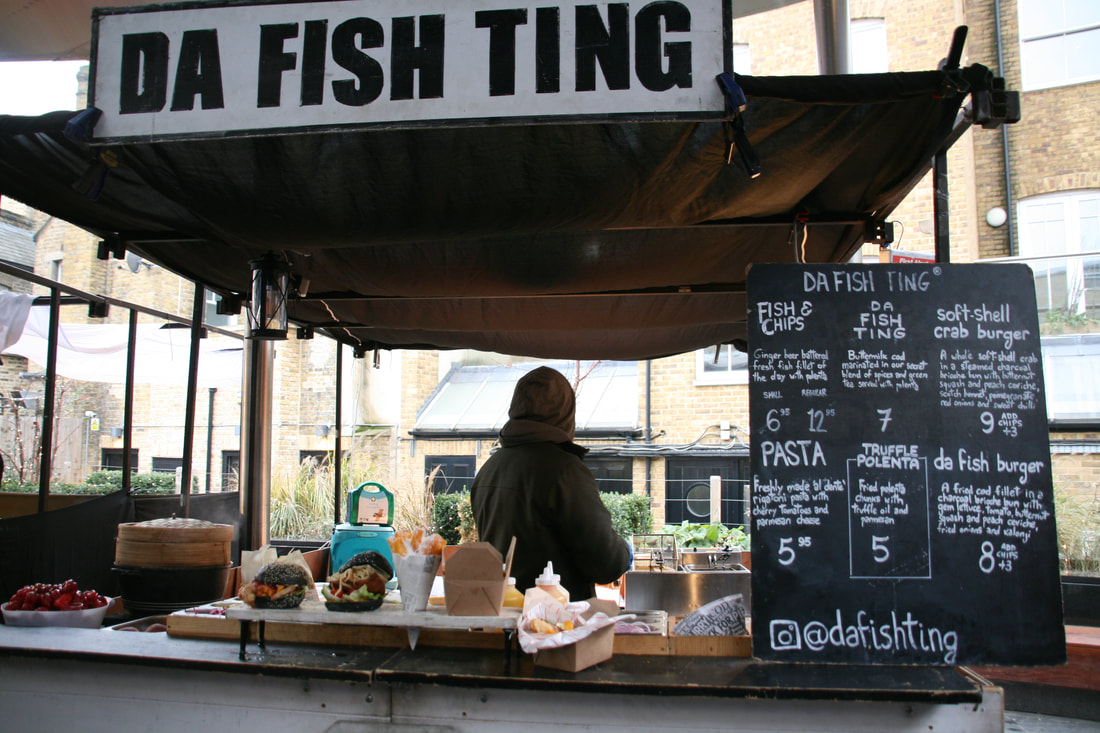
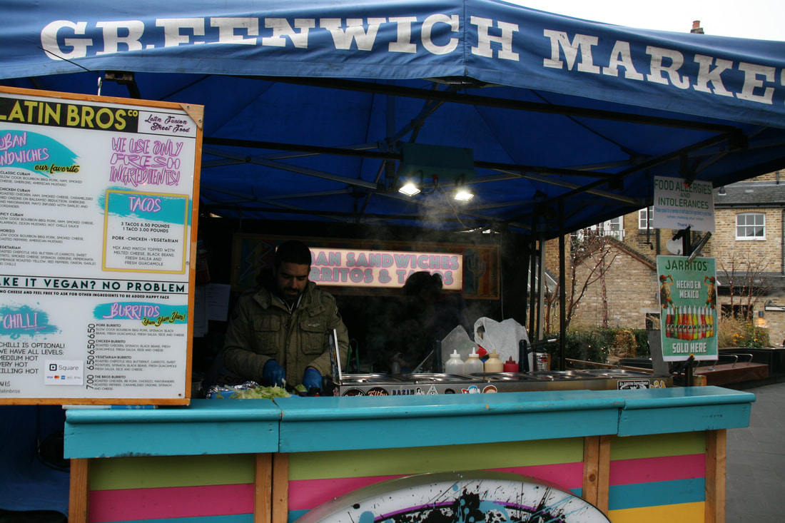
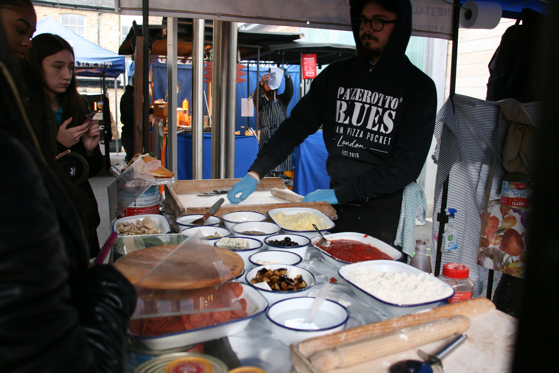
As I mentioned above, I got the idea of going into a food market to photograph some of the stalls and the food they sell. I realised from this that most stalls have bright colours such as: blue, orange, pink, green and red. This shows how sellers try to make their stalls stand out by using a variety of colours in order to attract buyers. From this, I contemplated whether the stall holders had looked at the colour wheel to make their stalls attractive. I think they use colour as a distraction to make buyers concentrate on the colours instead of the price.
Jacob Reischel
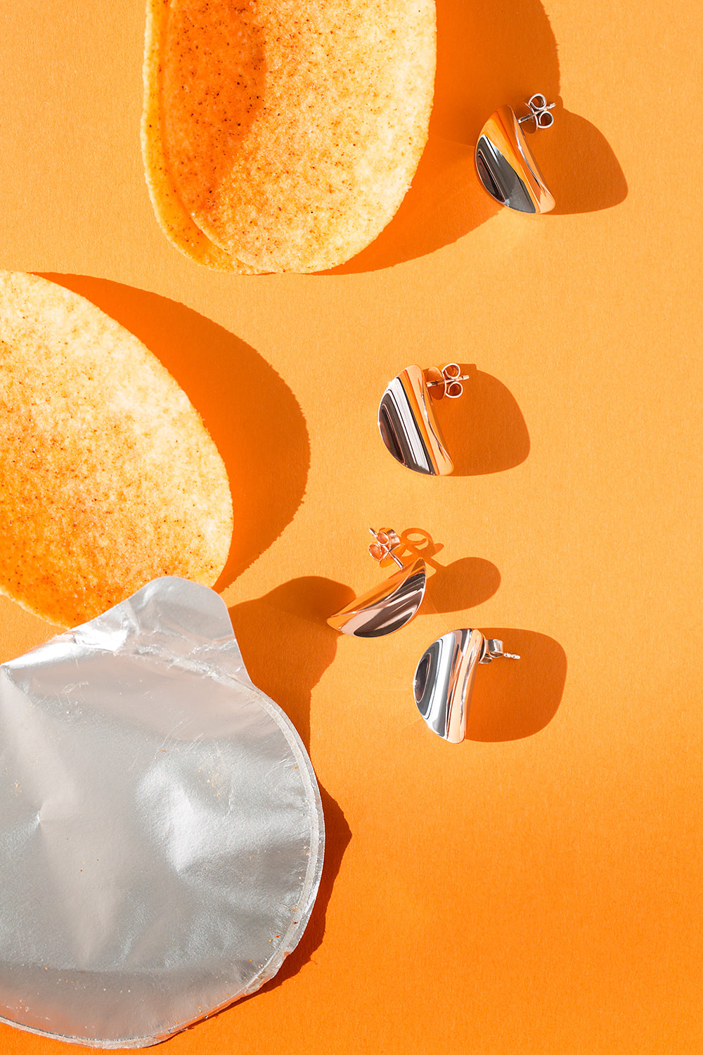
I have looked into Reischel's work and I really enjoy that he only photographs objects that we use everyday. I think this is interesting as if we saw any of these objects in our daily lives we would not notice any of the colour that he is manages to highlight in his pictures. He does not use different parts of The Colour Wheel in one picture, instead he uses hues of the same colour. I think Reischel has thought about still life as some of his pictures include food which is mainly associated with still photography.
|
From all his work this is my favourite picture because it is a simple image. It looks like it contains a red orange and another two fruits, however I am not sure what they are. There are some lines around the picture that may have been drawn with a pen or pencil. The background has a contrast between a baby pink and a shade of beige. I think that this picture has been taken from the right side as we can't see the left side completely. There are some aspects of the picture that make me doubt that some of the fruits are real. For example, the fruit at the top looks like it has some lines drawn on it with pencil, which you wouldn't be able to do with a real fruit. The bright red from the orange is the focal point of the picture, it is not repeated anywhere else in the picture.
There are some aspects of the picture that make me think that it may be a painting. The beige colour on top left part of the picture looks like it was painted, as when it is contrasted with the light pink it is a blurred line rather than a straight one, an actual photograph would not appear like this, suggesting it is painted. This could be because still life pictures in the 17th century where drawn or painted, which then inspired photographers to experiment with a mix of real objects and drawn objects. |
|
Still life
When I did my research about artists related to my theme, I realised that most of them base their work on still life. Still life is mostly used because it allows the photographers to change the composition of the picture, this is a key idea for my theme of colour as it provides me with the choice to choose how the objects should be arranged. I think the lighting and the angle from which you take the picture are important, as lighting can be used in many ways to make an object the focus of the picture. The angle from which the picture is taken is also important because you can take the picture from a specific side to create shadows with lighting which can lead to different effects.
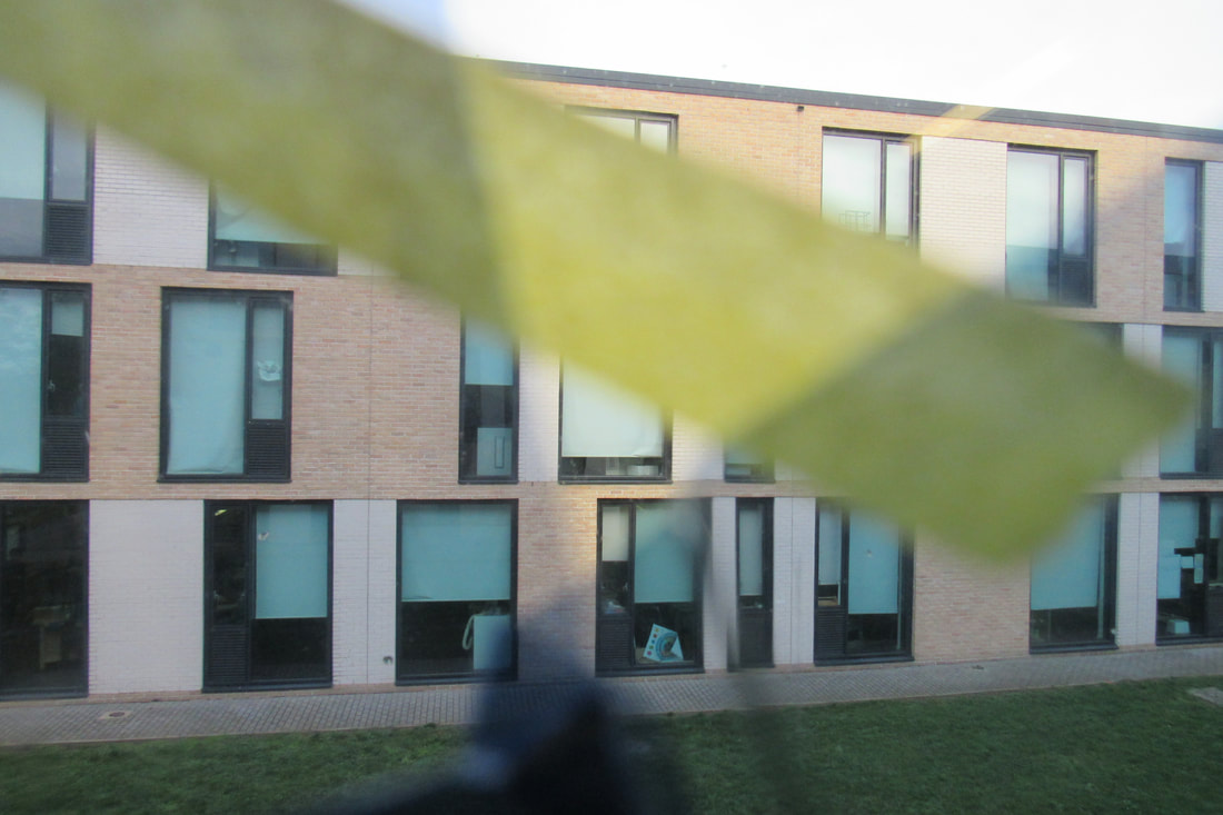
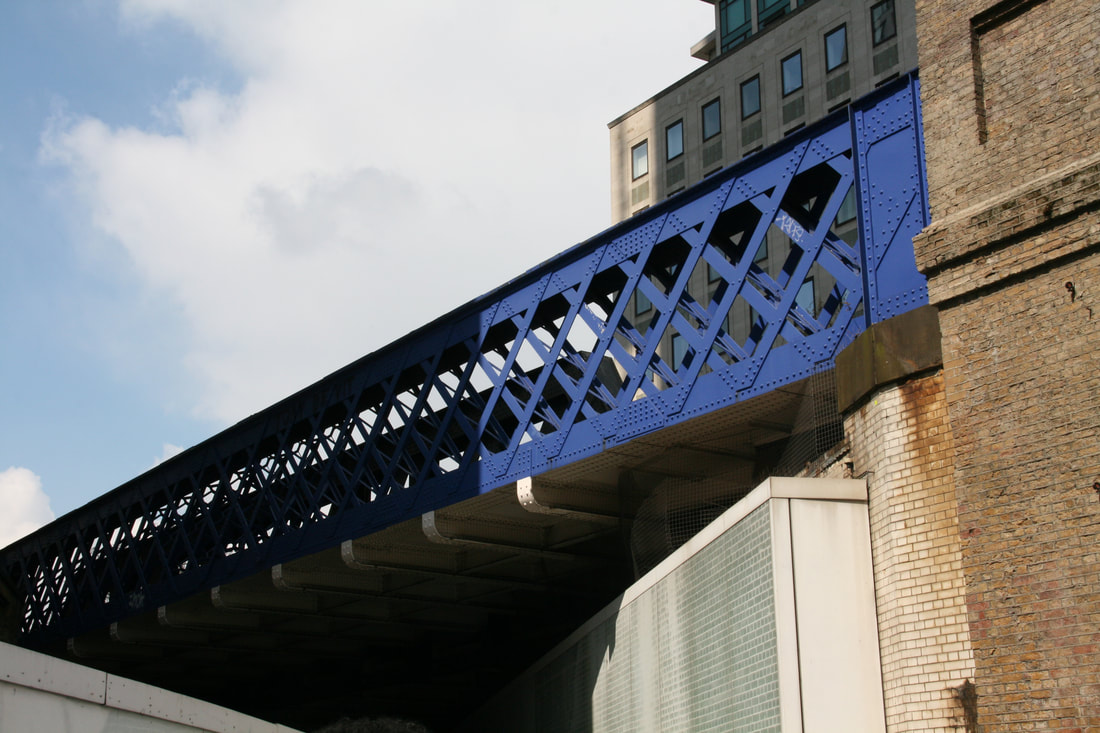
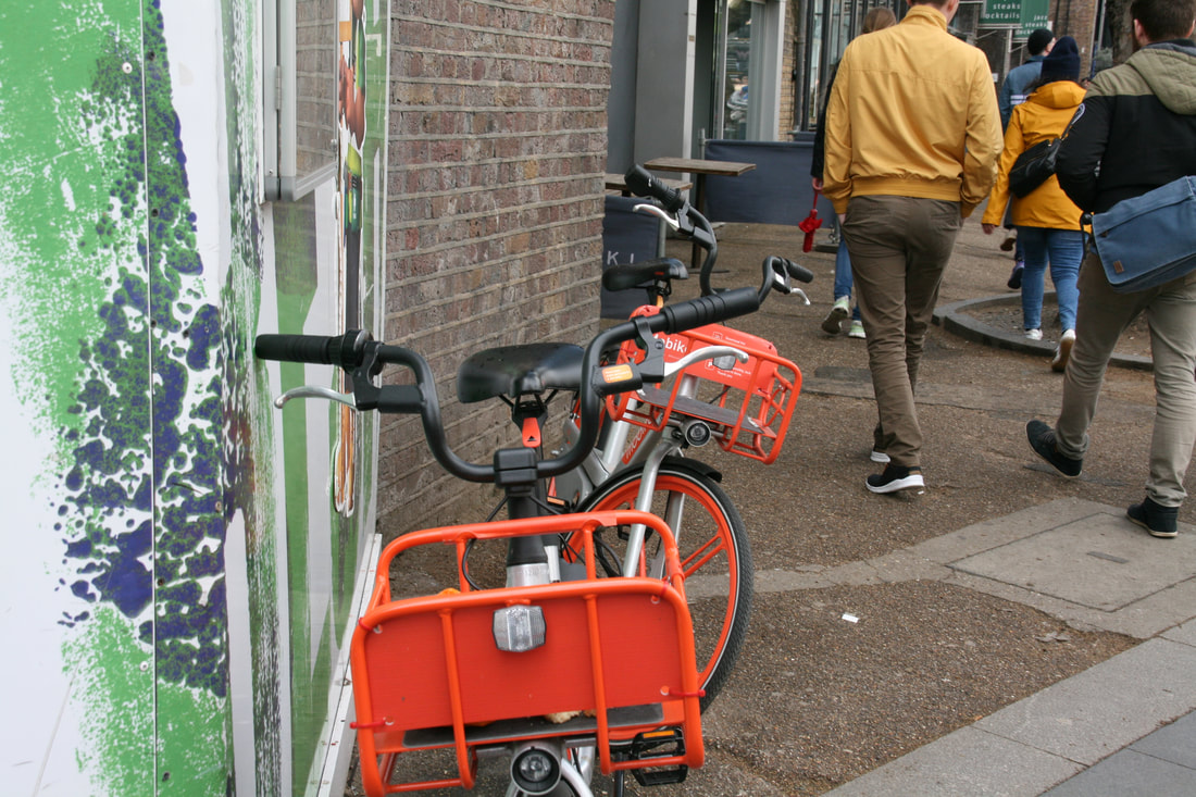
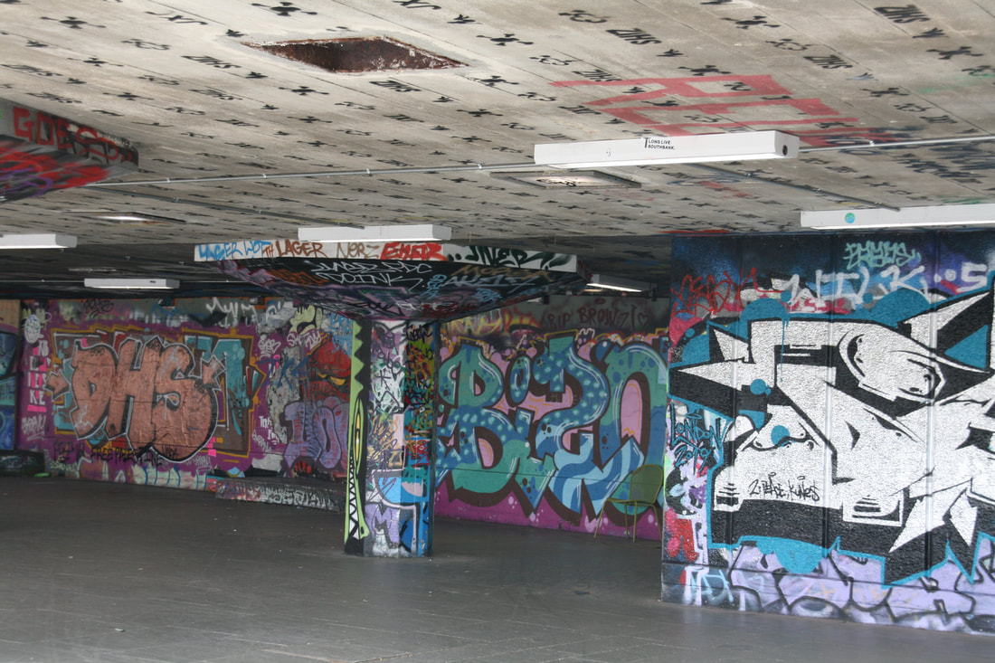
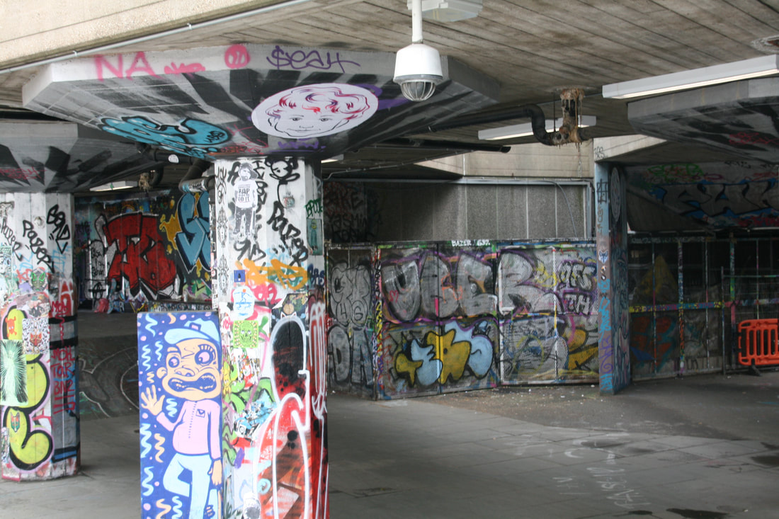
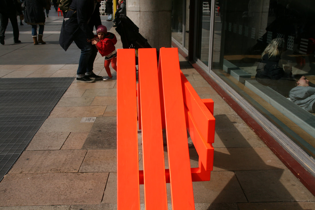
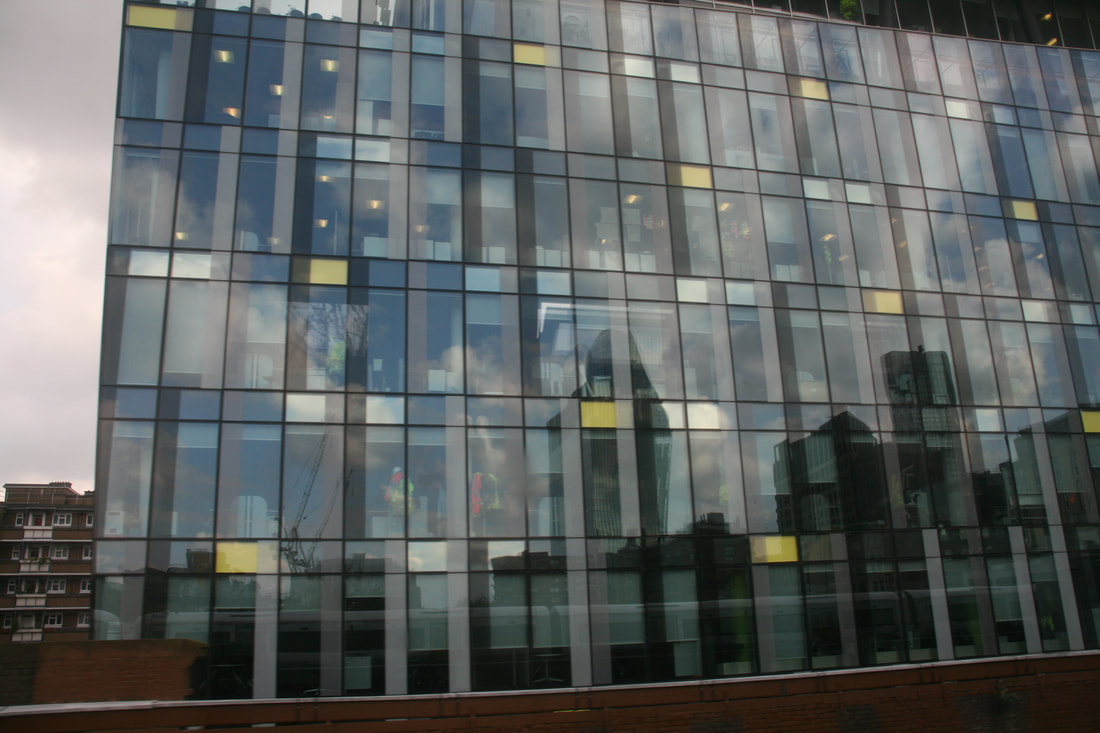
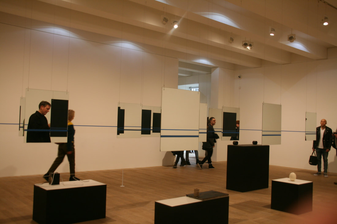
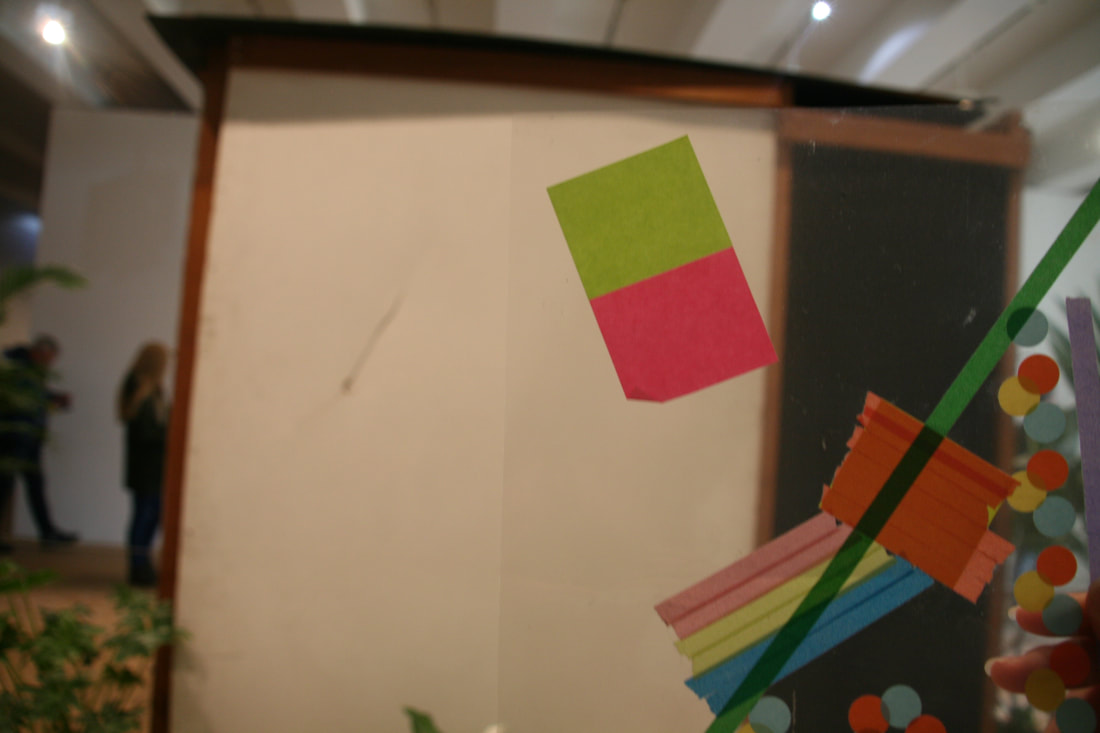
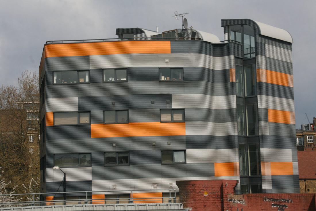
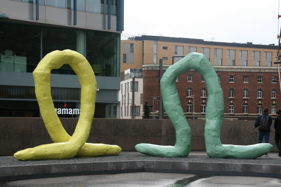
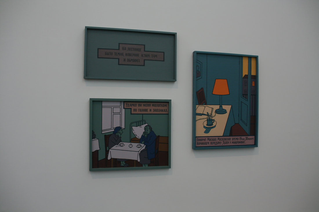
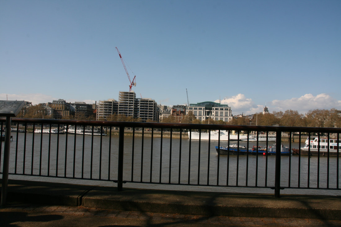
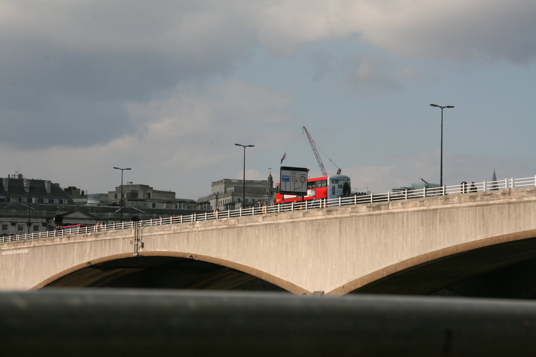
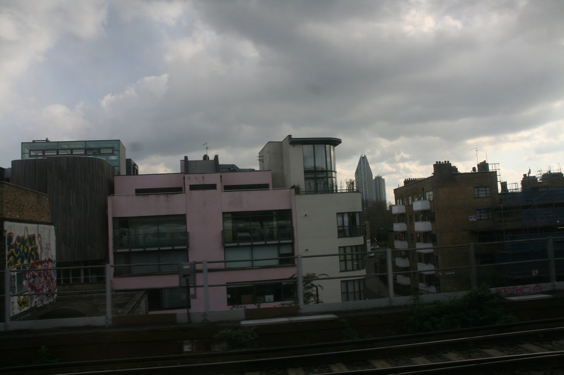
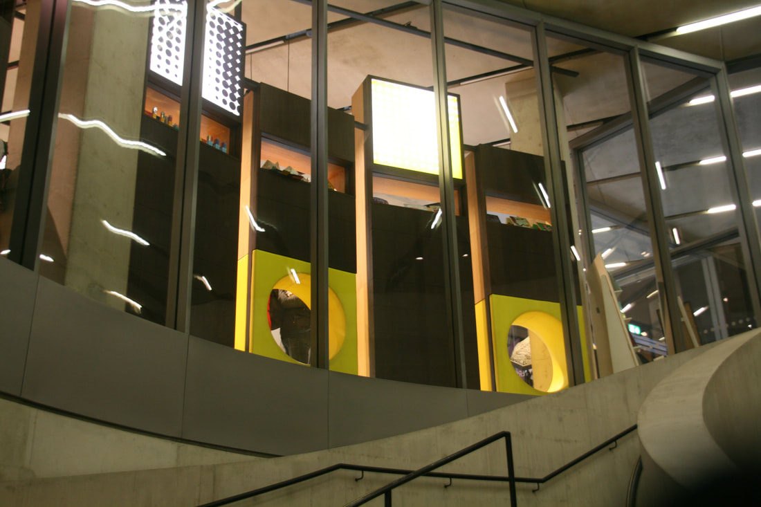
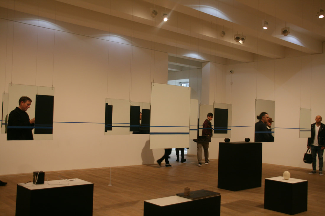
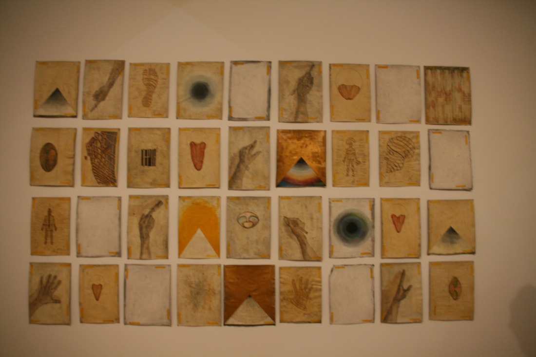
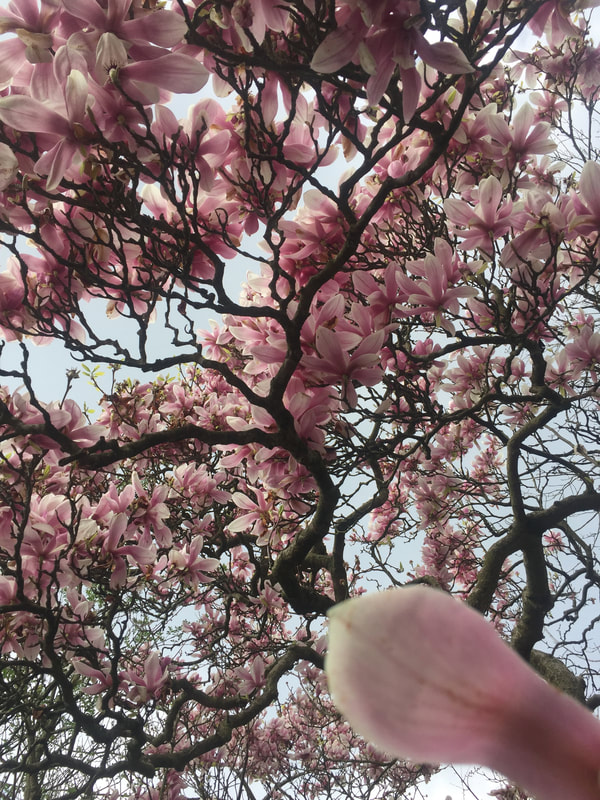
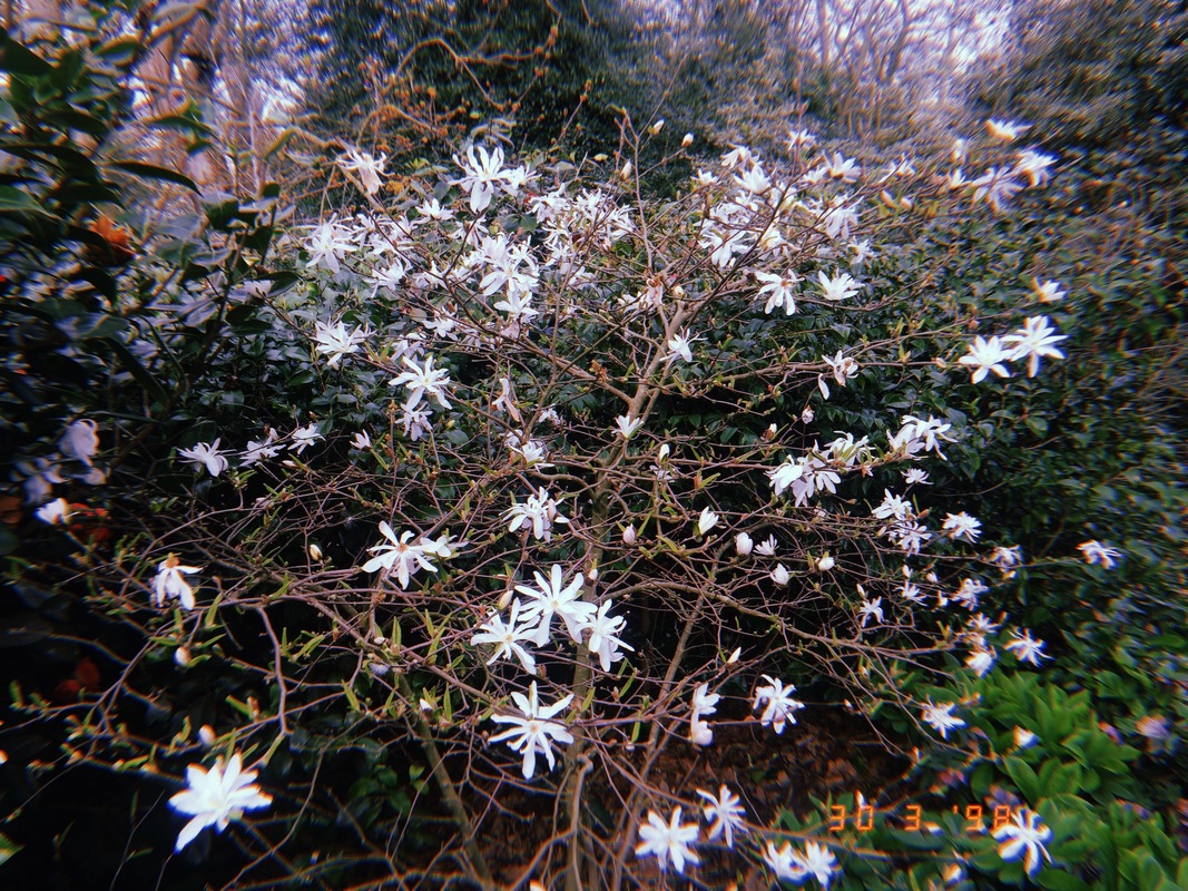
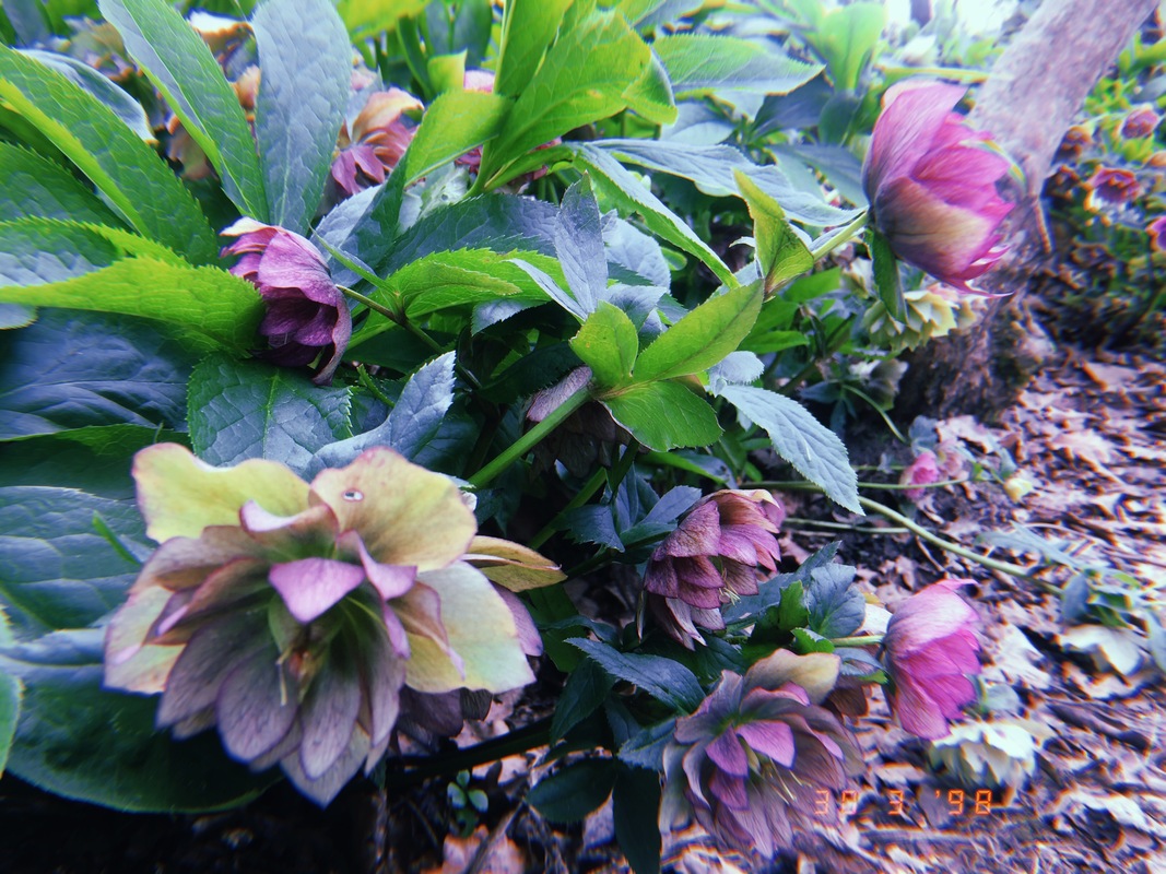
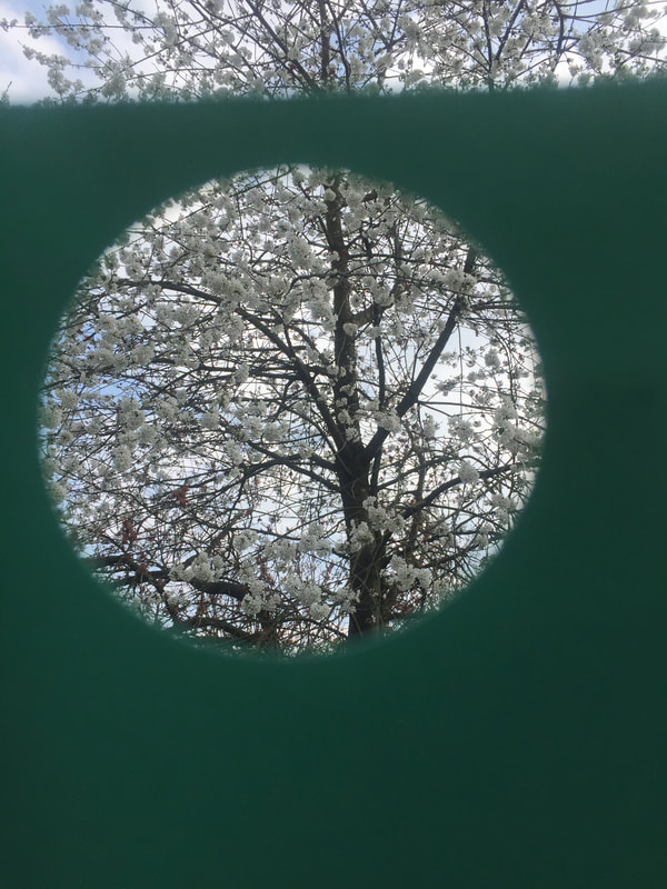
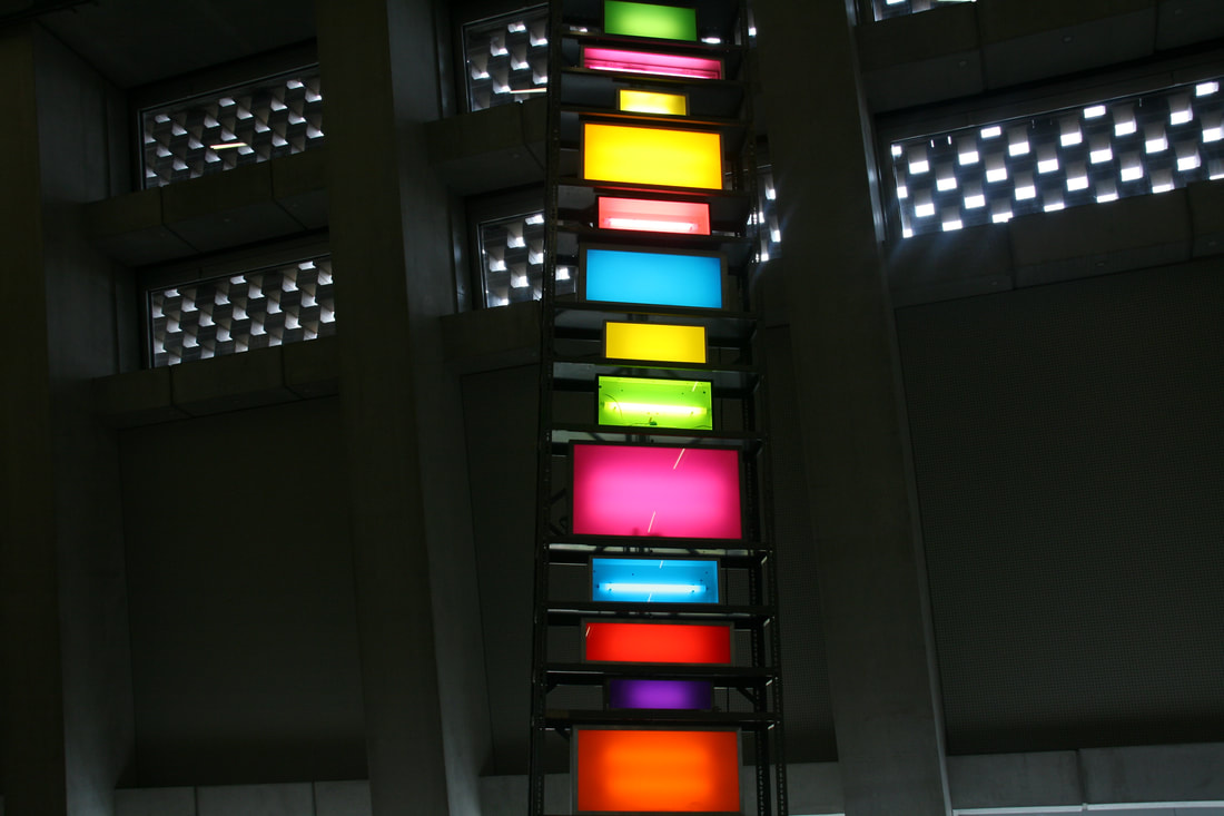
Also, my investigation into still life found that it does not only comprise of objects that have been arranged for a picture, still life can also include a landscape to which no adjustments have been made. This made me consider that everything surrounding us it is still life as we can change the lighting and the angle of the shot to manipulate the picture. Thinking about this, I decided to go out and start taking pictures at an exhibition in the Tate modern, on my way there I saw many colourful places.
Also, my investigation into still life found that it does not only comprise of objects that have been arranged for a picture, still life can also include a landscape to which no adjustments have been made. This made me consider that everything surrounding us it is still life as we can change the lighting and the angle of the shot to manipulate the picture. Thinking about this, I decided to go out and start taking pictures at an exhibition in the Tate modern, on my way there I saw many colourful places.


Plan for the exam
I have finished my research and I am left with two ideas..
-make a collage with different pictures and different colours
-make a photograph with strips ( Inspired by Seung Hoon Park)
Materials
+Paper trimmer
+card board x2
+Scissors
+superglue
+glue
+Printer
+USB
+Cutting mats
+Circle cutter
DAY 1
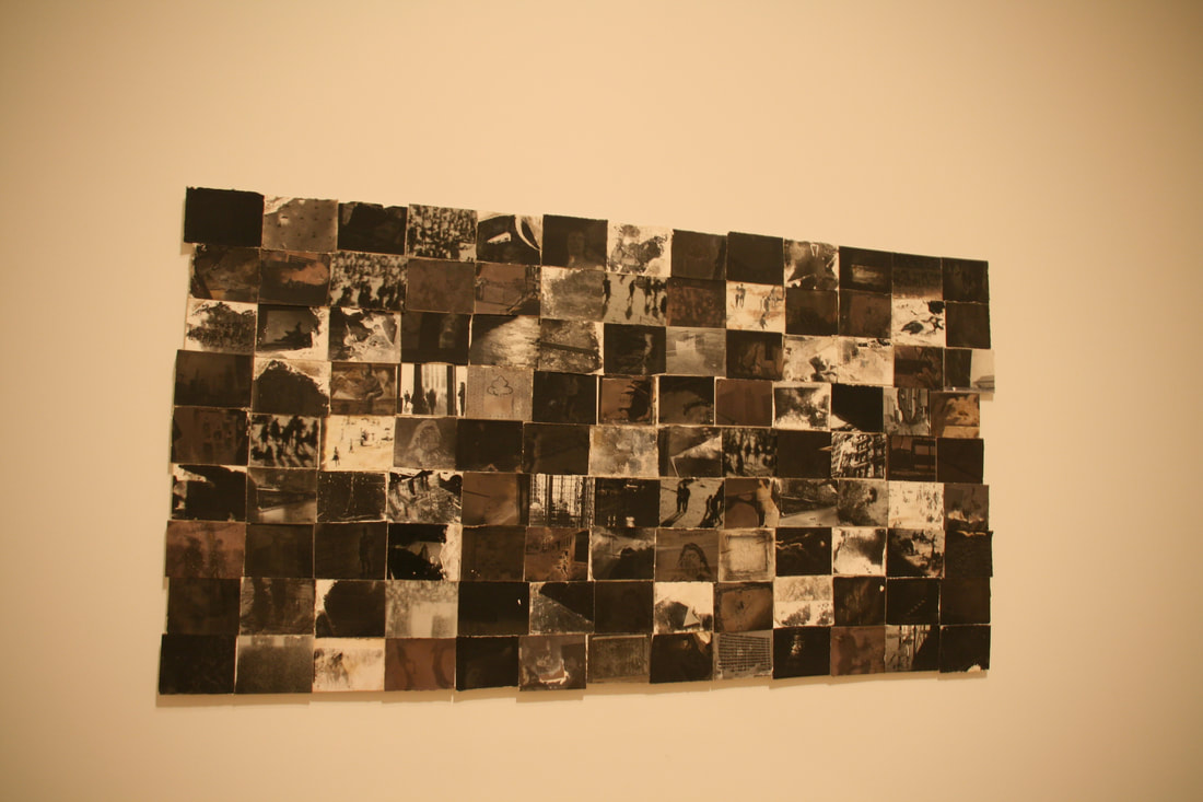
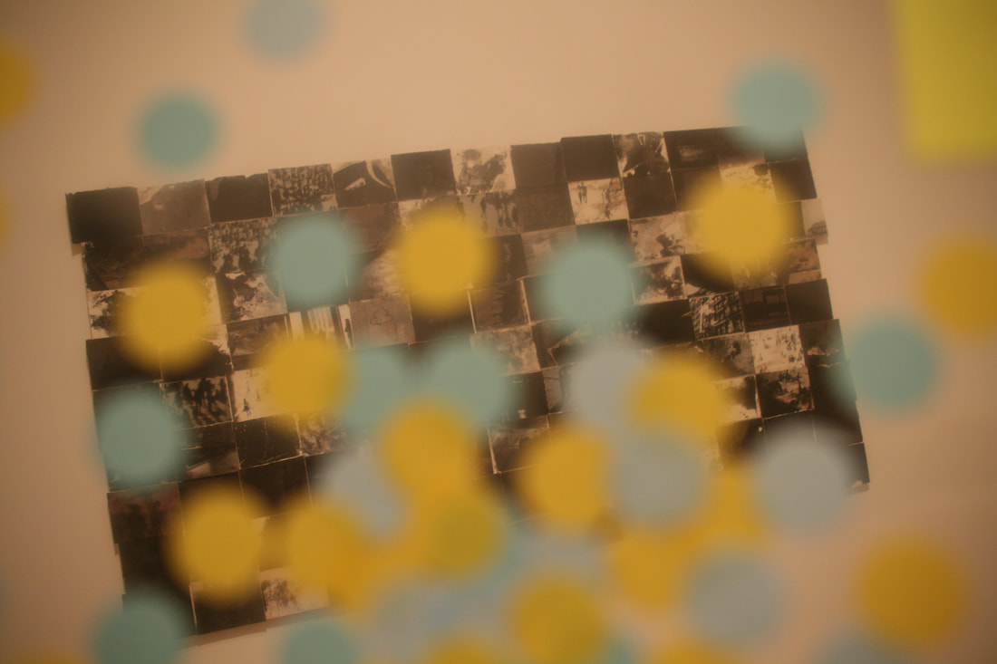
During the first day I will be documenting and making my first outcome which will be the collage with strips. I will use two pictures, one in colour and another in black and white. I will cut these pictures into strips, which will be cut to the same size (approximately 1cm). I will then attempt to glue these strips onto a piece of thick paper, weaving them to create the appearance of a pixellated image. I will try to make three collages and I will evaluate them individually looking at what went well and the things that I could improve on, or that I don't like.
Day 2
I will make the second type of collage. I am expecting to make 2 collages and evaluate them at the end. This task should take me no longer than 4 hours, from then I will evaluate my work from the 10 hour session as a whole.
-make a collage with different pictures and different colours
-make a photograph with strips ( Inspired by Seung Hoon Park)
Materials
+Paper trimmer
+card board x2
+Scissors
+superglue
+glue
+Printer
+USB
+Cutting mats
+Circle cutter
DAY 1
During the first day I will be documenting and making my first outcome which will be the collage with strips. I will use two pictures, one in colour and another in black and white. I will cut these pictures into strips, which will be cut to the same size (approximately 1cm). I will then attempt to glue these strips onto a piece of thick paper, weaving them to create the appearance of a pixellated image. I will try to make three collages and I will evaluate them individually looking at what went well and the things that I could improve on, or that I don't like.
Day 2
I will make the second type of collage. I am expecting to make 2 collages and evaluate them at the end. This task should take me no longer than 4 hours, from then I will evaluate my work from the 10 hour session as a whole.
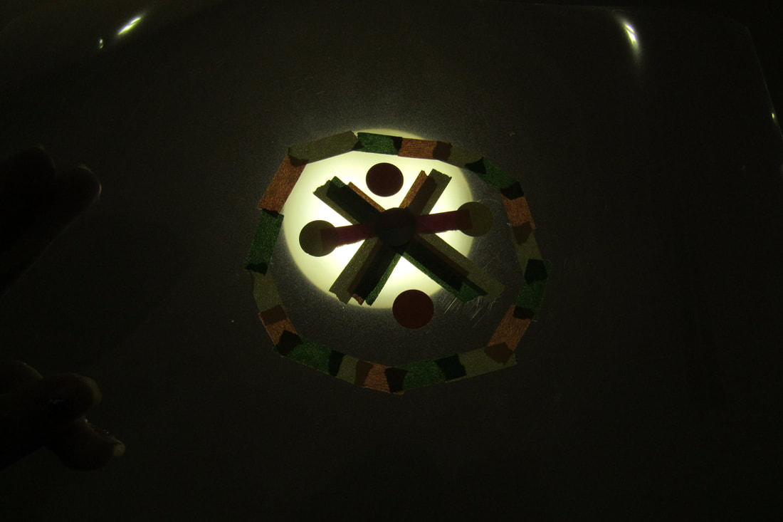
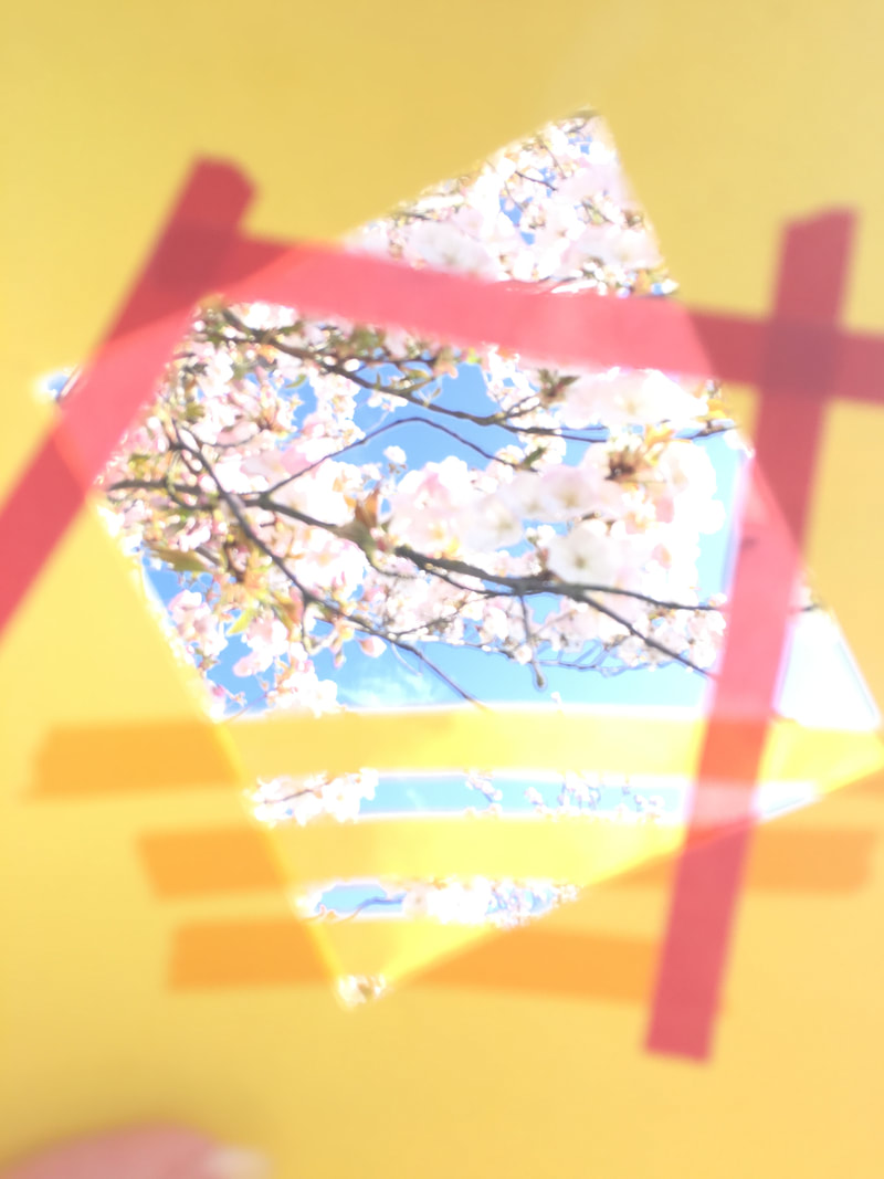
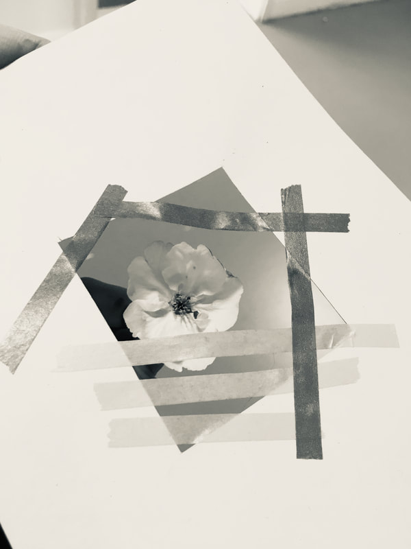
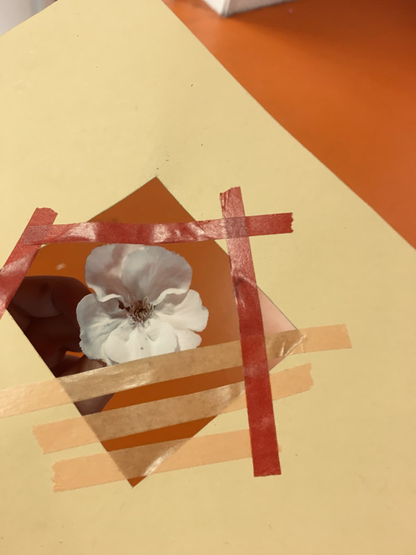
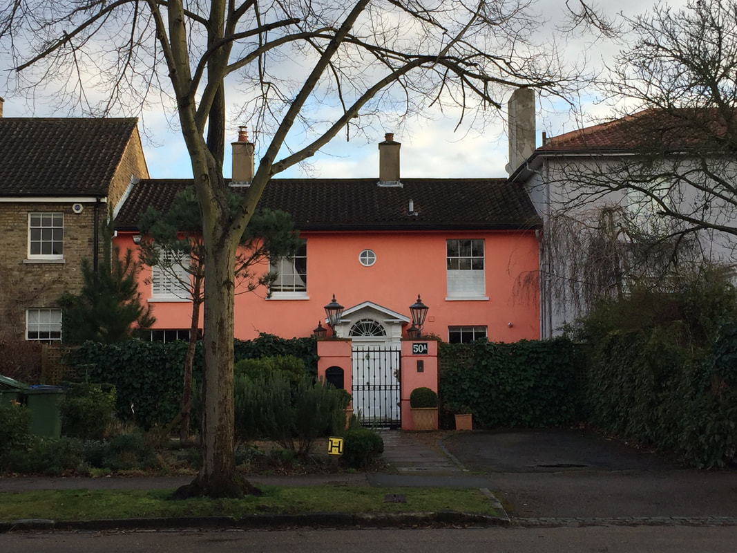
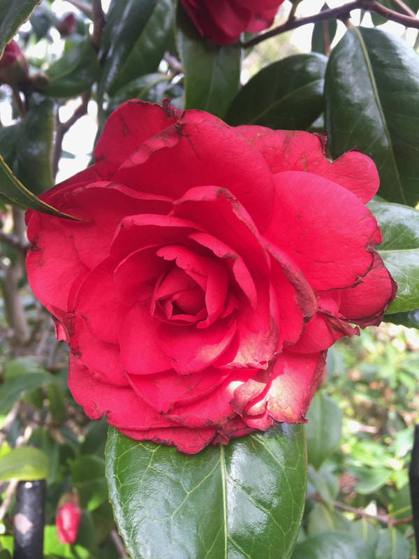
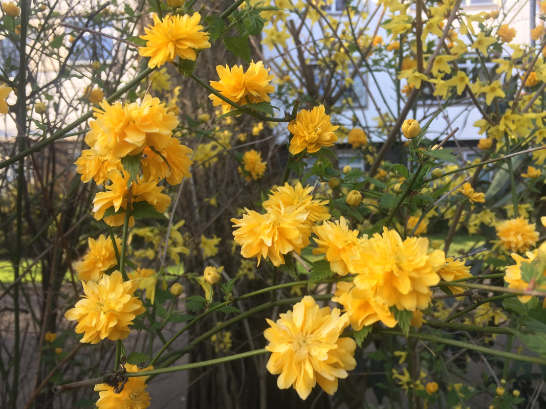
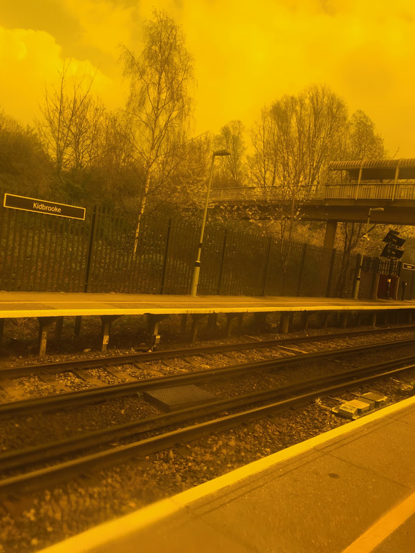
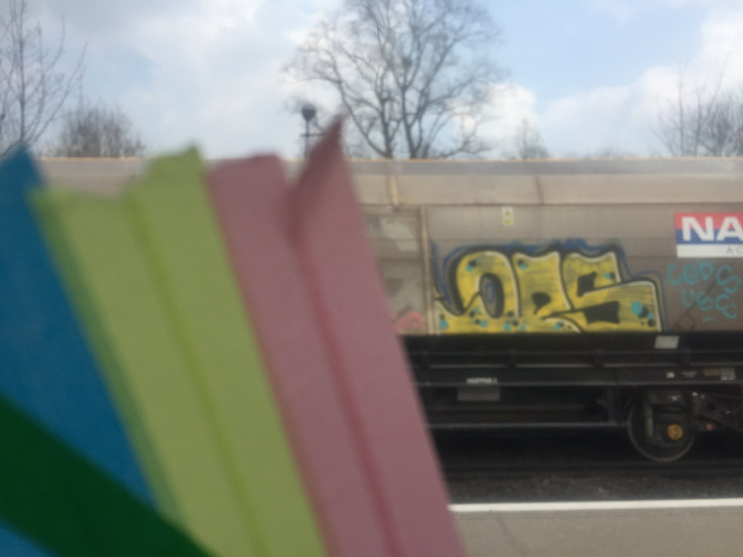
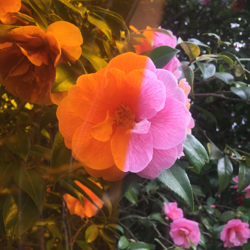
Pictures I will use in the exam


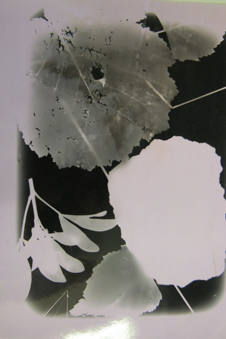
Collage with strips(experiment)
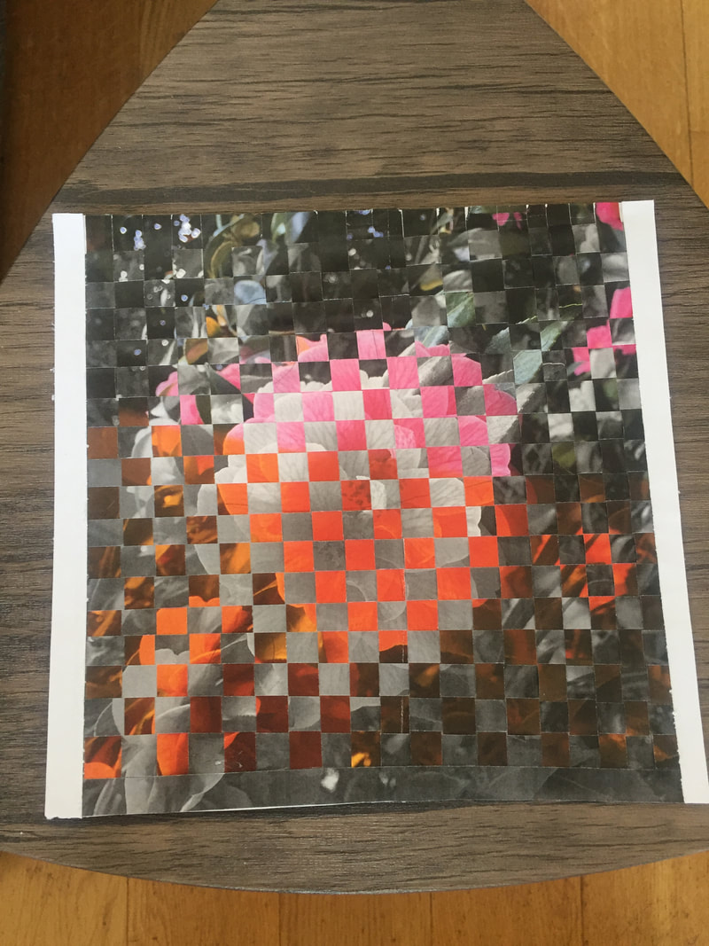
I chose this picture then printed it in both colour and black and white. I cut both down and I tried to make a collage. I really like it, so I will be performing the same experiment in the exam.
