PHOTOGRAMS
|
|
Photograms are really easy to make .For make one you don't need a camera, just some objects .Placed them in a photo-sensitive paper combaning objects that light go through and some that light can't , then this will be exposed to light making a negative. Photograms are sociated with Man Ray , he used to call them "Rayographs".
|
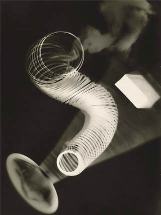
This one of the most famous photograms made by Man Ray.The formal elements in this piture are:
Focus: There is a good focus in the objects that are solids such as in the spring and the small box, but whatever is under the spring is not in a good focus you can see the shadow of the object but no the whole object and there is smoke on the picture.
Light:The light is artifical since the picture is made in the dark room, there are some shadows next to the spring and a shadow that looks like smoke wich makes us think if it is real or just an illusion.
Line and shape: Because of the spring there are lines and circles in the center of the picture and in the side there is a small box that is rectangle and the. There is small oval wich it looks as the base of the ice cream cup.
ANGIE MCMONIGAL
|
|
"Ironically, people trend to change their attitude towards you when you being treating them the way they treat you"
Angie McMonigal McMonigal lives in cChicago since she was 15 and has being exploring the city with her camera.Her photographs are usually concentrated in architecture, she sees as human creation for example a simple steel and brick construction can be a great source of history for her and can inspire her.
|
MAN RAY
|
|
"To create is divine, to reproduce is human "
Man Ray He spent most of his career in Paris. His work has styles influenced by cubism,futurism , dada and surrealism. Dada and surrealism were his key ideas when it came the time of take a picture, but at first he was naturally an abstract painter then he eventually chose photography.
|
MY PHOTOGRAMS
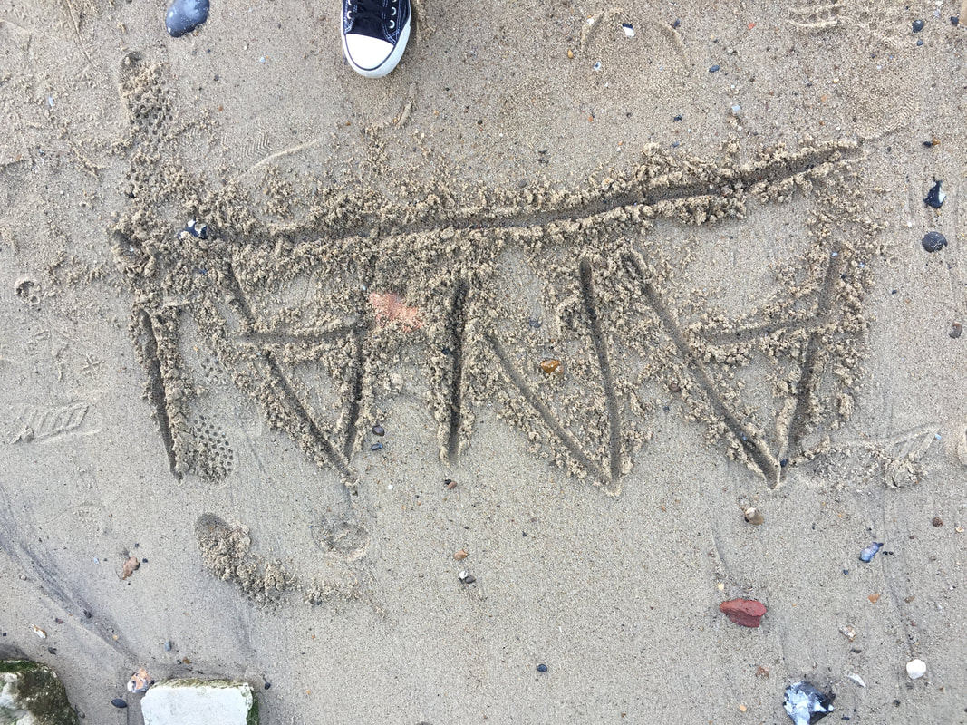
WWW: They are kind of abstract.
EBI: I could try to mix some more objects, such as objects that the light could past through.
EBI: I could try to mix some more objects, such as objects that the light could past through.
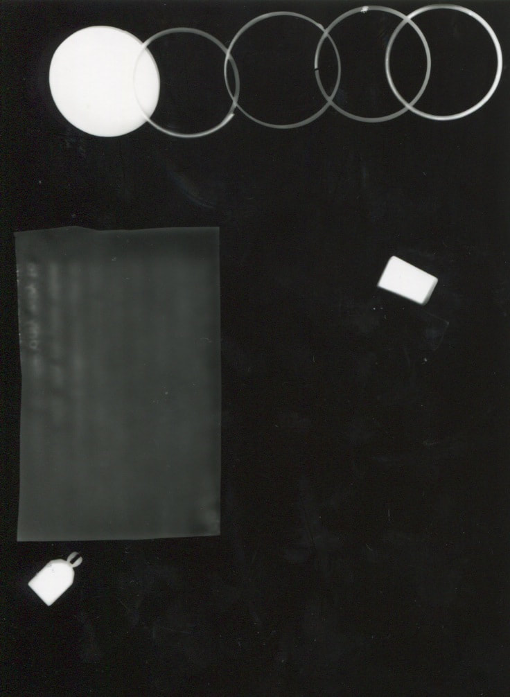
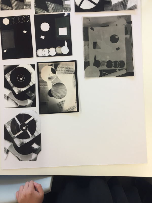
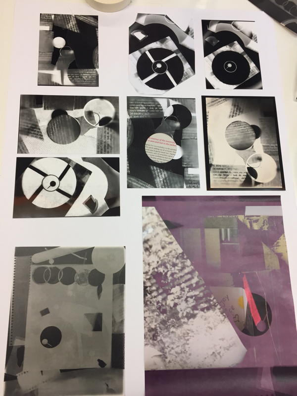
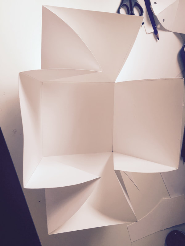
These are the cut-ups of my photograms. I made them, then took a pict in the dark room again.
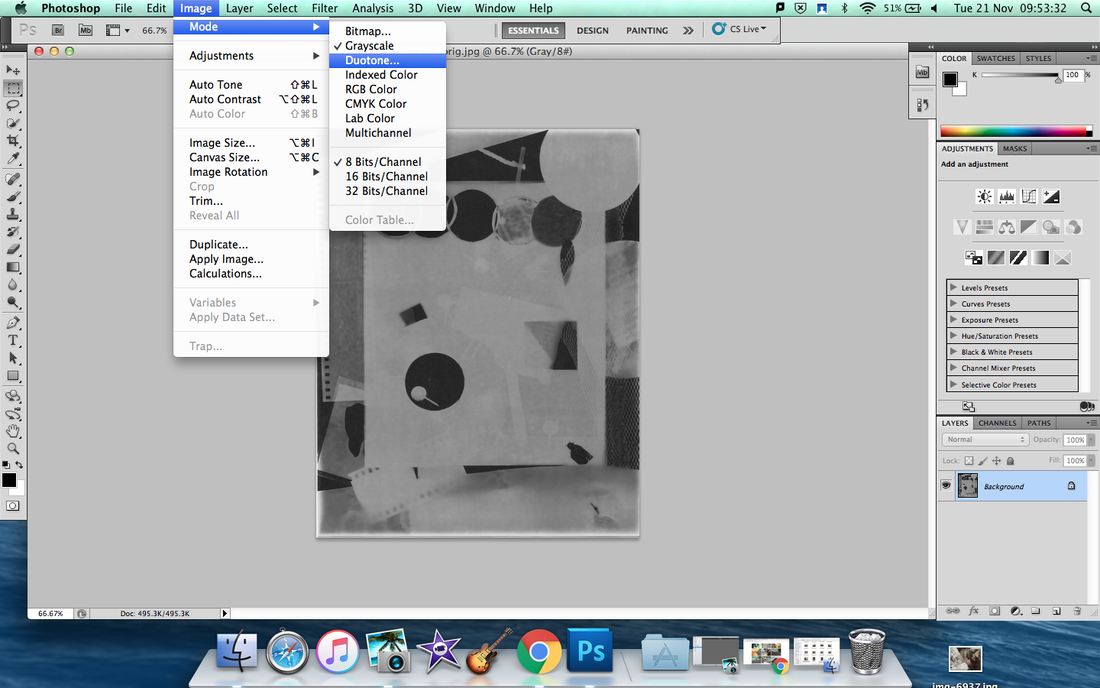
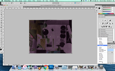
Duotone and Combining photograms
|
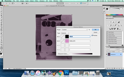
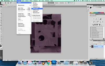
The first step is too open your photogram and change from grayscale to duotone, and if the option of duotone is already selected is lees work but always double check.
It will appear a small option where you can choose the colour you want to make your duotone but before you have to click on type and select duotone.
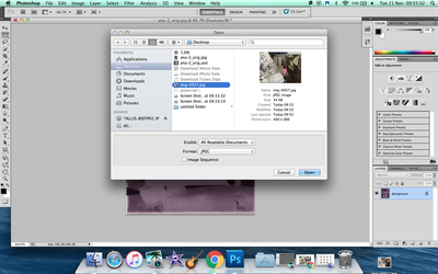
That is it you made your duotone and you can combine your duotone with other picture you had, in my case one of the pictures i took outside school but the duotone has to be in R&B colour.
|
Abstract and Abstraction
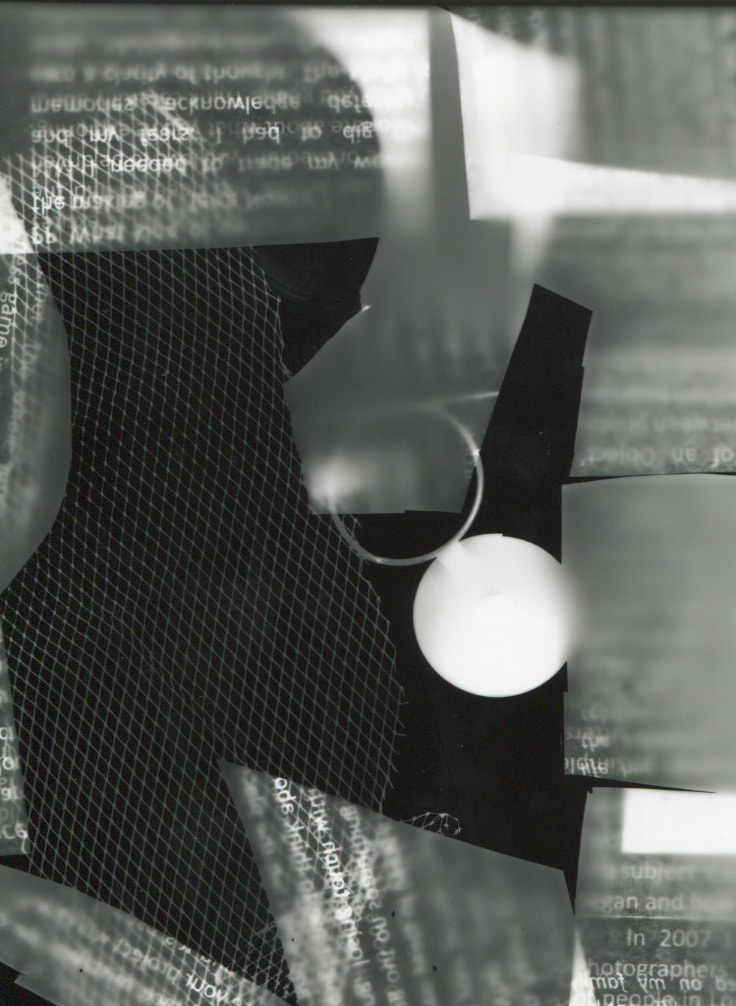
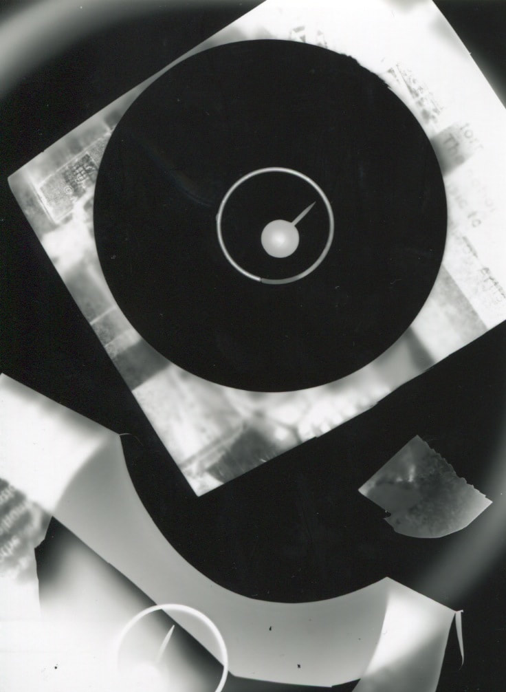
This is my final outcome for photograms. I arranged them in one way but i did not like like it, I decided to change and to use essential pictures and not all of them.
Abstraction is the quality of freedom that you have to make something.Abstraction means something that you made which is unusual,something that is not like the rest we can say that is not ordinary.
Abstract is a concrete idea but not yet existence.
I took some pictures but they are not completely abstract but they are kind of confusing and they are not pictures that everyone would do.
Abstract is a concrete idea but not yet existence.
I took some pictures but they are not completely abstract but they are kind of confusing and they are not pictures that everyone would do.
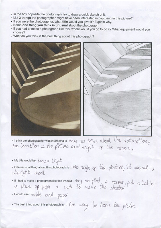
The Formal Elements
Photographers are usually aware of the ways in which they can create interest in their images beyond the simple fact of the subject. This is what separates good pictures and bad pictures of the same thing. The following list describes some of the abstract elements in any photograph. Below the list is an example of how you can analyse a photograph looking for these things specifically and how this helps to give the image meaning:
Focus:Which areas appear clearest or sharpest in the photograph? Which do not?
Light:Which areas of the photograph are brightest? Are there any shadows? Does the photograph allow you to guess the time of day? Is the light natural or artificial? Harsh or soft? Reflected or direct?
Line:Are there objects in the photograph that act as lines? Are they straight, curvy, thin, thick? Do the lines create direction in the photograph? Do they outline? Do the lines show movement or energy?
Repetition:Are there any objects, shapes or lines which repeat and create a pattern?
Shape:Do you see geometric (straight edged) or organic (curvy) shapes? Which are they?
Space:Is there depth to the photograph or does it seem shallow? What creates this appearance? Are there important negative (empty) spaces in addition to positive (solid) spaces? Is there depth created by spatial illusions i.e. perspective?
Texture:If you could touch the surface of the photograph how would it feel? How do the objects in the picture look like they would feel?
Value/Tone:Is there a range of tones from dark to light? Where is the darkest value? Where is the lightest?
Small task to introduce abstraction
|
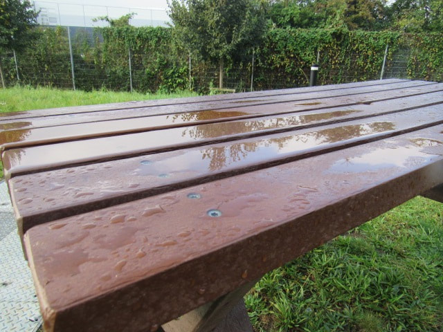
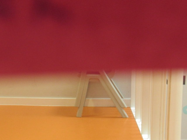
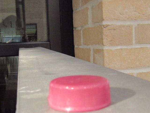
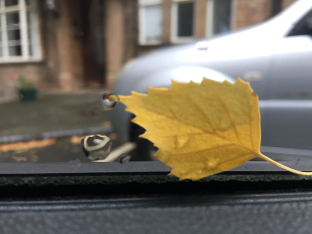
Focus:The object is completely in focus but there is softening focus down the left corner of the table.
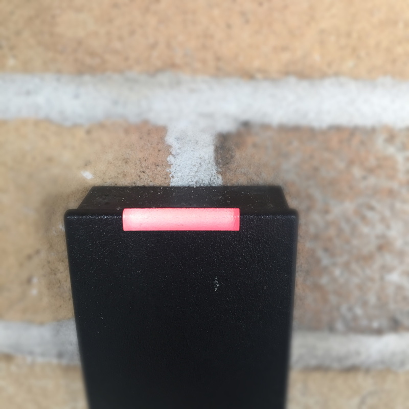
Light:The picture has shadows reflected on the wall and table where they they look come from a window Line & Shape: There are some lines that stand out, special line of the table and the shadows lines.There shape as triangles, rectangles and circles. Repetition: The shadow create a repetition in different surfaces, like repeat the same beat in music. Shape : There is the shadow of an triangle, lines, and the shape of the table that is a circle. |
For get a good picture we have to think on the formal elements, that can arranged the pattern of the picture and can make a picture look simple or not.
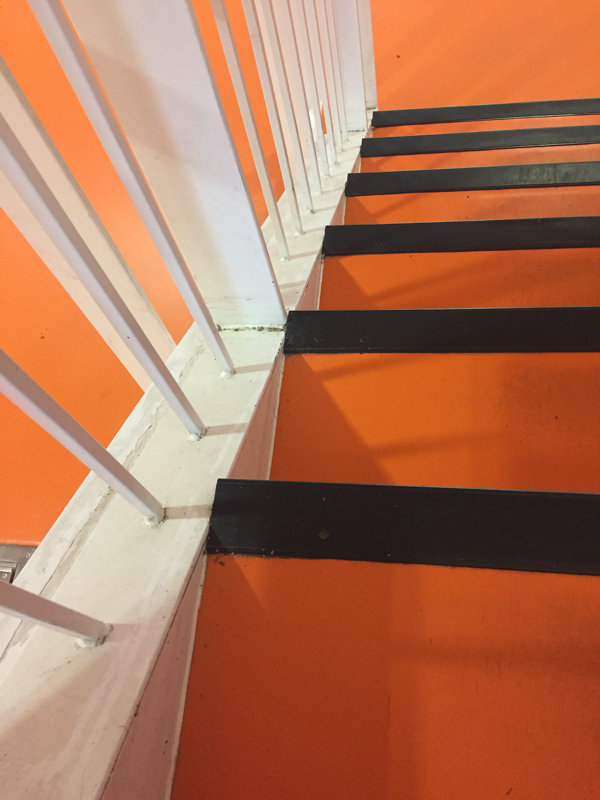
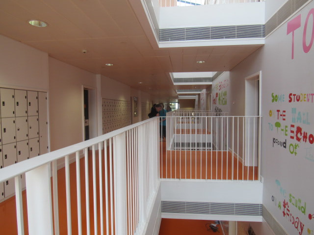
Abstract pictures at school
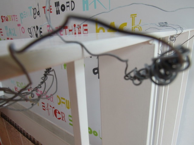
|
|
GOOGLE SLIDE PRESENTATION
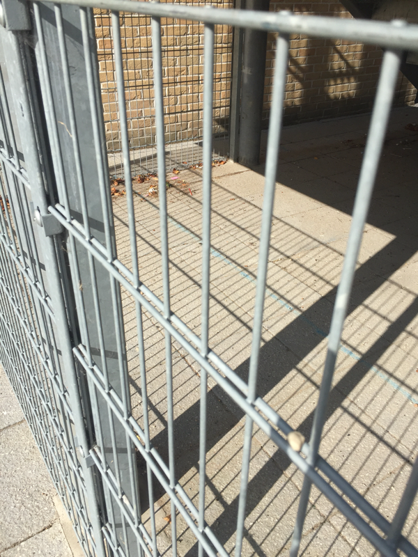
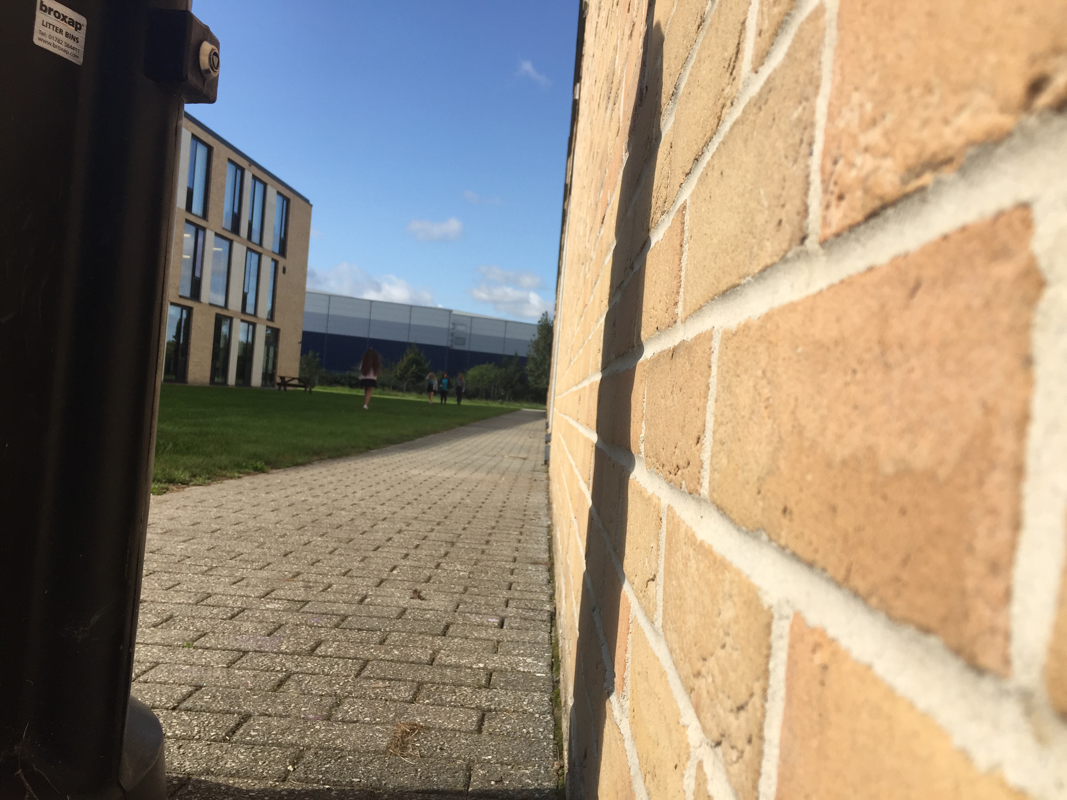
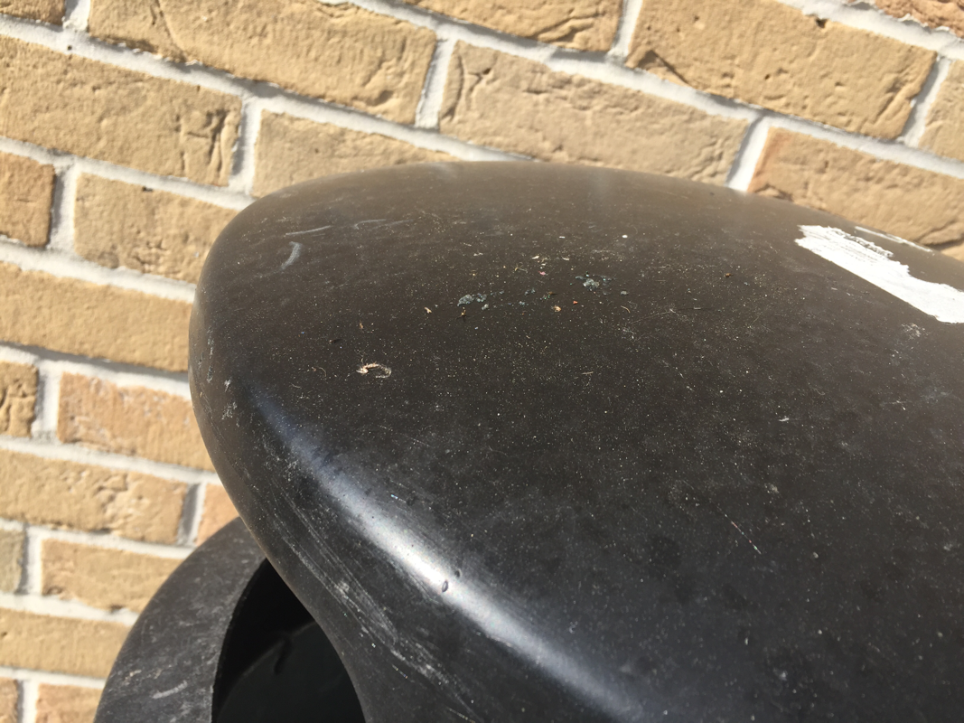
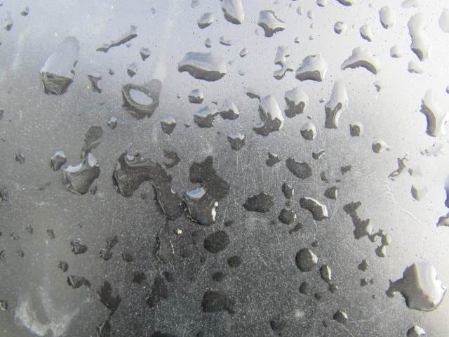
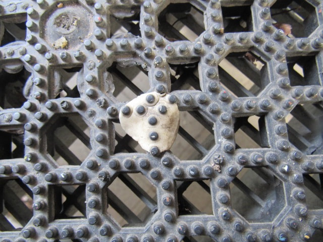
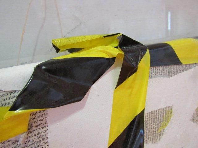
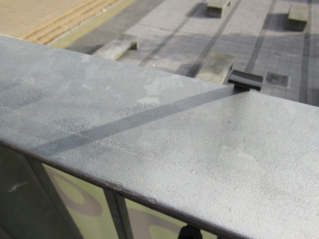
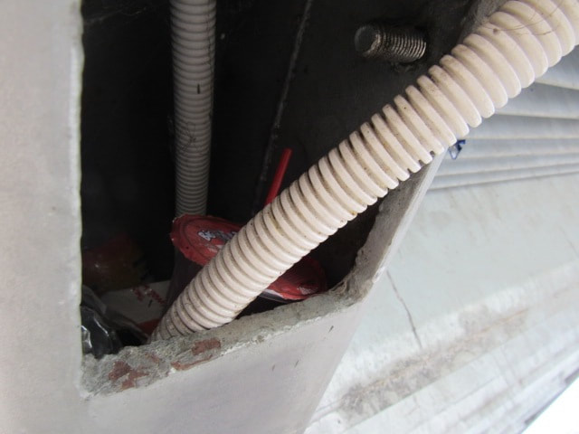
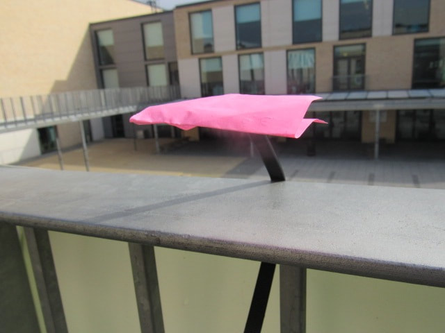
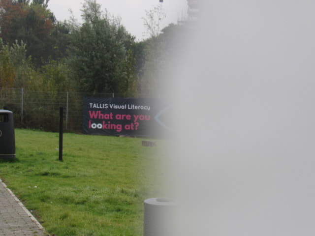
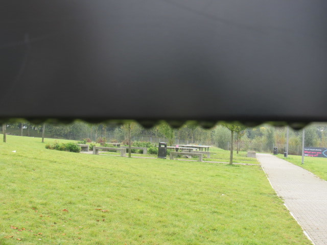
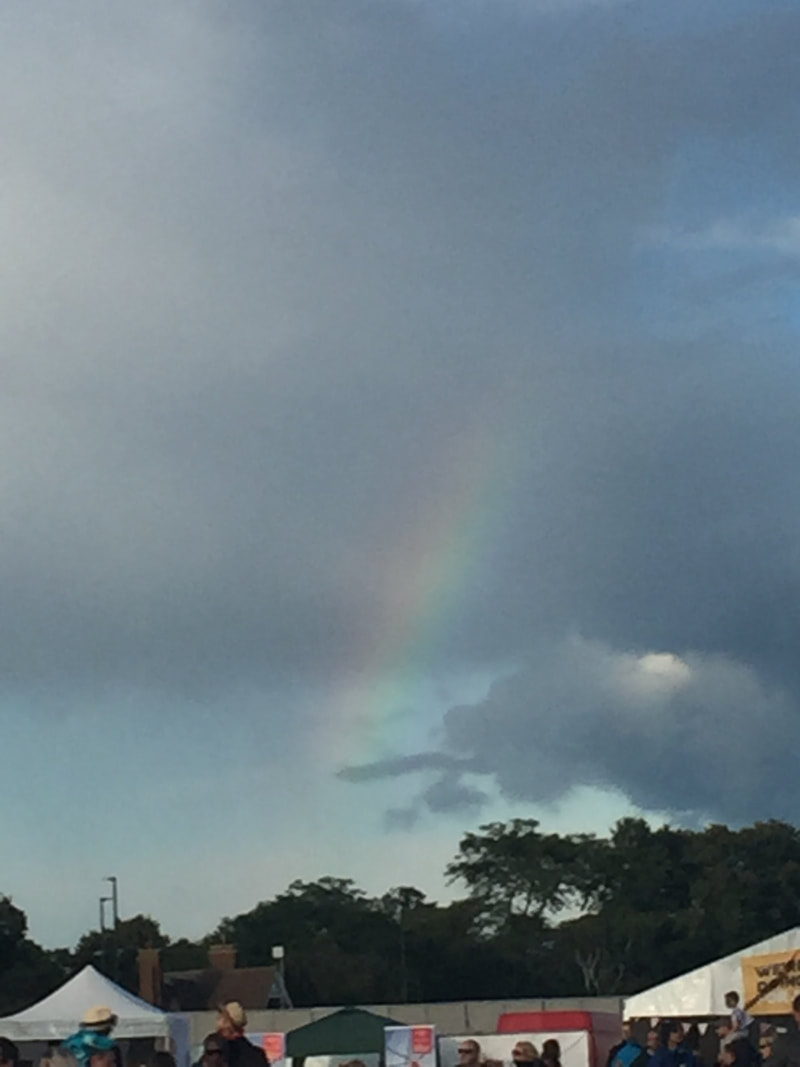
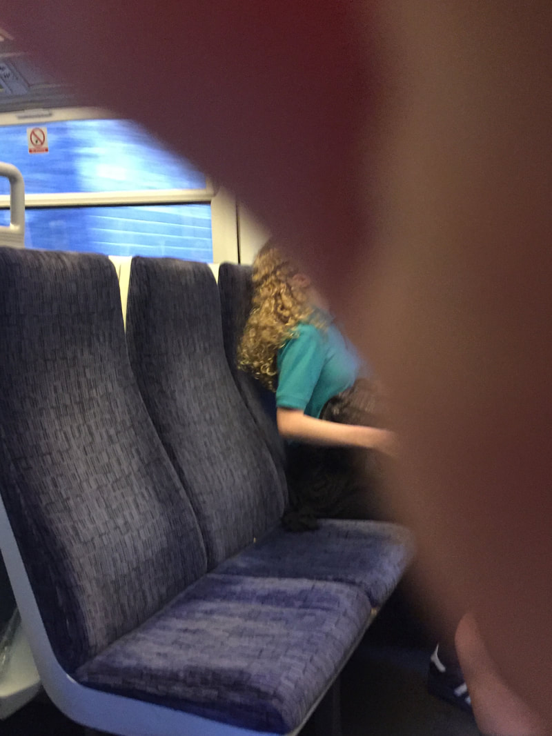
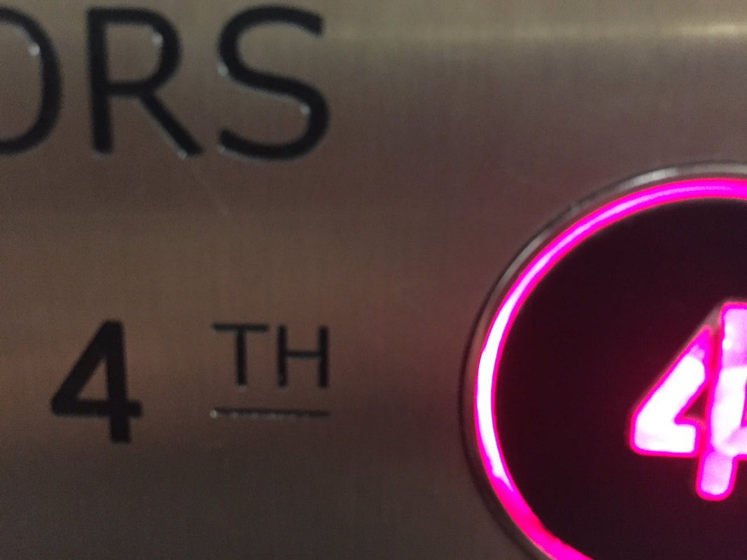
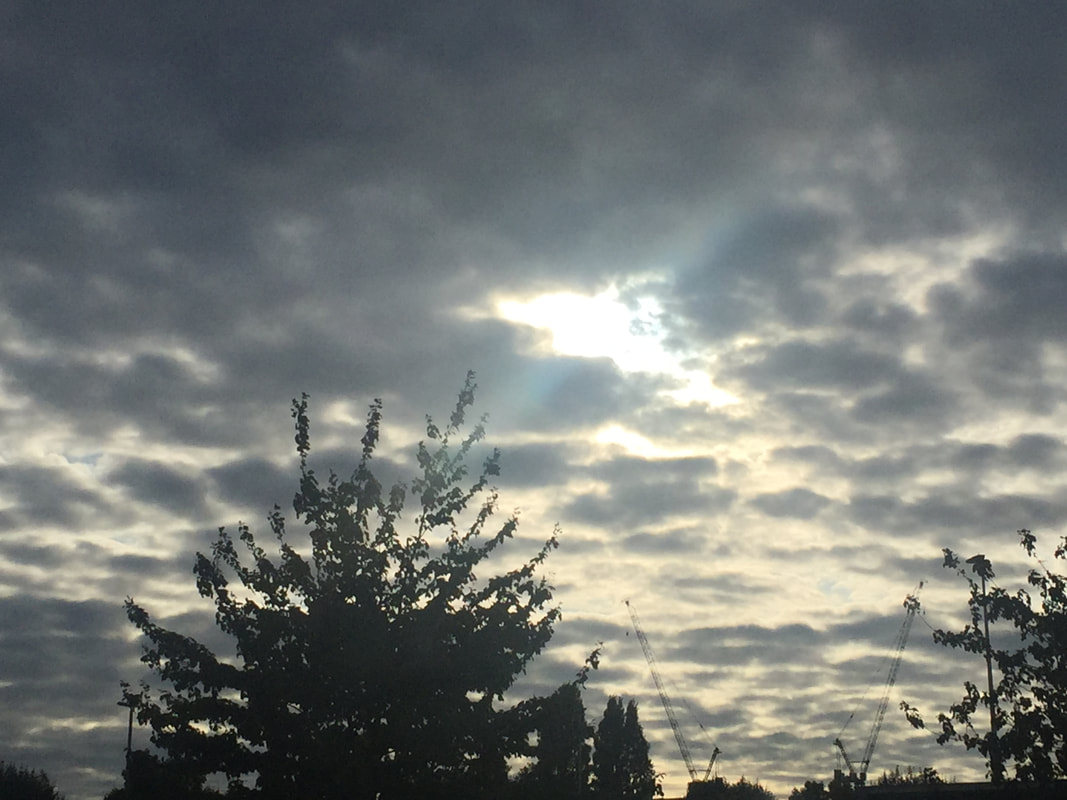
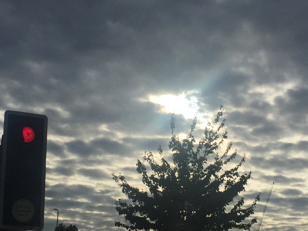
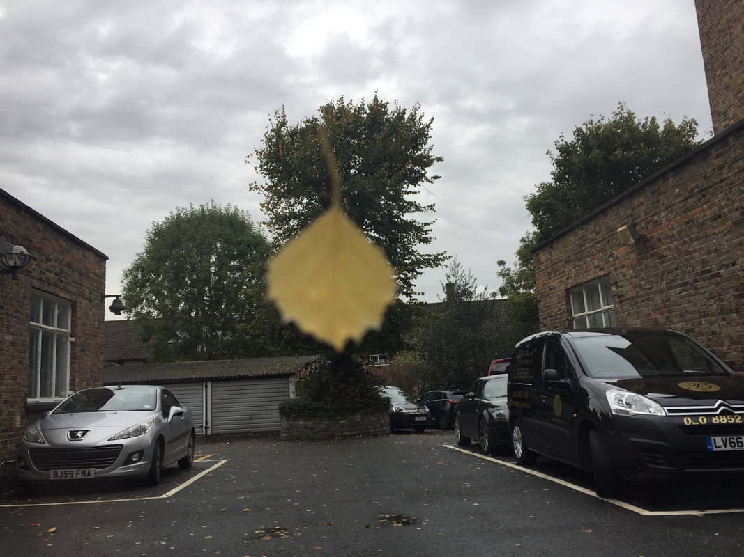
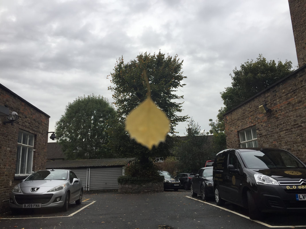
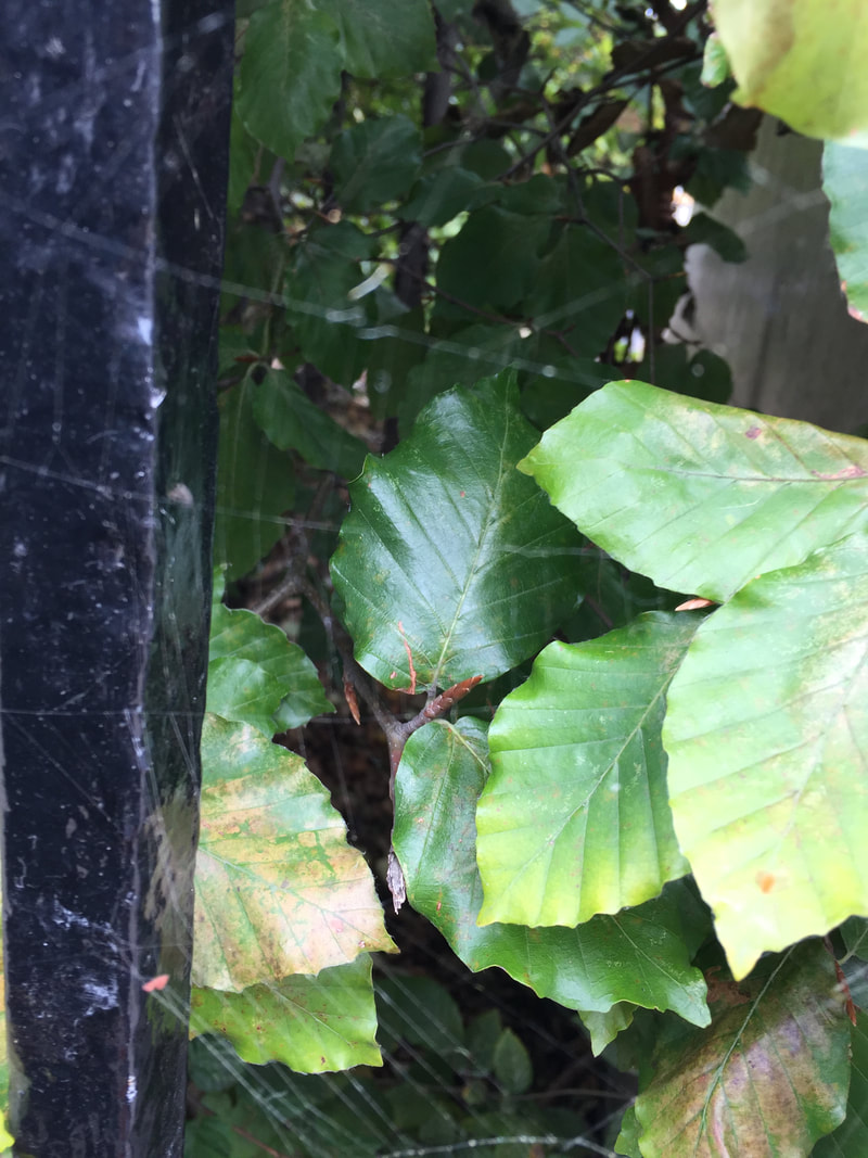
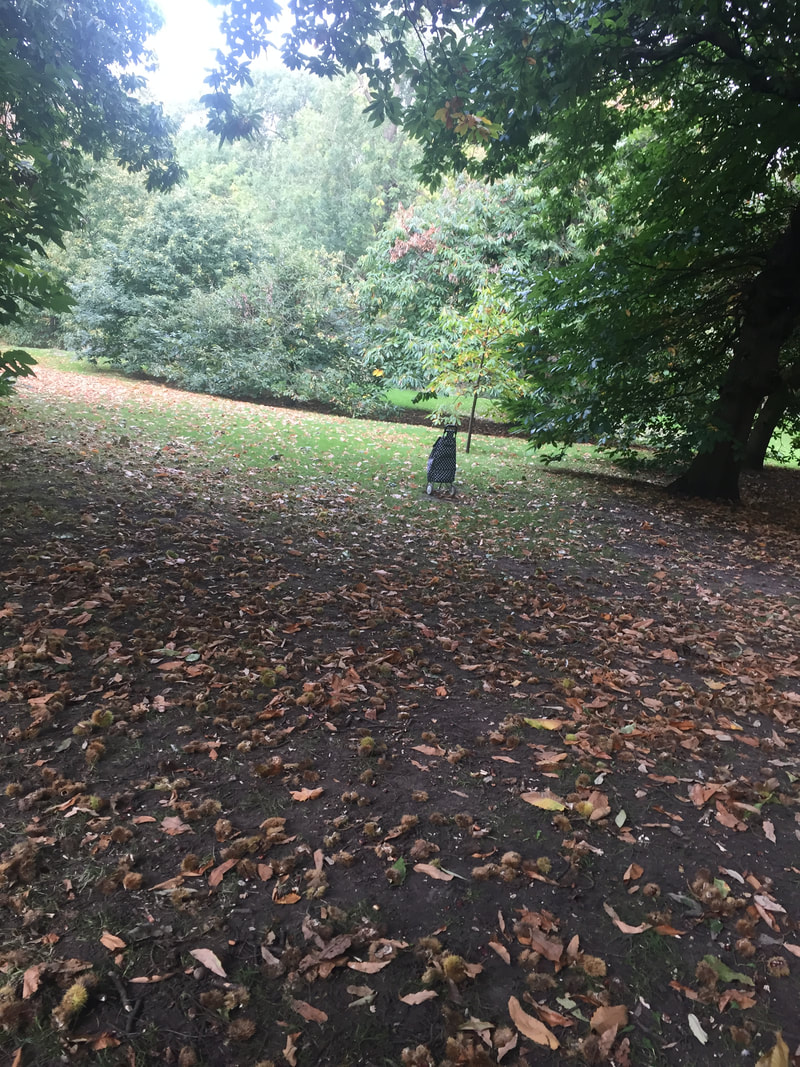
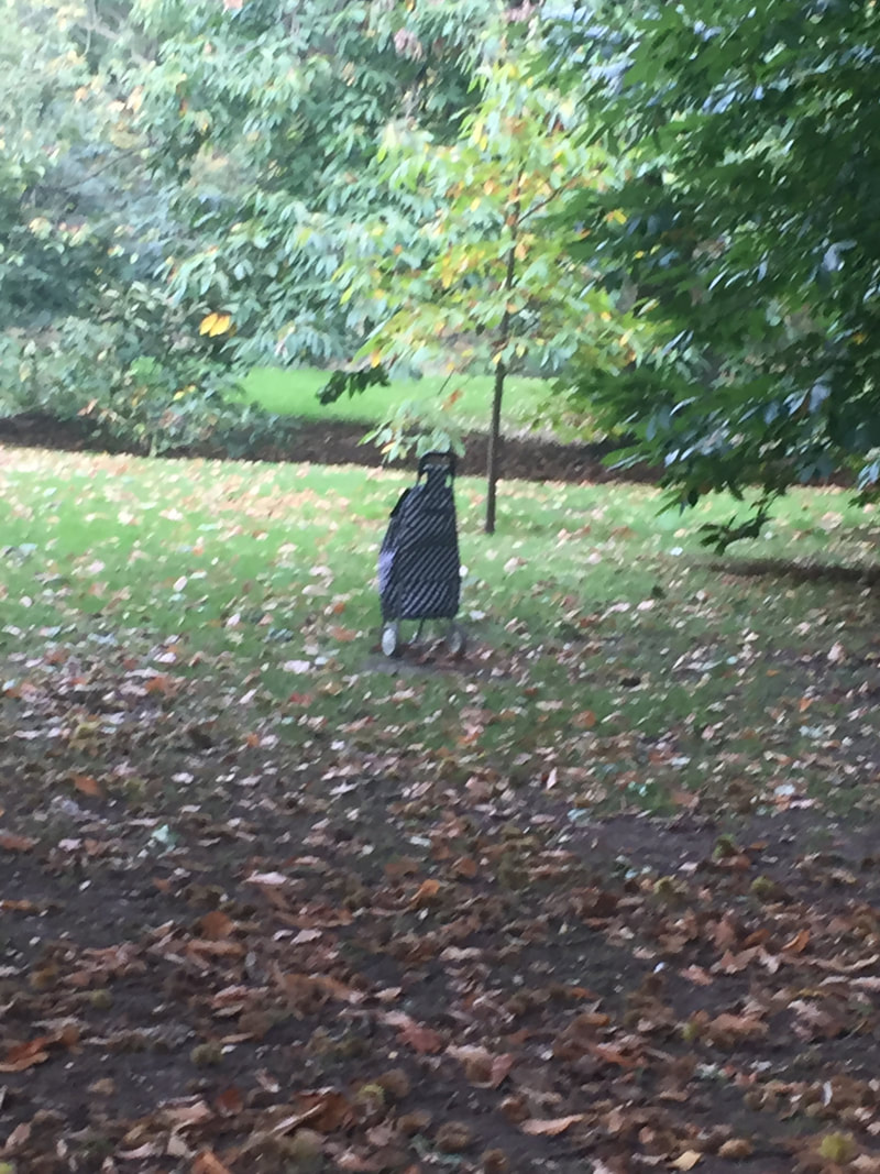
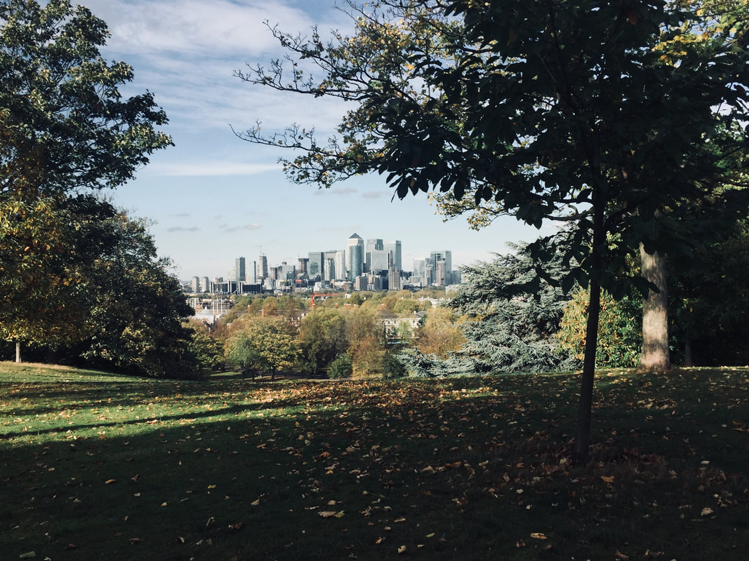
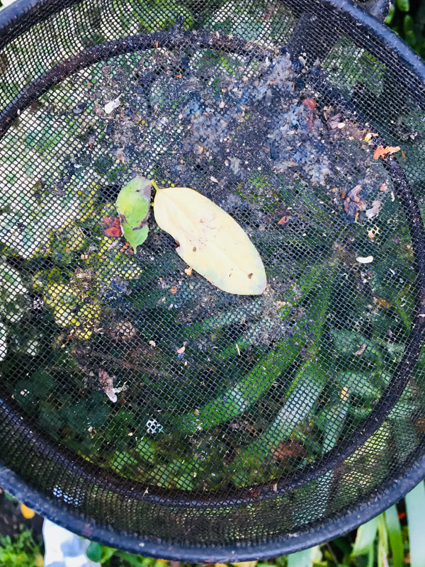
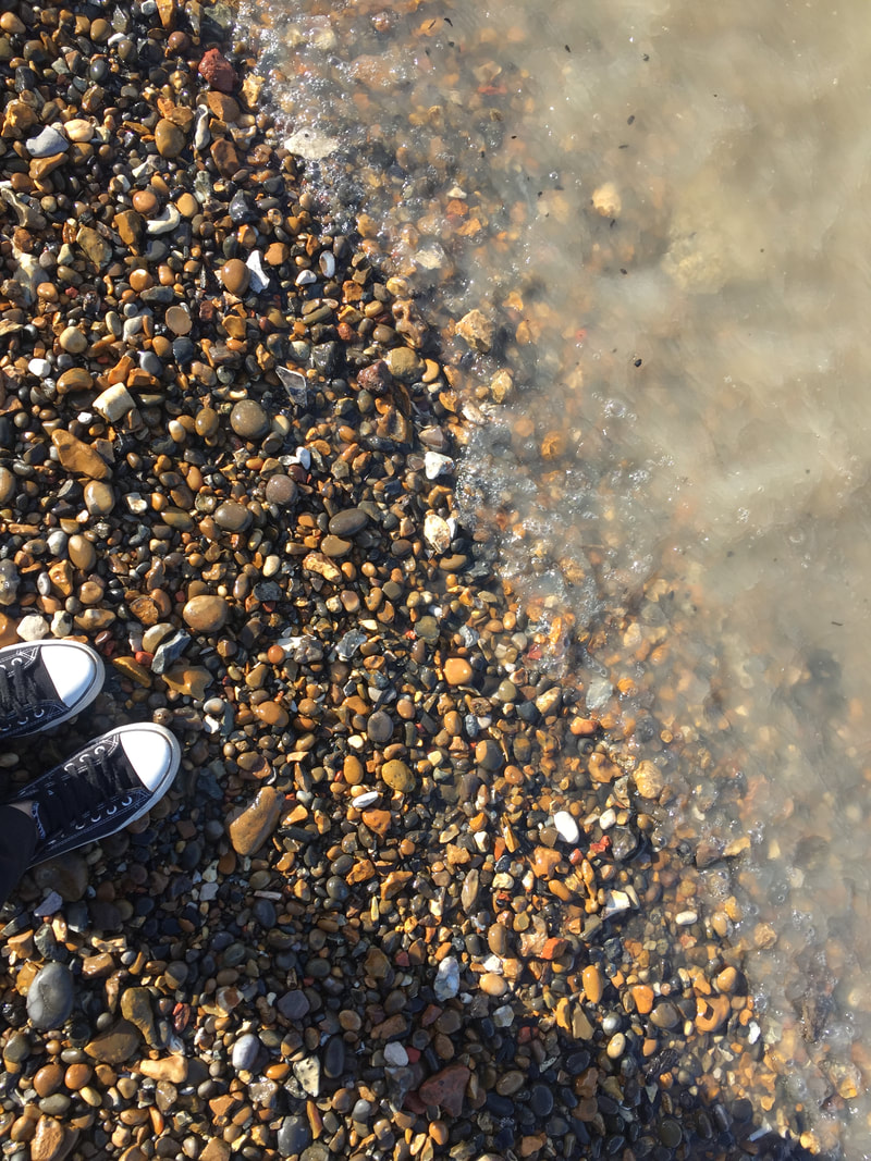
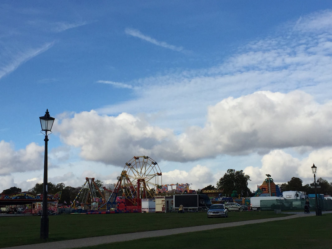
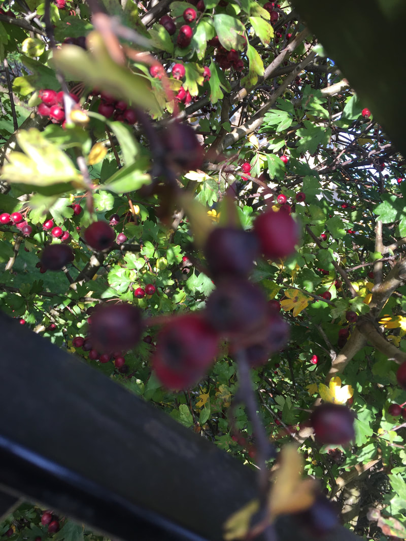
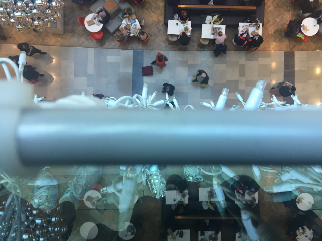
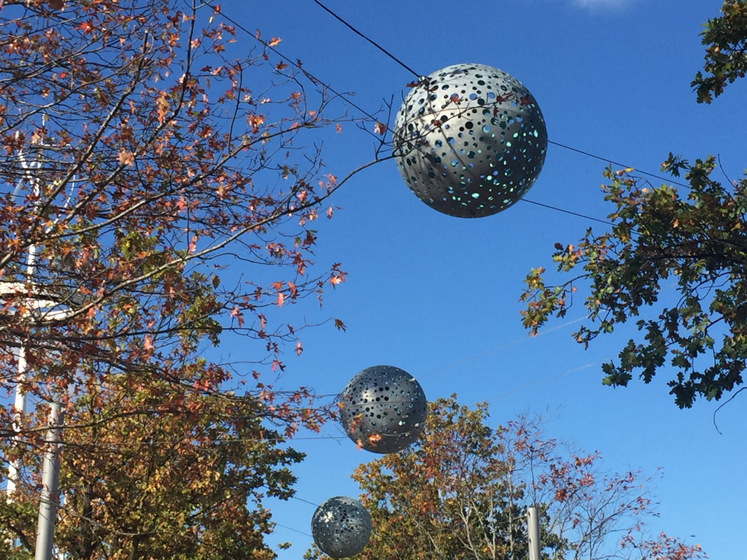
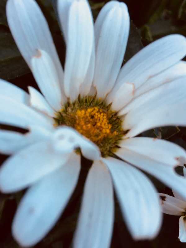
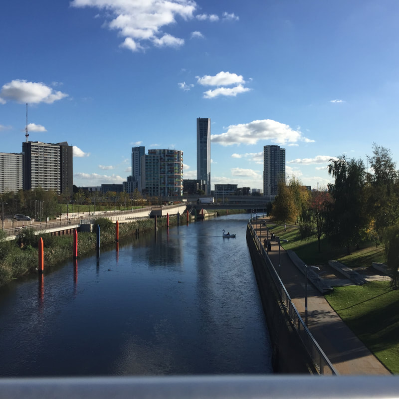
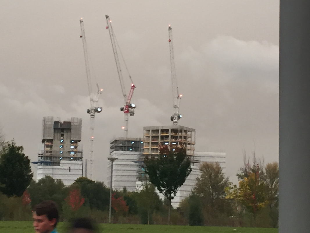
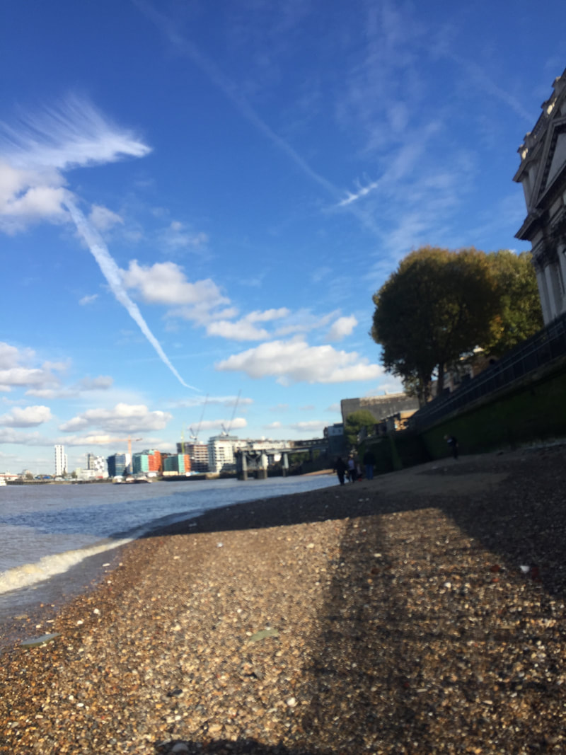
PICTURES TAKEN OUTSIDE SCHOOL
I took some pictures outside school, but I don't think they are abstract enough .
For next time I will change camera, location,etc.I will still adding them to compare.
For next time I will change camera, location,etc.I will still adding them to compare.
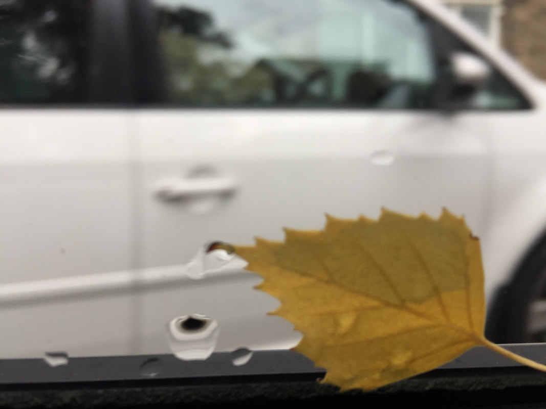
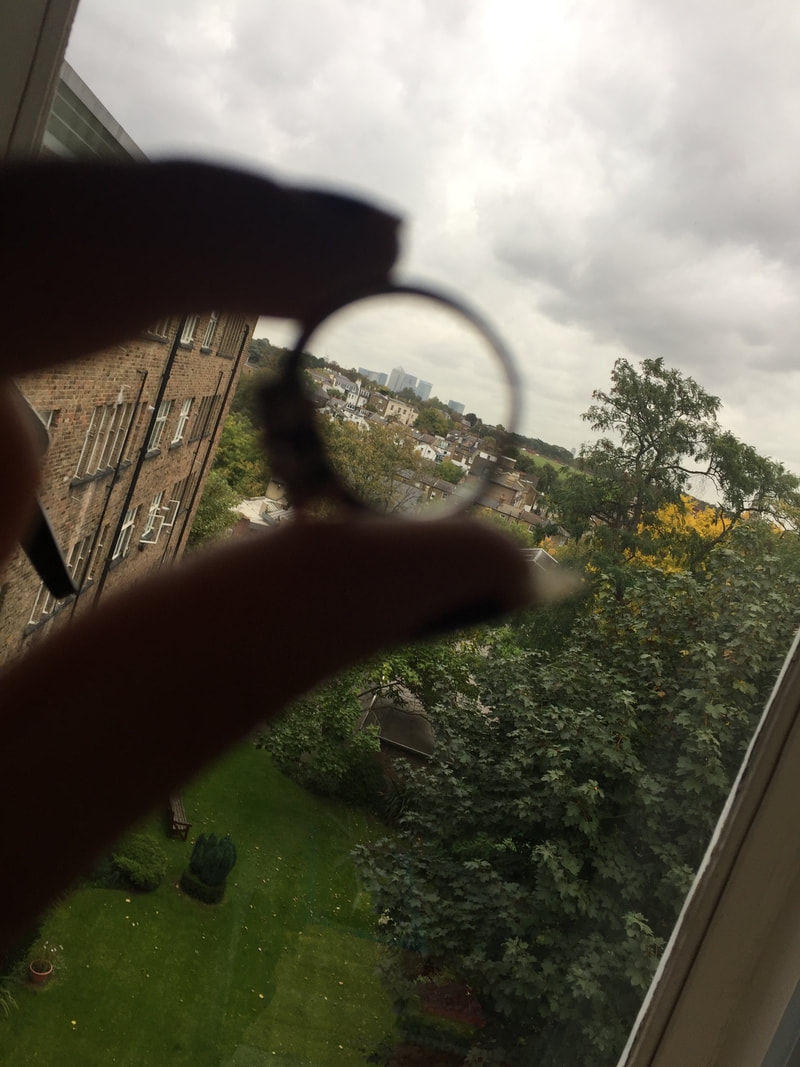
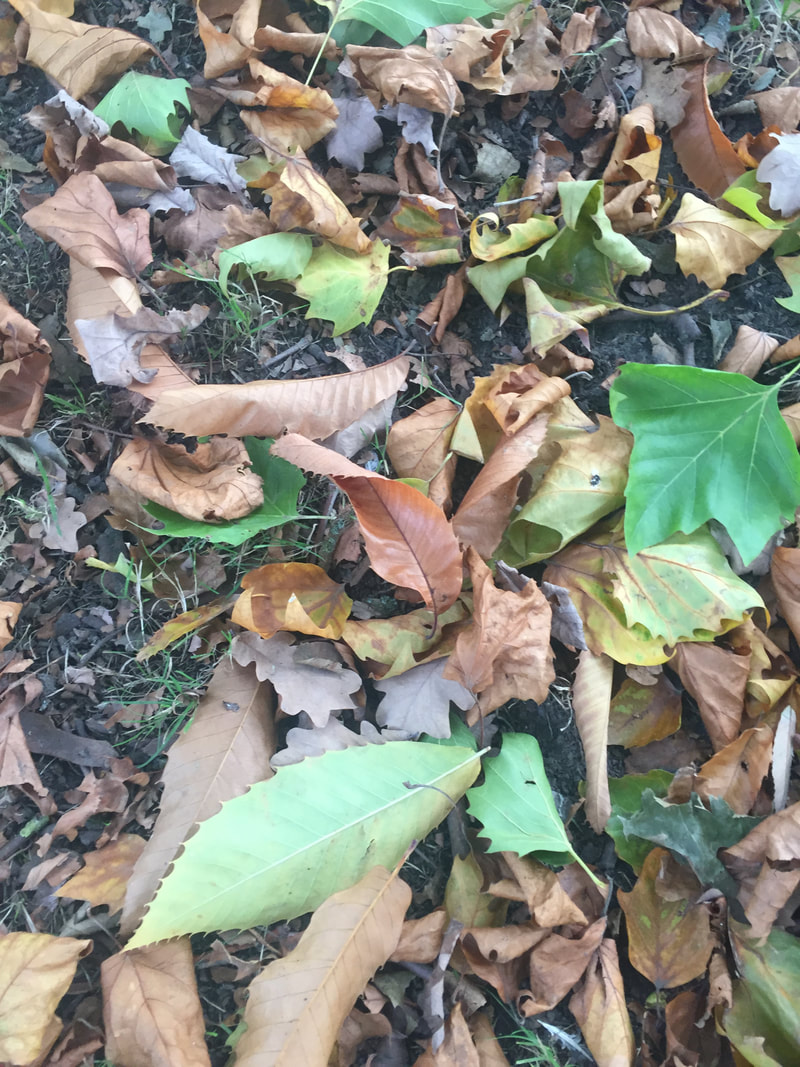
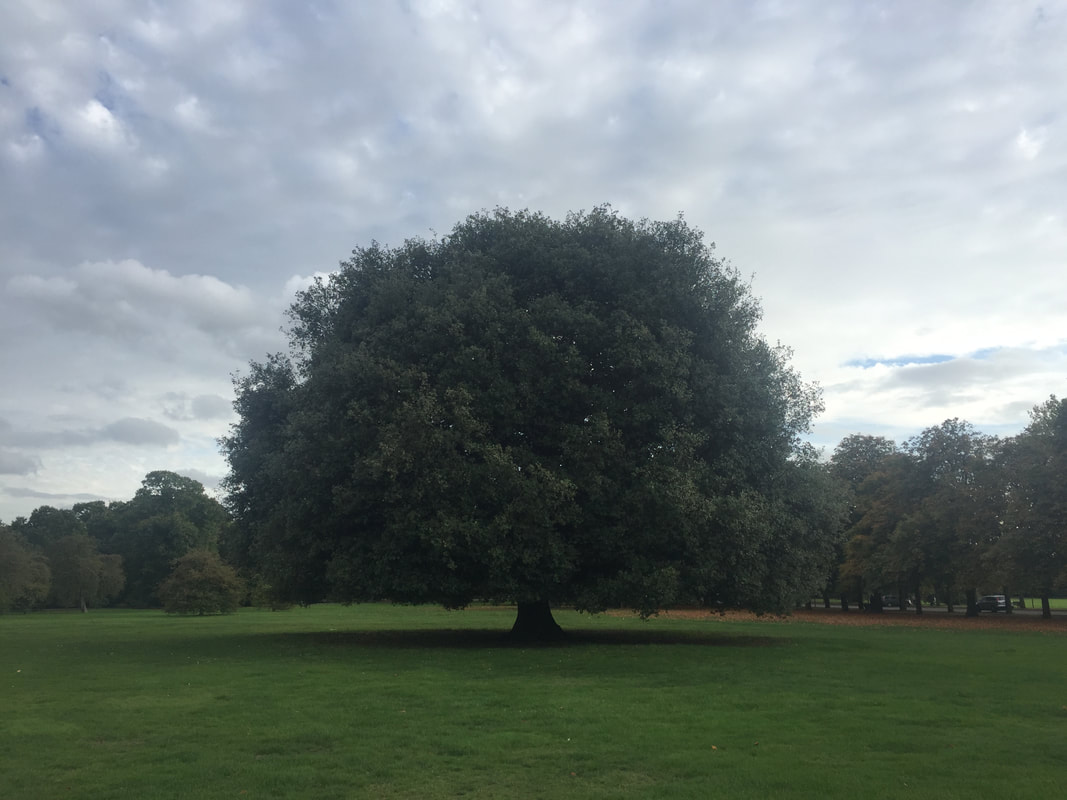
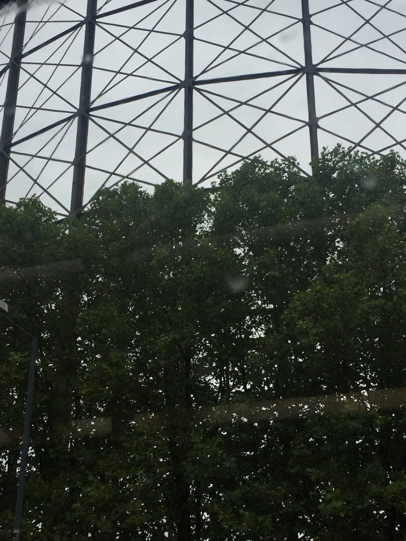
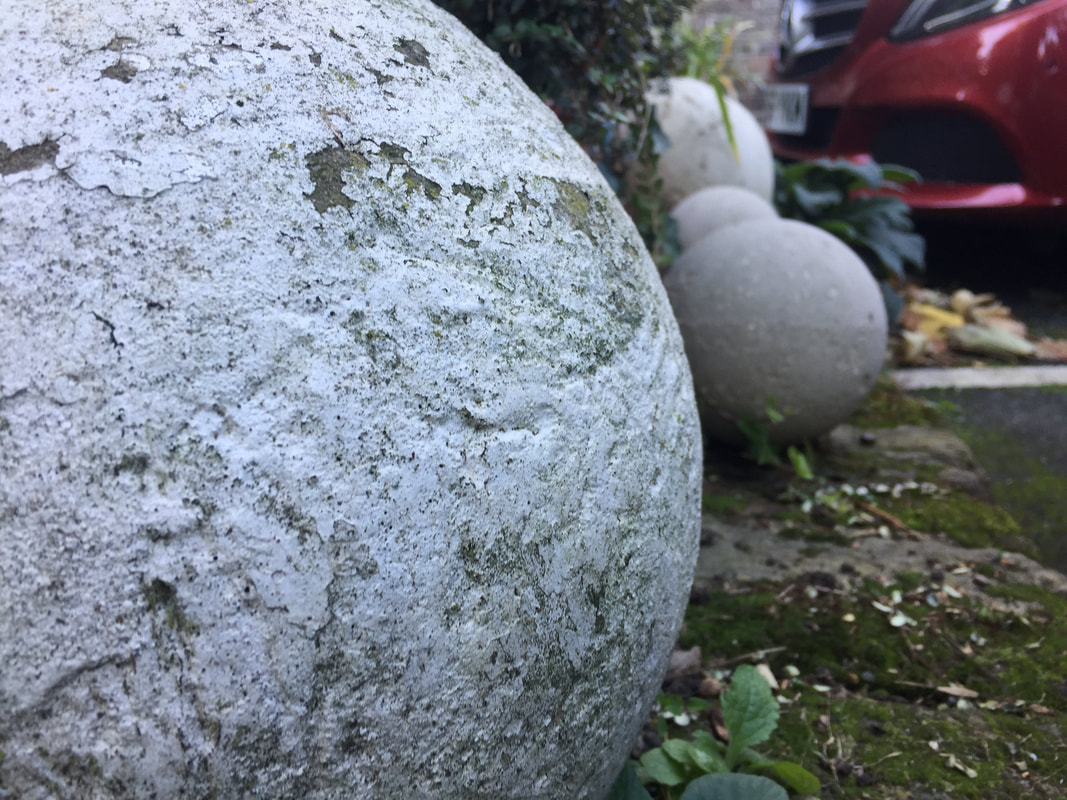
These are some pictures that I took outside the school, which I will be using for my abstract book, I will like to play with the focus for my next pictures.
I was researching some information about abstraction and for my outcome I decided not to make a simple book, I want to not just use photography , I will be including some art and my mystery box of imagination.
I was researching some information about abstraction and for my outcome I decided not to make a simple book, I want to not just use photography , I will be including some art and my mystery box of imagination.
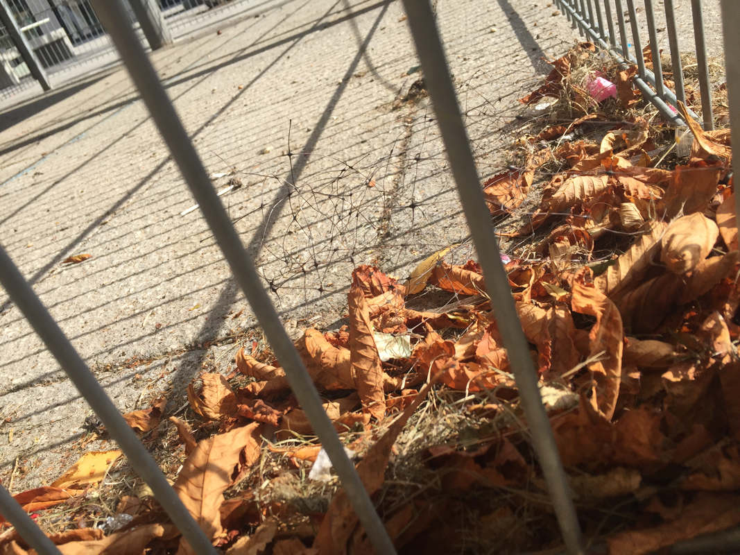
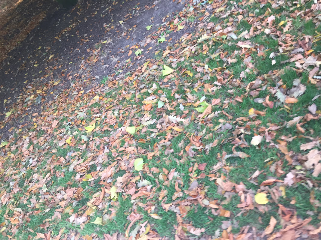
HALF TERM
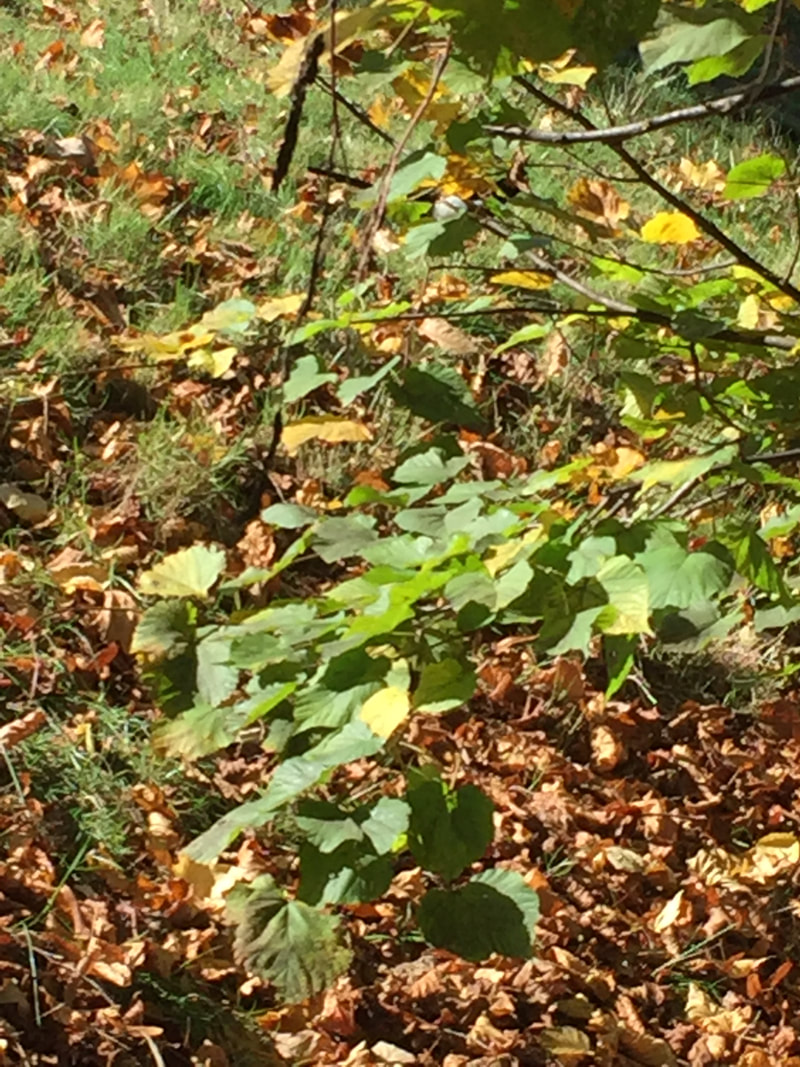
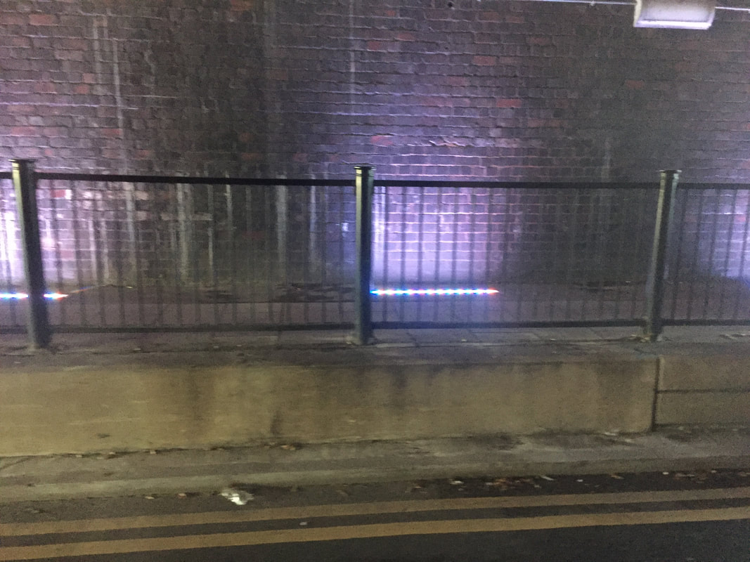
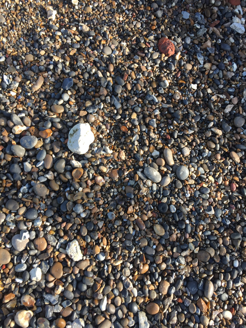
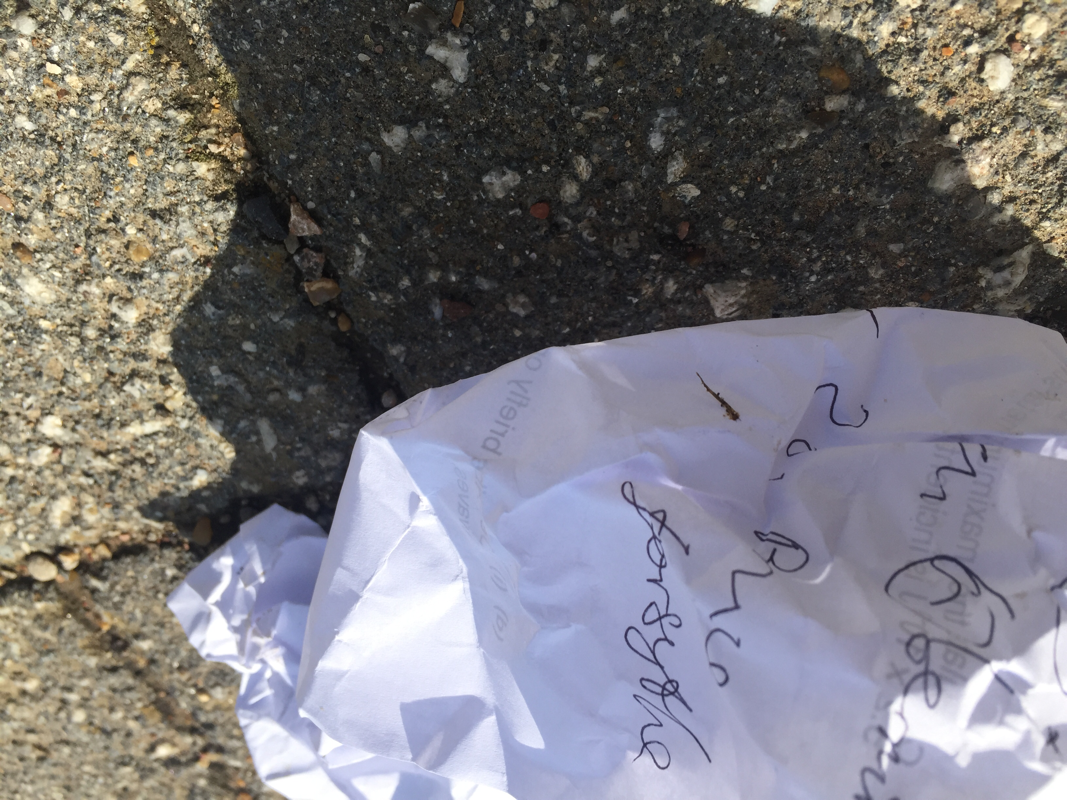
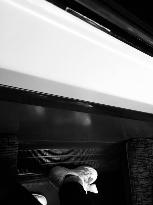
These are some pictures that i took in the past half term.
WWW: Good focus and goos setting for the pictures.
EBI:Could try to play more with the camera and objects.
WWW: Good focus and goos setting for the pictures.
EBI:Could try to play more with the camera and objects.
|
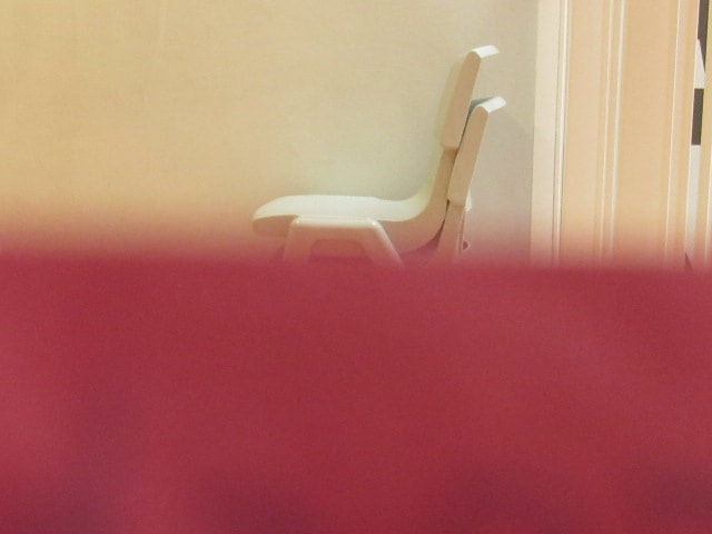
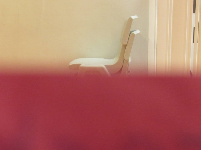
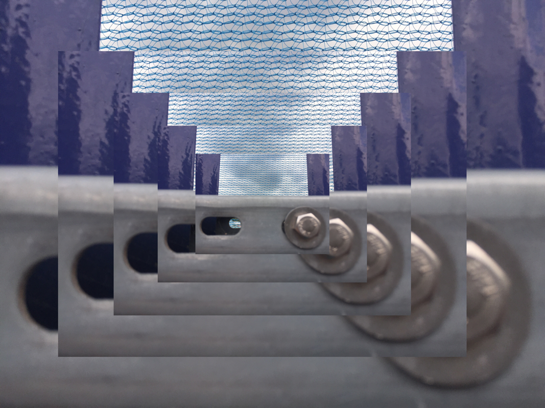
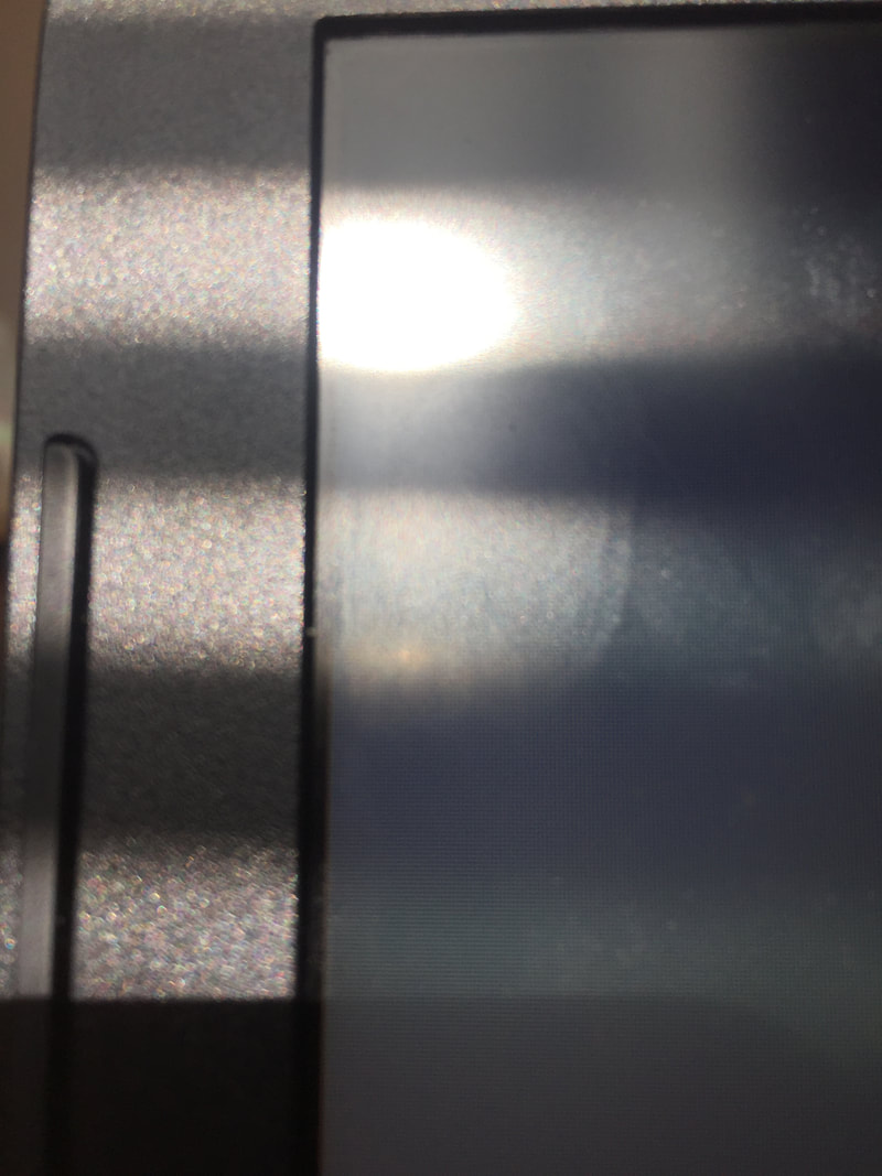
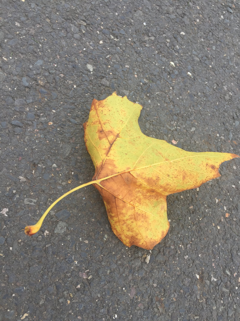
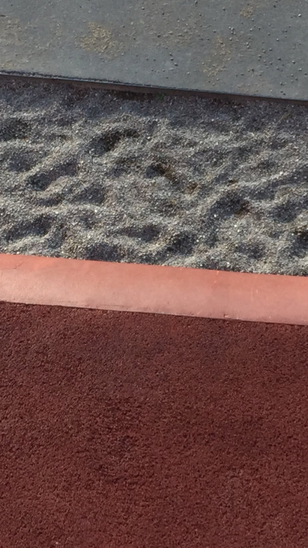
Favourite one
What is closer to the camera is without focus and what is further away has good focus. |
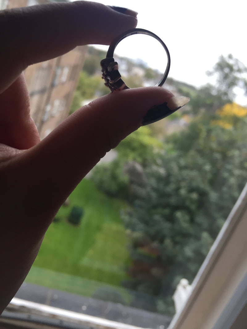
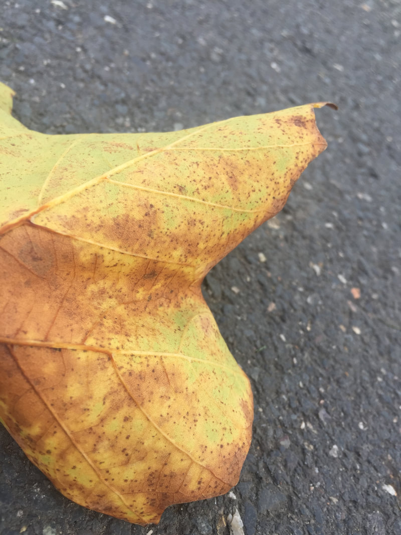
Least favourite one
The contrast with both objects are not good. The quality is not the best. The lighting is not good. |

|
|
ABSTRACTION ASSESSMENT
KELD HELMER-PETERSEN
|
|
He is Danish modernist photographer, in 1948 his book 122 colour photograms ( Farvefotografier )it was unique and innovative use of colour in his photograms, this photograms are composed with the patterns of landscapes and buildings.His book Black light( Black to Black) this abstract book has black and white pictures.This book is based on Petersen's influences, working methods and techniques such as futurism.
|
AARON SISKIND
|
|
“In any art, you don’t know in advance what you want to say – it’s revealed to you as you say it. That’s the difference between art and illustration.”
Aaron Siskind His work is abstract and true to life, he was identified with the ideas of abstract expressionist later on he tried to put emphasis on texture, he close-up framing,line and visual rhymes, all this elements create an abstract real life picture. |
I saw these two photographers and i will try to base my final outcome with the ideas of these two photographers.
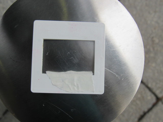
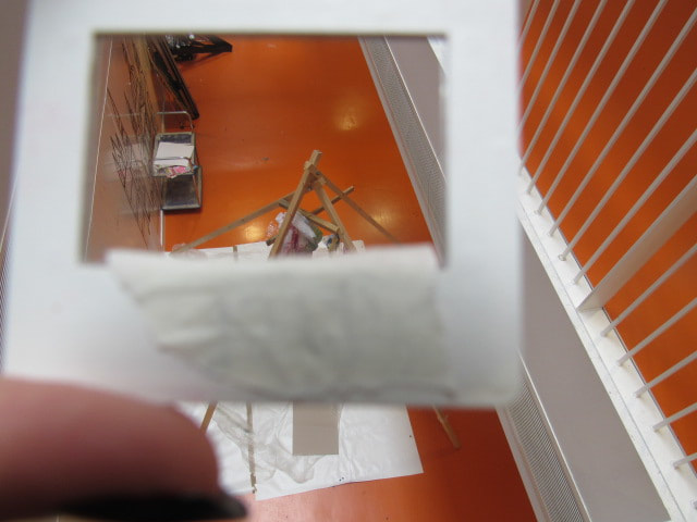
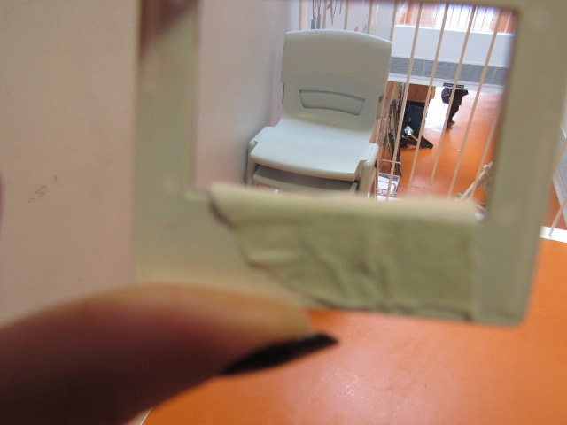
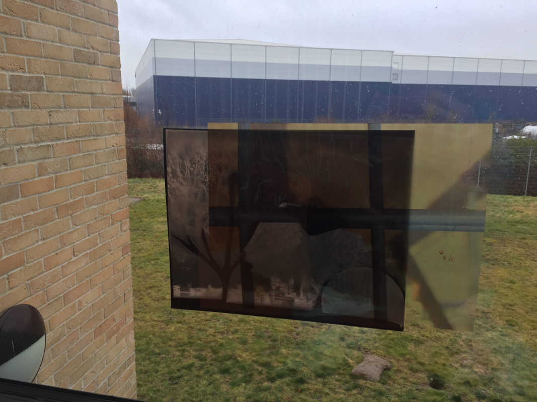
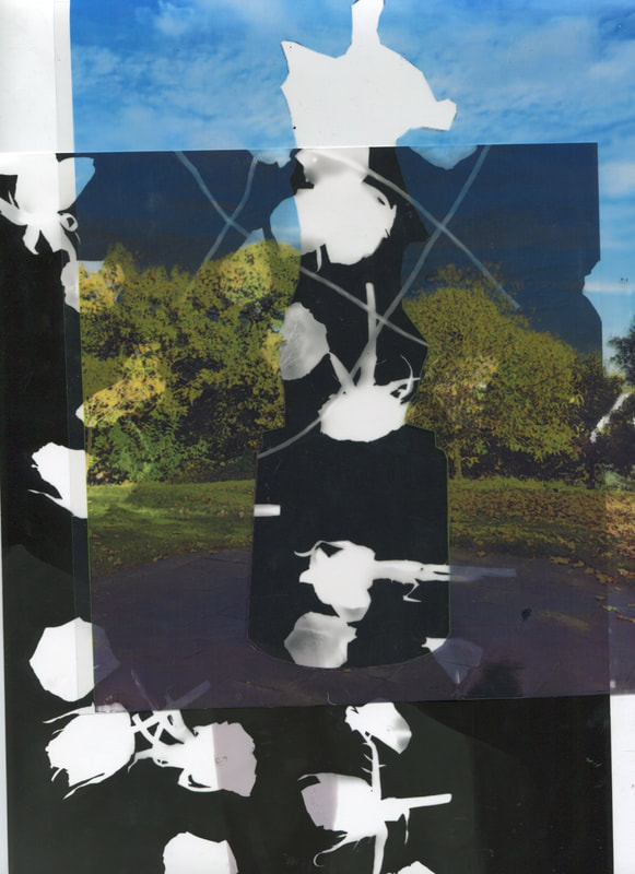
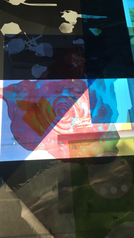
Dafna Talmor workshop
Dafna Talmor burn in Israel, but when she was 5 she moved to Venezuela, where she went to a international school and decided to move to London, where she went to the Goldsmiths in 2001. She came to our school where she told us how to cut positives and make them look more abstract and interesting, instead of a simple picture. I have made some examples trying to be inspired is Dafna's pictures. She inspired me by creating some layers and using those layers to create a abstract pictures.
This are some examples of what I did in the workshop.
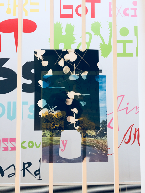
|
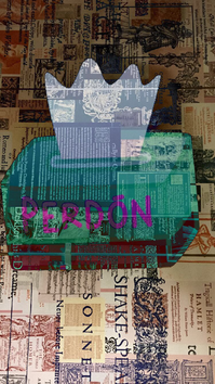
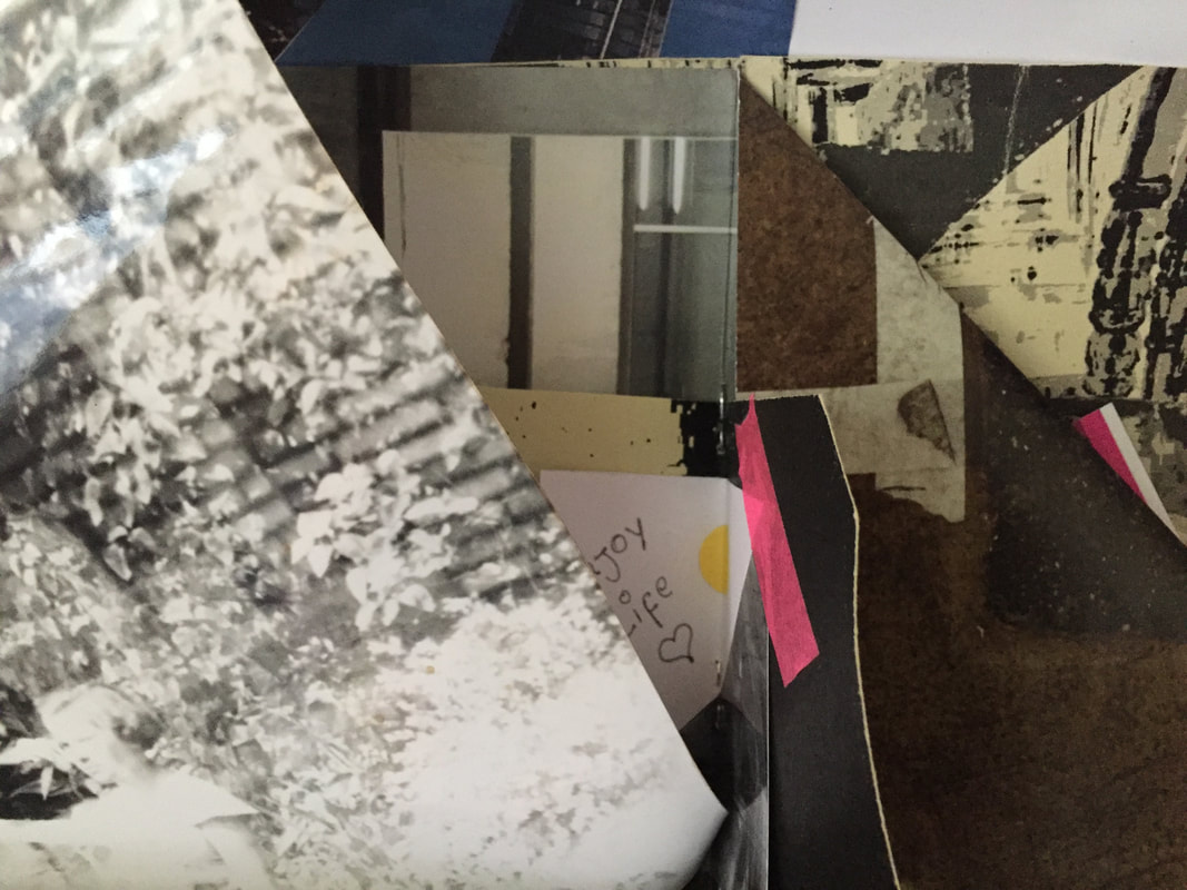
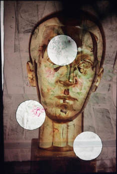
For this picture, I decided to combine 2 simple pictures and make a small simple collage by making some holes in the picture so you can see what is under it.
|
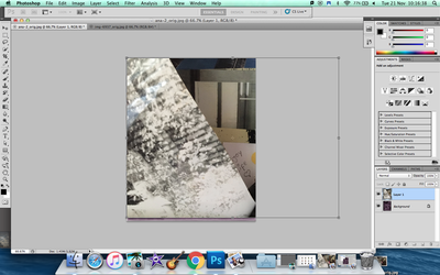
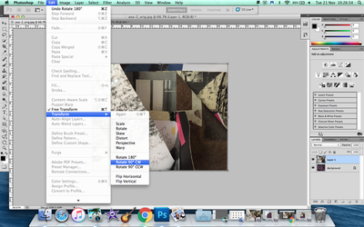
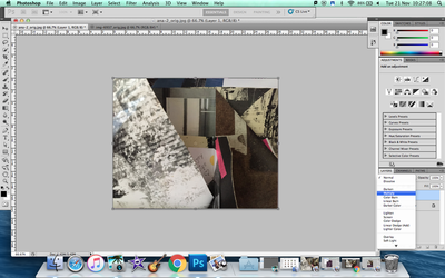
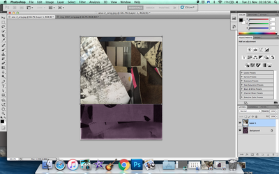
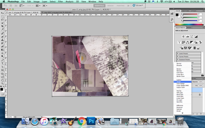
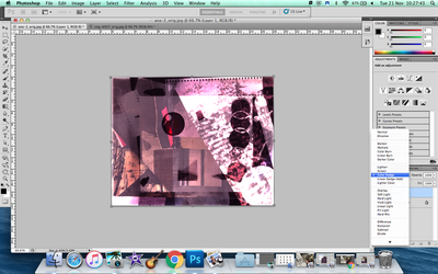
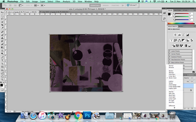
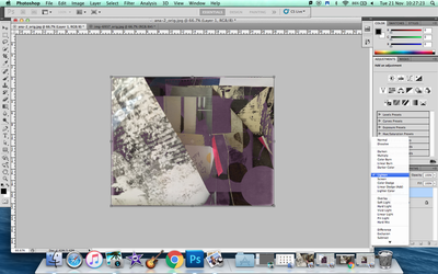
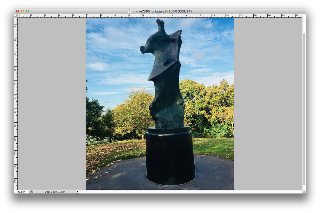
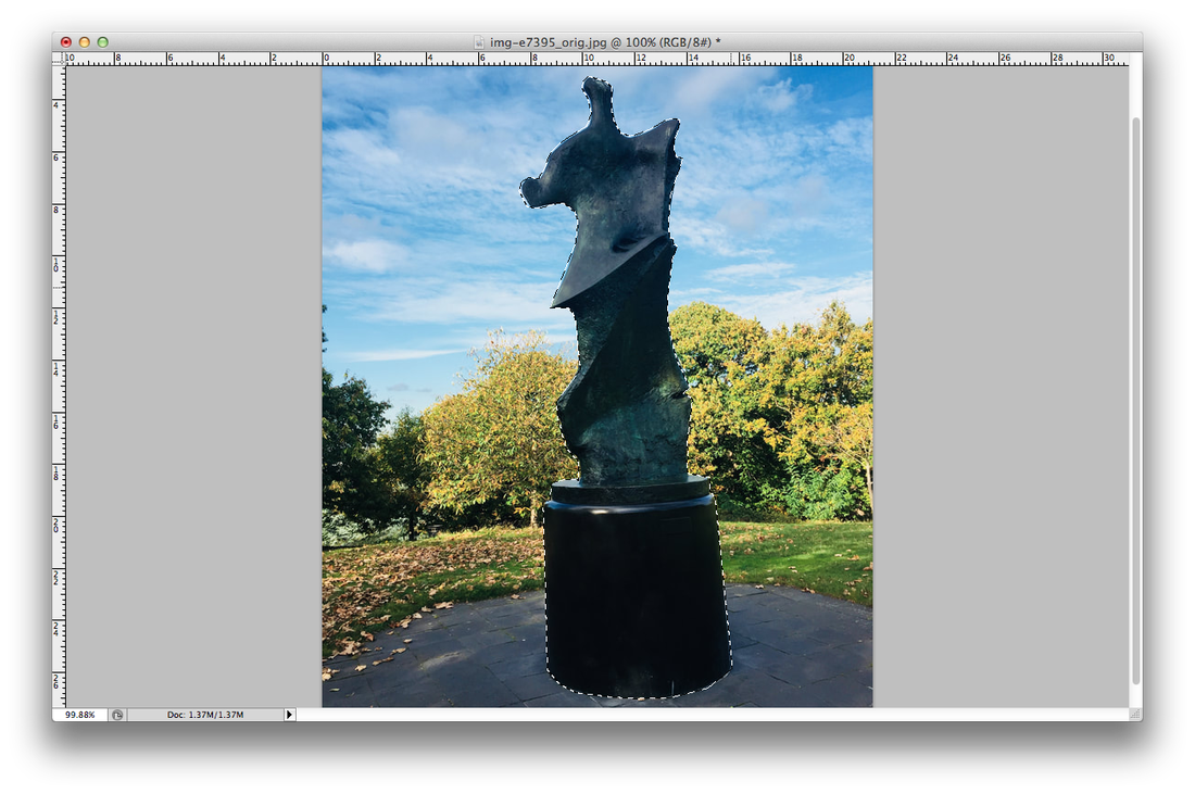
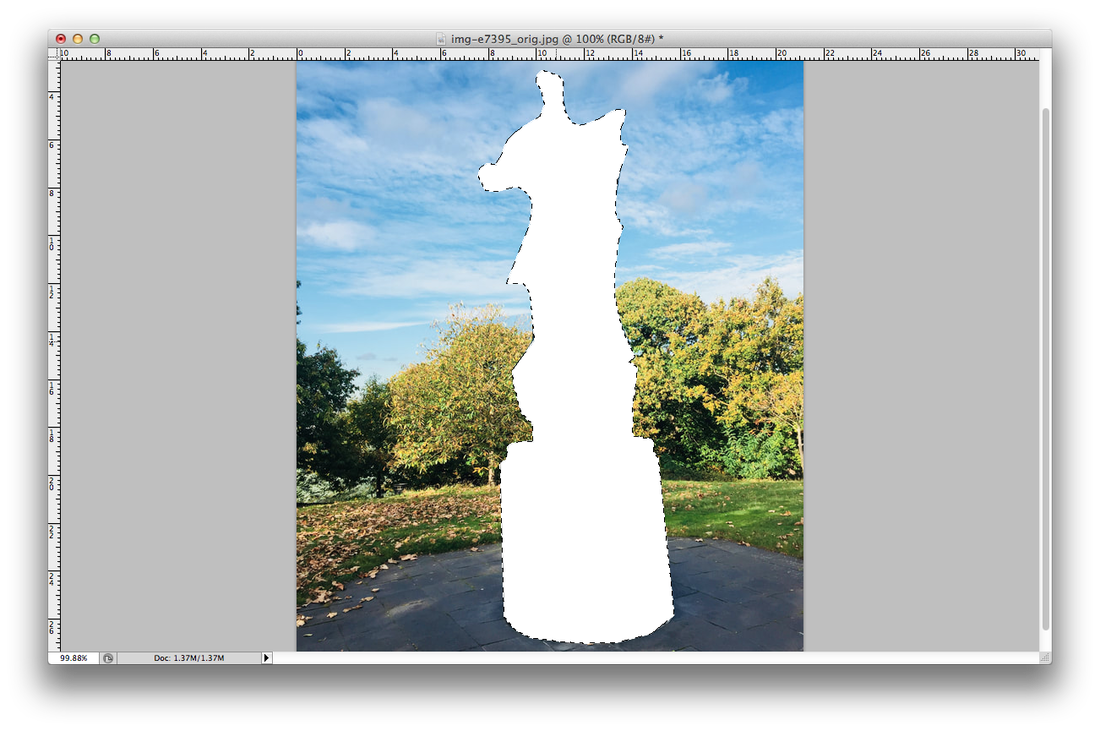
CUTTING SHAPES IN PHOTOSHOP
|
|
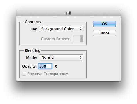
First select the picture you want to cut and drag it to photoshop. There select the polygonal lasso tool and start going around what you want to eliminating from the picture, what you don't want. When you have already finish and the dots are kind of moving press delete, select background colour and press ok. Don't forget to save it, then you will have your picture finish.
|
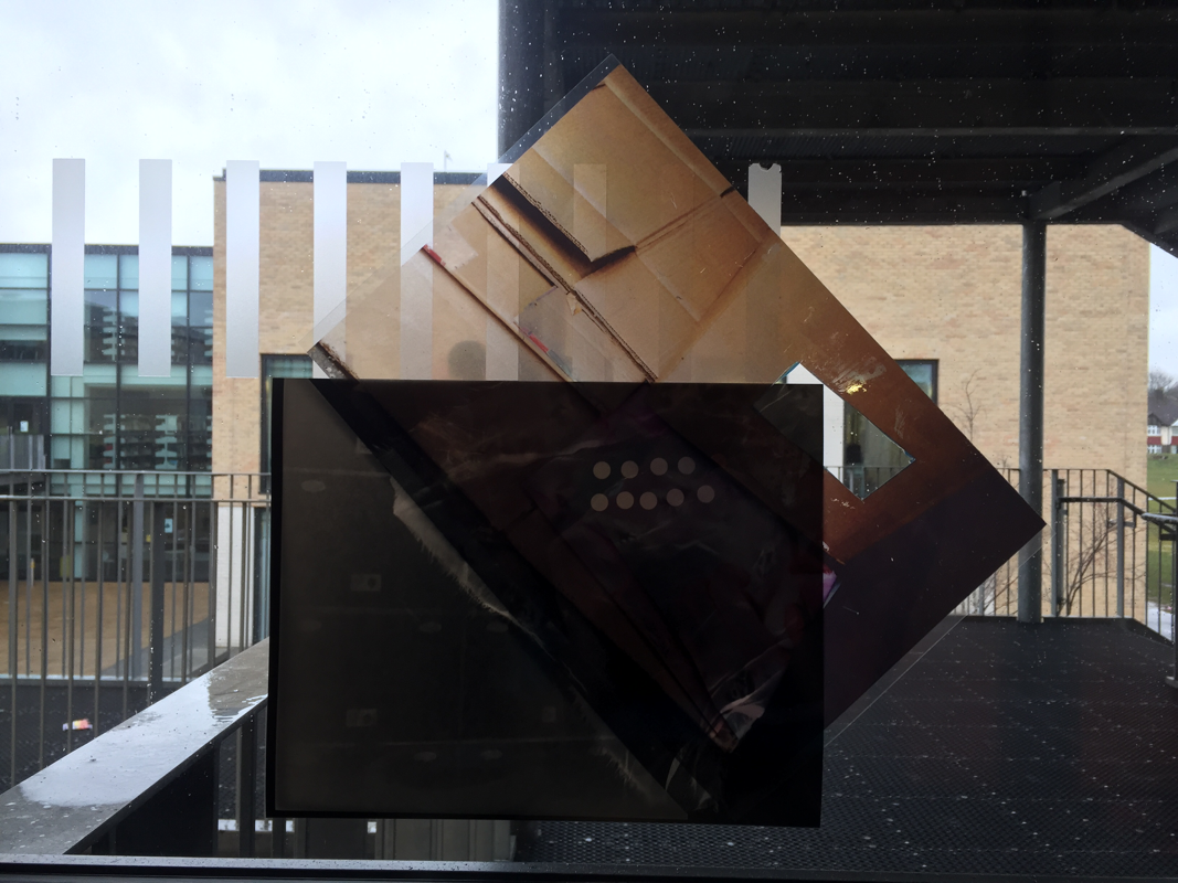
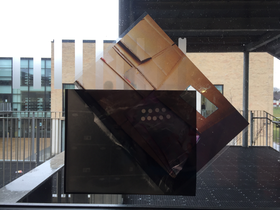
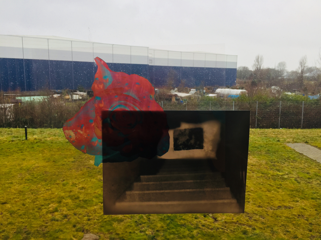
These are some examples that I scanned, trying to experiment because i can see which one looks the best with what pictures.This collages have between 3 or 4 pictures combine together.
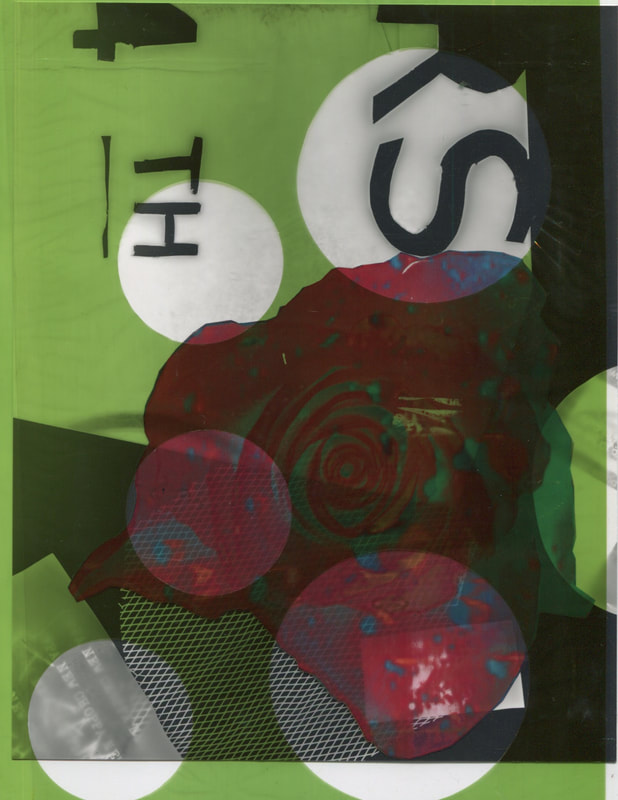
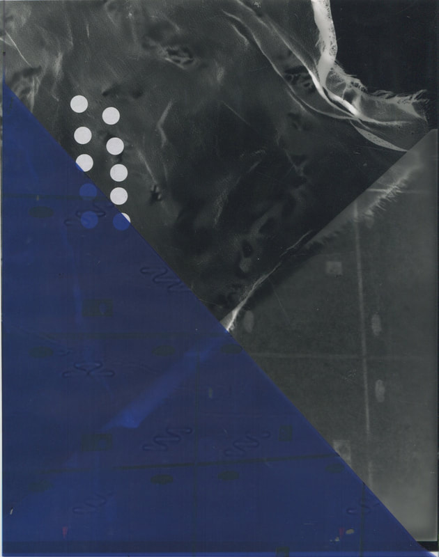
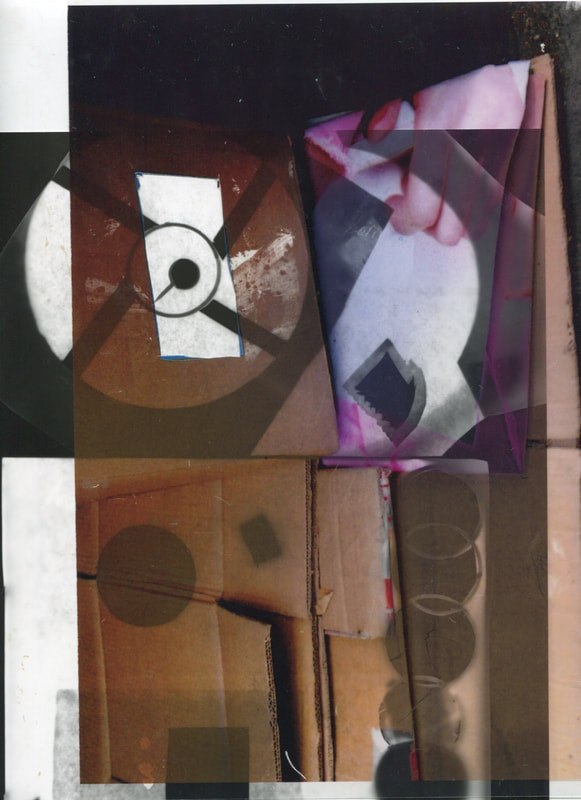
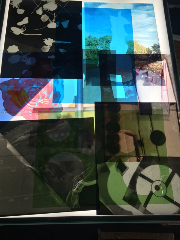
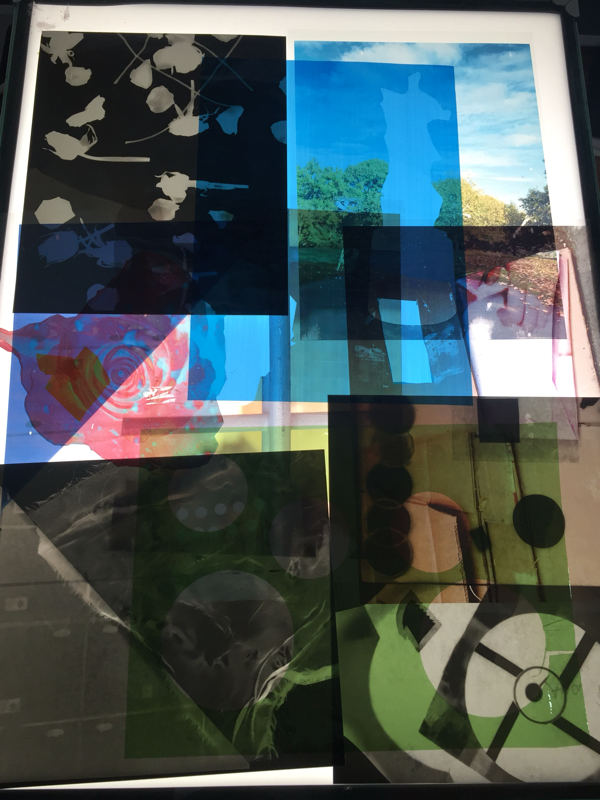
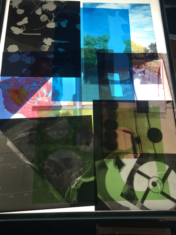
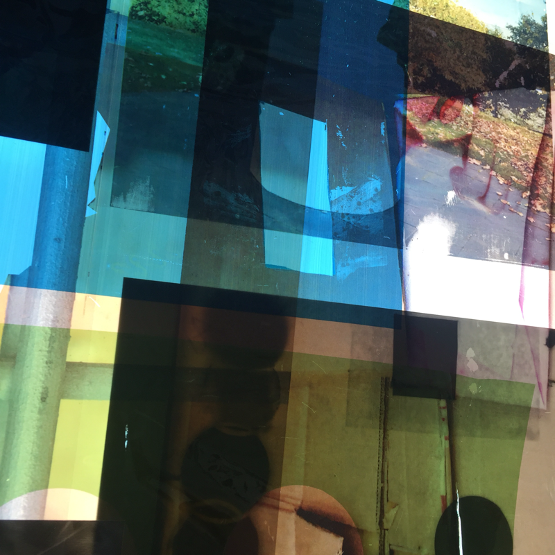
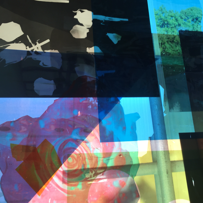

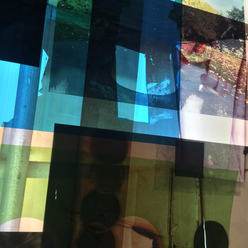
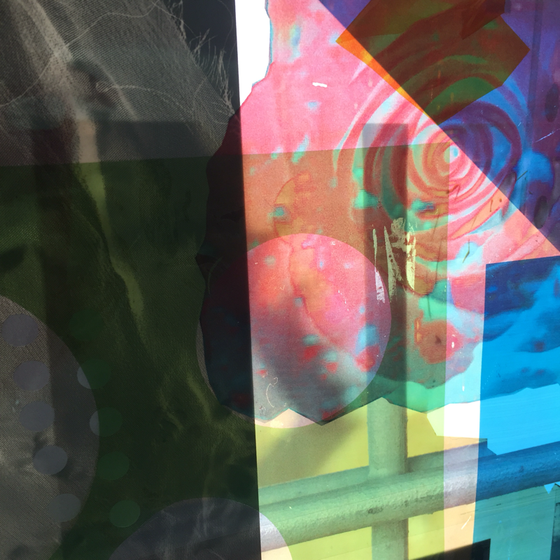
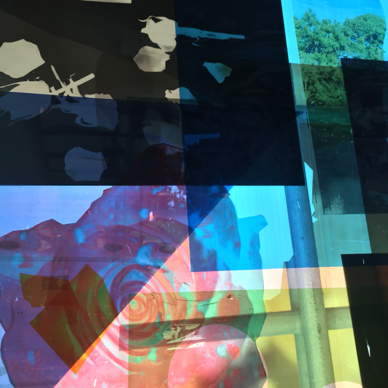
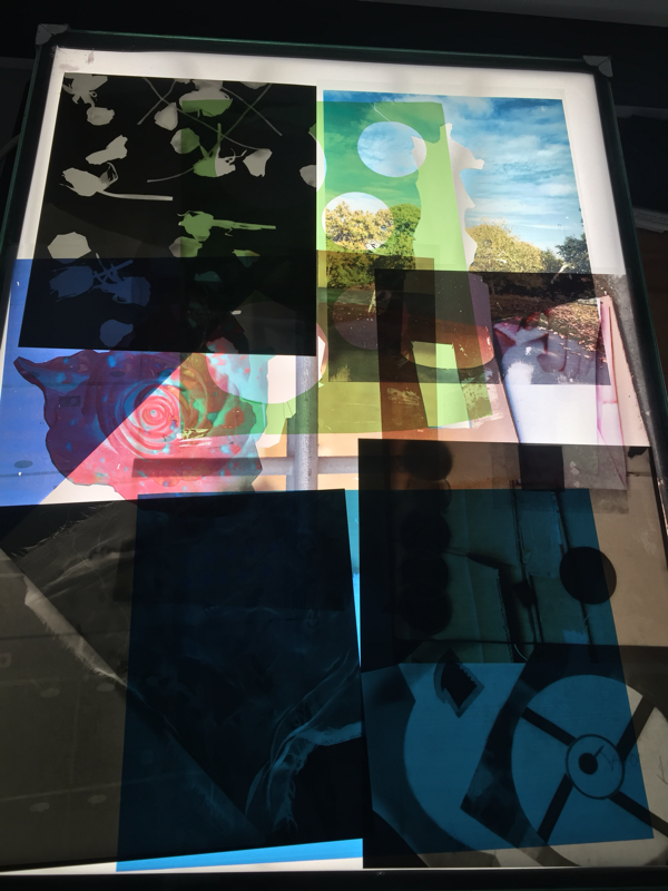
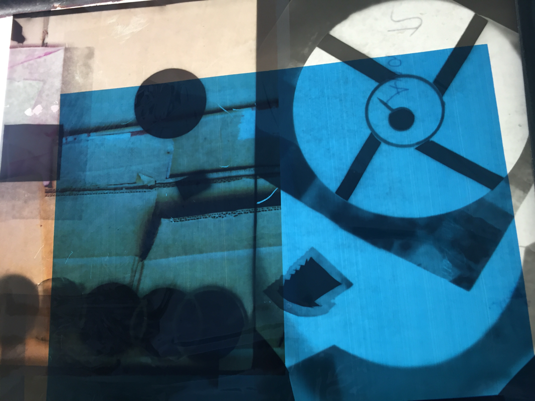
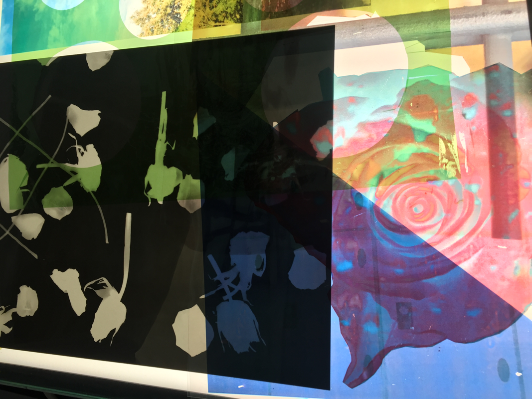
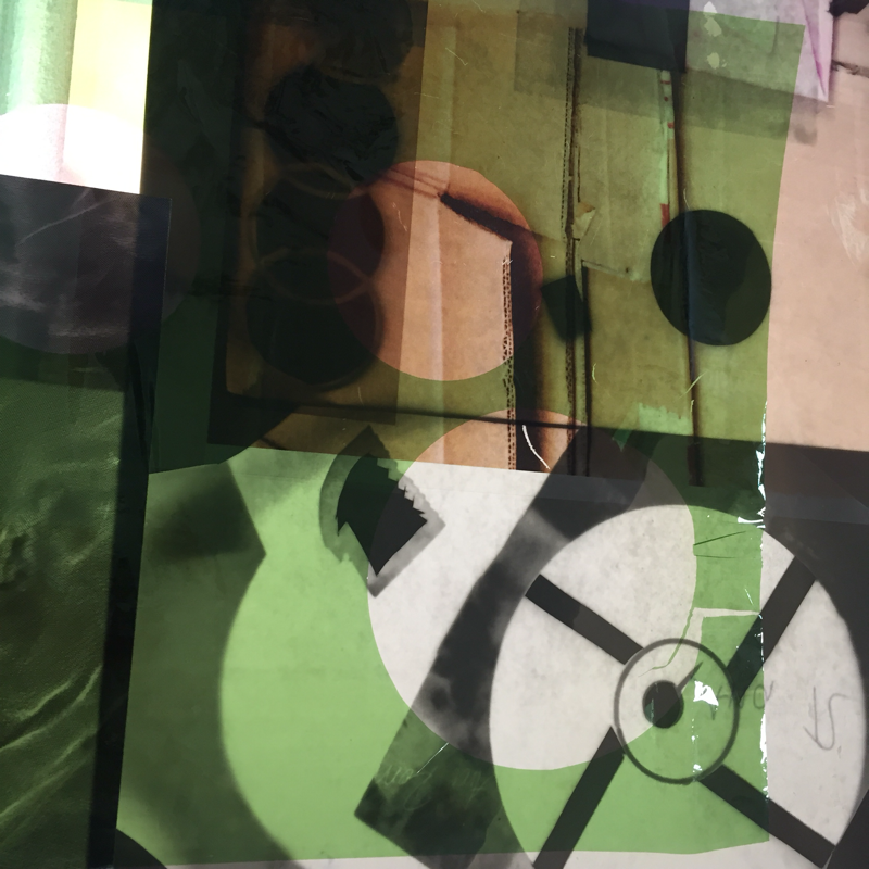
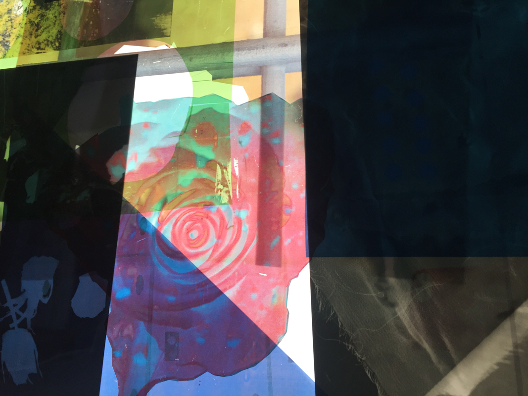
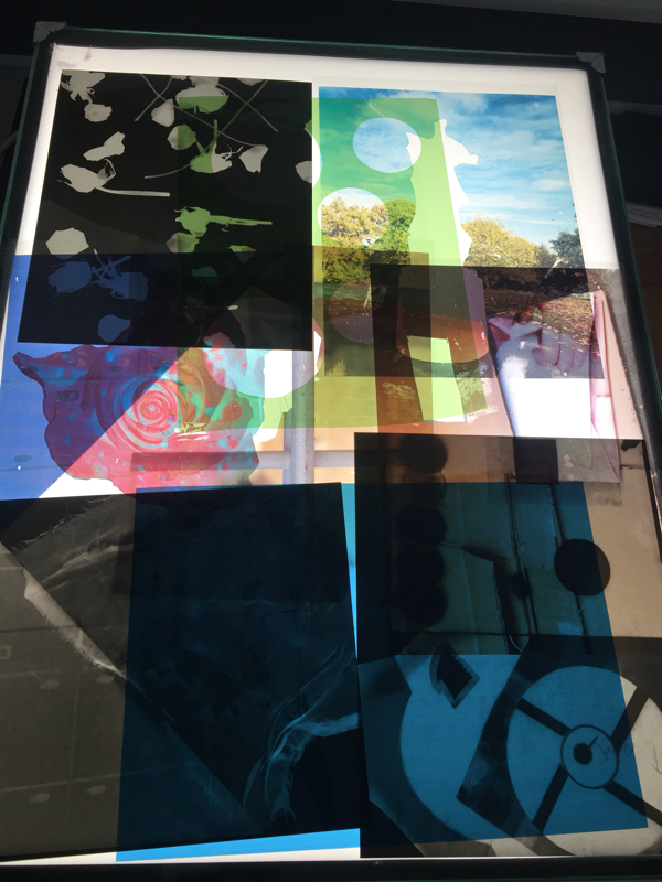
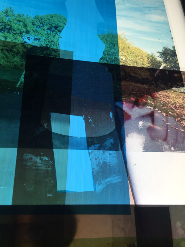
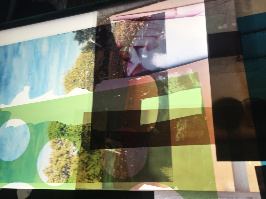
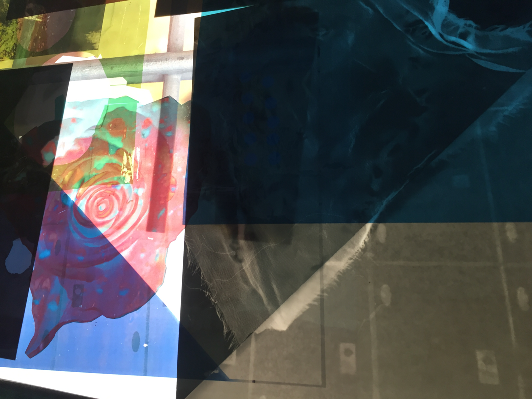
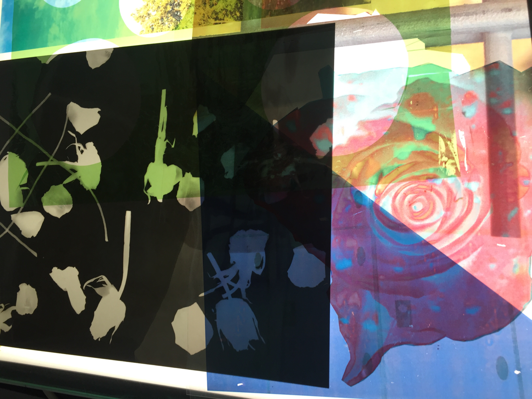
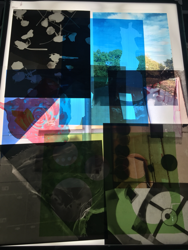
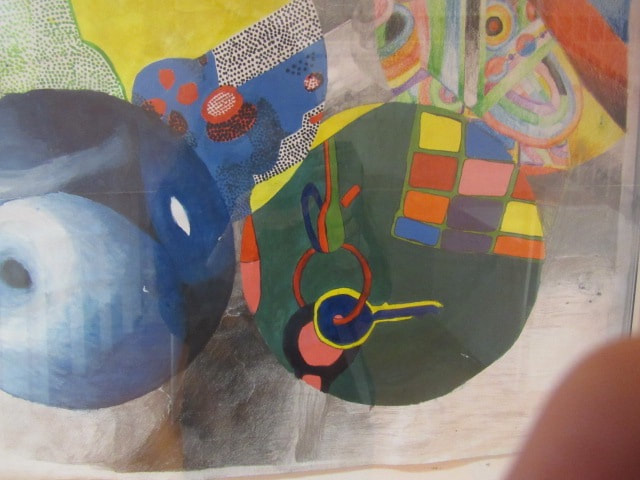
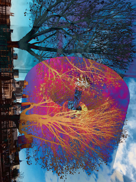
MY FINAL OUTCOME
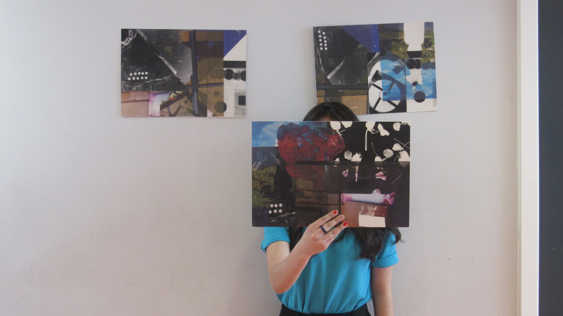
For my final outcome I made some collages, with a number of layers.
WWW:
* I am satisfied with the combination of my pictures together, that I decided to make 3 outcomes with different combinations.
*I like the way my outcomes are presented, because they are quite easy to be put anywhere and easy to be handle.
* I experimented many ways of how to print out my pictures, I took some pictures in the light box, but quality was not that good. Then i tried to scanned them and print them out but I thought they were to simple. By the end i decided to make the collages directly in the printer and it was the best option.
* For presenting my outcomes, I decided to print them in some special paper and glue them in a card board, so it is easy to be displayed.
EBI:
- I think next time i should have it planned instead of just guessing.
- I will try to develop more my final outcomes and see how far I can go by experimenting.
